Blonde ambition
Posted on Nov 2, 2022 by Lee Renwick
Chayse Irvin’s Blonde cinematography paints a fragmented fiction of history’s most famed actress – wilfully disruptive and emotionally charged in equal measure
IMAGES. Netflix
There are a few cinematic codes by which most abide. With each new film comes fresh visual delights, and while pictures are as varied as the narratives they depict, one thing is almost guaranteed: consistency.
Spectators possess a wonderful ability to settle into the strangest cinematographic grooves, provided it continues to deliver as expected until the final frame flits by. It’s a comfortable experience that Chayse Irvin denies throughout the entirety of Blonde.
From scene to scene, images shift in a way untethered to time, story or aesthetic – anchored more so than anything by an intoxicating performance from Ana de Armas. Andrew Dominik’s most talked about film to date has been the subject of both criticism and great adulation. But, for those capable of overlooking questions of art versus taste, one thing is undeniable. If, as Roland Barthes quoted, “What had not yet ever been seen is devoured by the eyes,” then Blonde is a veritable feast.
“When I heard about this particular story, I was very excited. It’s based on a book, which deviates from fact and combines a lot of characters into a single metaphorical individual. It pushes the psychological experience Marilyn Monroe may have been going through to the point of hyperbole. I sensed that it desired a visual structure which worked outside of conventions,” begins Irvin.
“I have, in the past, felt more connected to a visual language that was a bit more observational. It gave spectators more licence over how they viewed it, whereas this film tries to show a point of view very literally. That point of view could be expressed in a fragmented and distorted way. It didn’t have to adhere to notions of logic. In fact, it was much more emotionally driven.”
Between combinations of aspect ratios, sensor formats, lenses and choices between colour or monochrome, we see an endless array of looks. In moments, they are typically complementary to the subject matter. In others, they appear random and psychologically jarring. Irvin’s process is unique to the degree of being impossible to emulate.
“I didn’t know exactly where ideas would be applied. Andrew had a better sense of that, because he could always view the film from a wider perspective than I could,” Irvin explains. “I feel it’s very much the responsibility of a DOP to capture the moment. A director sees a structure and tries to create meaning at different intervals.
“Instead, I would present visual ideas in moments of inspiration. If I saw something during the blocking that was connected with a particular emotion, I could sense a certain cinematic device I’d developed could be applied here to support that theme.”
It’s not the first time Irvin has approached cinematography in this way, but previously it was little more than a visual experiment. Here, on a much larger scale and applied to a fitting subject, it takes on a poignant meaning.
“The approach is completely motivated by Marilyn’s lack of – but at the same time need for – stability in life. I feel we found a way to support that sense of desire and continual denial.
“I value images existing as metaphors rather than symbols. In that way, they’re indefinite in meaning,” Irvin continues. “For that reason, I was protecting a somewhat arbitrary approach to each individual shot. All I needed was an understanding of the gesture, and how it connected with Marilyn. I abstained from thinking about it on a per-scene level, because I felt if I went down that road it would start coming off as a contrivance, where I wanted it to be abstract. If I had preconceived everything and executed it at intervals, it would have been an imposition on the spectator – so I shot it in a way that lacked stability, true to the metaphor. I couldn’t even logically harness why I approached each scene the way I did. I’d put it down to intuition.”
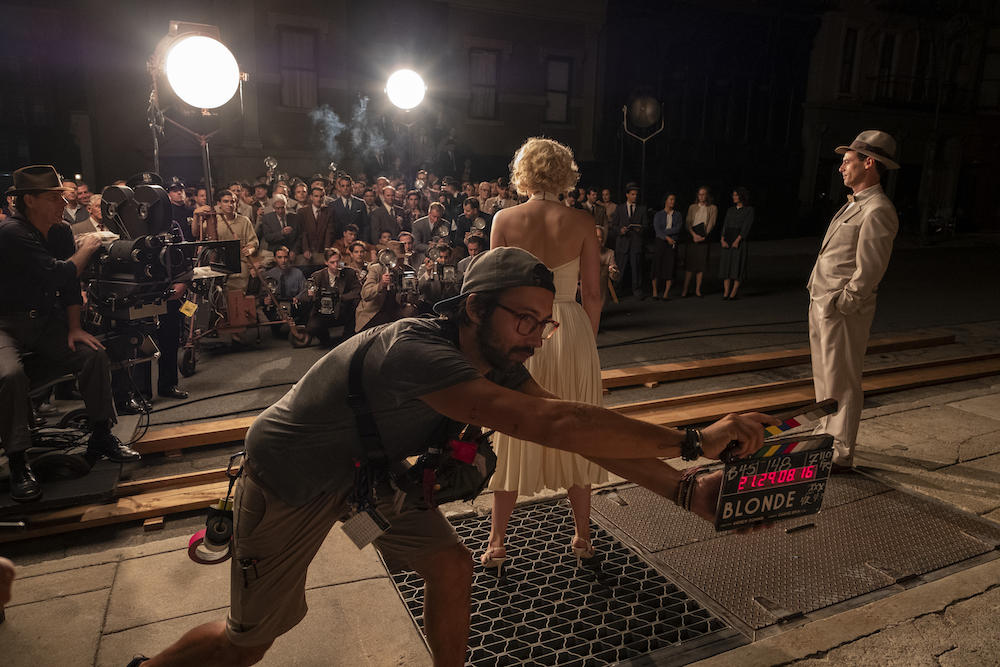
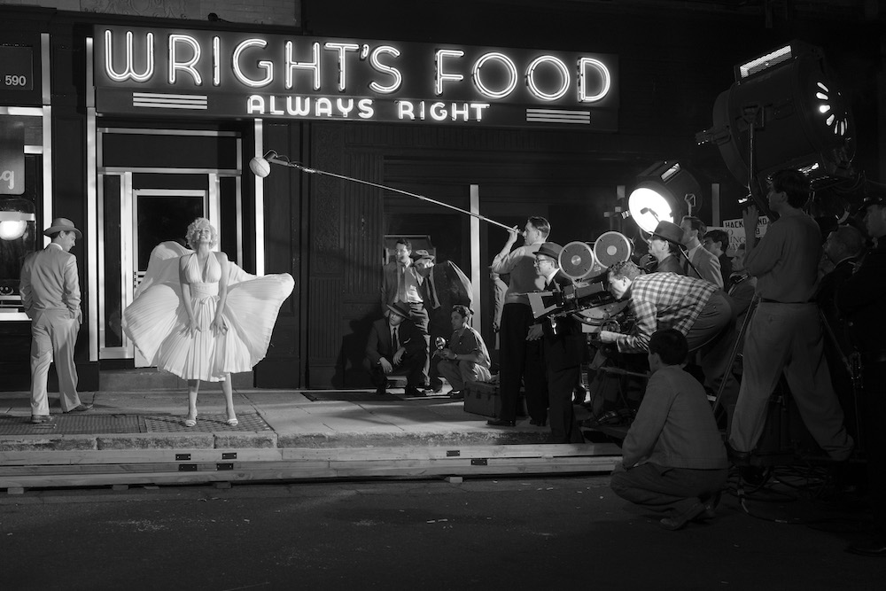
Contrary to this, keen-eyed viewers will notice a number of moments pulled straight from Marilyn Monroe’s non-fictionalised life. Sequences mimicked photographs exactly, with scenes staged in what were once photographs. While closer to the truth than the rest of the film, these shots were, once again, designed to carry intrinsic meaning. As we gaze on, we’re forced to ask – as Marilyn herself may well have – where does woman end and myth begin?
“Sometimes, when we set those shots up, they felt so contrived – but I saw their purpose. To look at them, it feels like she’s a ghost,” Irvin explains. “In the final scene, when she dies on her bed, she rolls over and clinches the pillow. That’s a recreation of a still from the last series Marilyn had taken in her life – which has a tragic backstory itself. In them, she’s smiling as Marilyn, but Norma Jeane was broken. We applied that iconography to her death. In the film, Norma dies, but the figure of Marilyn remains.”
THE CREATIVE TOOLKIT
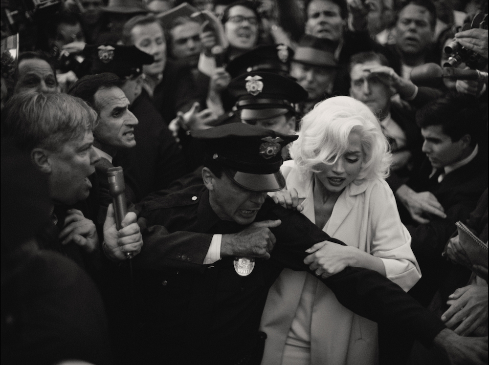
Within such a context, a considered camera and lens choice remained paramount, albeit for atypical reasons. To fulfil the desire for varied looks, Irvin chose not one camera, but two – and a selection of glass. A rare monochrome Arri Alexa was met by the Sony Venice, with both used prolifically throughout.
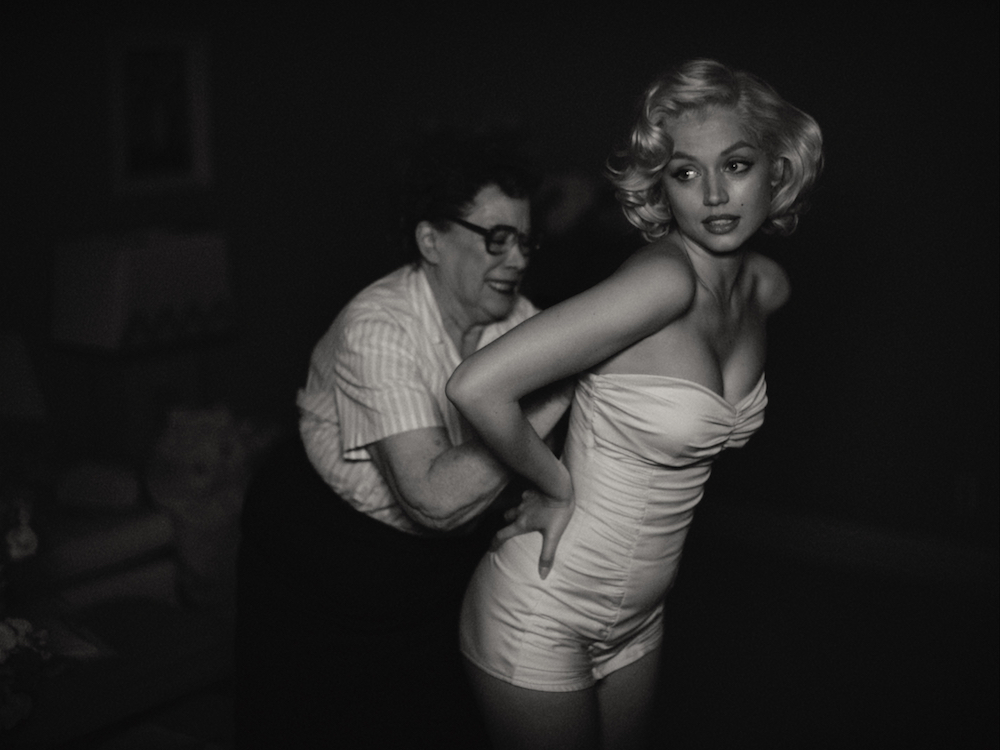
“Andrew and I both experimented with the black & white Alexa. There are only a few of them in the world and they’re considered scientific cameras, so I don’t know if they’ve ever been used on a feature film,” Irvin muses. “I love the look of the sensor. In a way, it better represents stills photography than Super 35, because of the grain structure and size.
“It also has the unique virtue of capturing infrared light. There’s a sequence in the film where Norma wakes up in the middle of the night and men have invaded her house. That was all captured in infrared and, in actuality, the set was completely pitch black. Ana’s eyes are black with completely dilated pupils, so you get this ghostly expression, and the veins in her skin are visible.
“There wasn’t time in the schedule to fulfil all the ideas I had, but the camera itself was a real source of inspiration.
“The decision to use the Venice came from a need to be adaptive and react quickly to things on the set,” says Irvin, moving onto his second tool. “Working through intuition is actually based around sensory response, so I picked the camera that could help support that.
“When I was testing, I was mostly indifferent to image quality. The question for me was, what’s it like working with the tool? There was a moment where we were shooting our stand-in in the production office. I had my apprentice operating the Venice and my focus puller on another camera. I was staging scenes in the beautiful light we had and the Sony Venice was capturing everything at the moment of inspiration. It was primarily, I sensed, because of the internal ND structure. You can operate without a matte box. While my focus puller was changing filters to maintain a consistent aperture, my apprentice was shooting.”
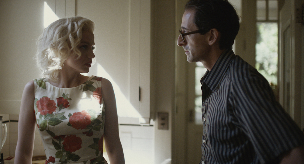
When it came to lenses, perhaps the greatest degree of personal preference and specific visual intention came into play. “I looked at some lenses with full-frame coverage and disliked the contemporary options,” Irvin states. “I feel connected to an optic that has a human touch. And that, to me, is best articulated as something that’s less than perfect. I had a meeting with Dan Sasaki at Panavision, and when I walked into his back room, I saw he had grease from his fingernails to his elbows. I knew he had what I was looking for.
“I trusted Dan with some requests that were outside the norm. He had put together a few H Series lenses, which weren’t widely available at the time. We also used the PVintage, because they’re an eclectic mix, with a nice lack of continuity between each. Some had full-frame coverage and others didn’t, so much of the film is actually a Super 35 extraction of a full-frame recording. The still image recreations all stayed true to what would have been likely in the era, however – a 50mm lens on a 35mm frame.
“The one other artistic sentiment I wanted to create in the film was a sensation of fragility. That meant using a particular depth-of-field. You can see in various close-ups of Marilyn that the fall-off is really strong. It looked as though the image was falling apart. I also wanted it to suggest a feeling that a mistake could happen at any point, because focus was so on the edge.”
IN THE SPOTLIGHT
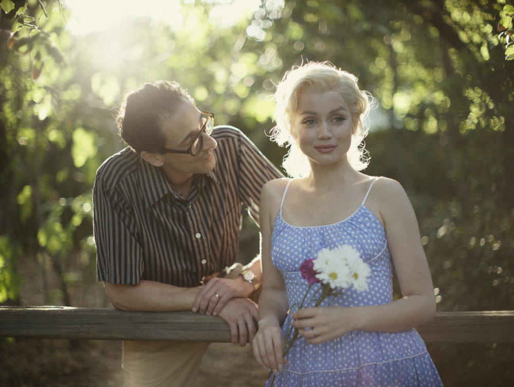
With such unusual offerings elsewhere, it’s easy to overlook the very heart of all typical cinematography – lighting. Unsurprisingly, Blonde required a number of approaches. Scenes are sumptuous or practical, depending on intent.
“There was a degree of obsession early on, where Andrew and I discussed exactly how to light Ana so that she resembled Marilyn. I was less concerned about that, and as the schedule progressed, we let go of that notion and trusted Ana was exuding the character herself.
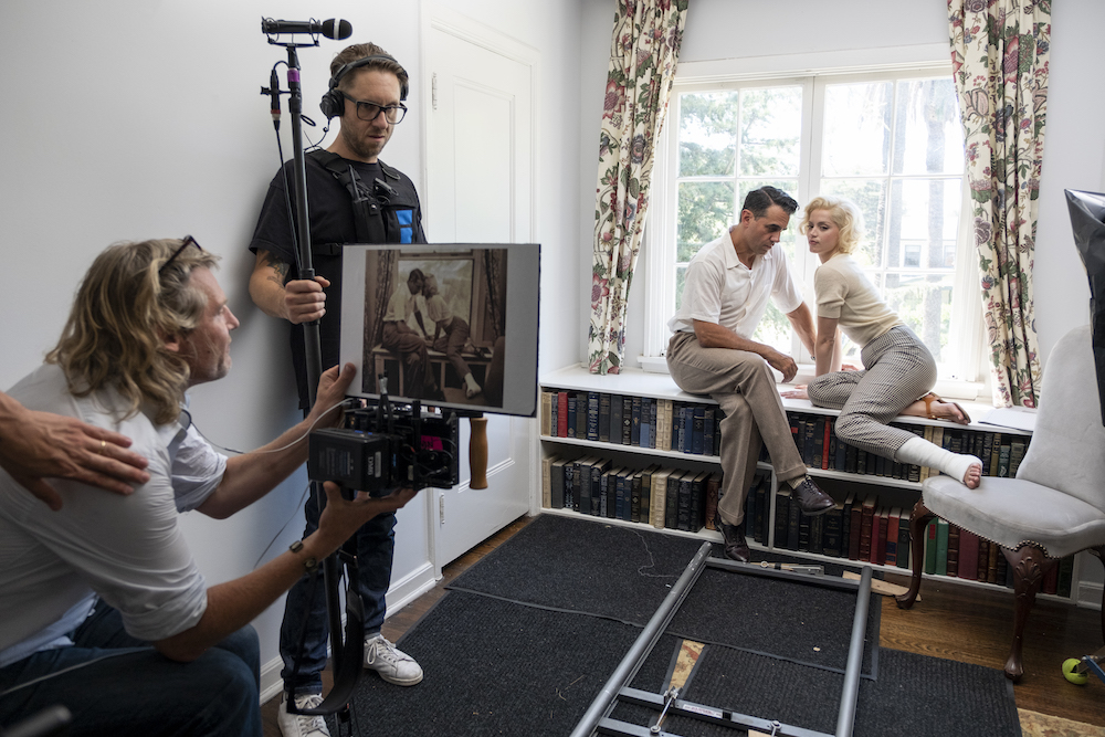
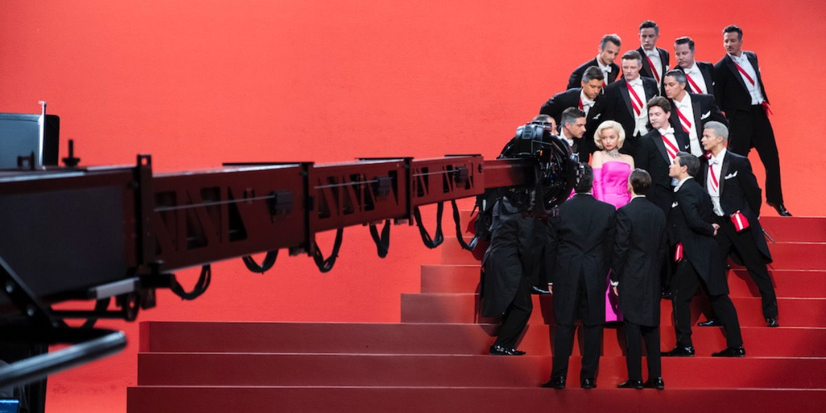
“I don’t recall lighting much of some locations, like the home she spends her last days in,” Irvin adds. “Those scenes were all very natural. But there were moments throughout where I tried to do more – especially in her youth, like the montage where we recreated famous posters, as Marilyn is truly introduced. That’s an expression of soft and hard light. We were trying to recreate exactly how the photographers of that era would have lit those scenes, and we tried lighting them with identical vintage units.”
More modern tools facilitated the spontaneity Irvin sought in his camera work. Large, top-down rigs were used, but not without their own challenges.
“Marilyn’s hair was very white, and if that was the closest thing to the source, it became brighter than I would have liked in some cases. The film also demanded a crazy amount of locations. It felt like we were in a new place every day, so there wasn’t necessarily one solution we could use throughout. It was very much about augmenting existing light, so as to stay true to the setting.
“In other scenarios, when she’s on the stage, at the premiere, or in the dressing room, for example, I chose to front-light Ana with a spotlight. It looks like flash photography more than anything. I liked that because, again, it distorts and fragments notions of reality. It was also a subtractive process, about trying to harness what’s happening emotionally and nothing else, letting everything around Marilyn fall to black.”
Undoubtedly, Blonde is a challenging watch, such is the will of its creators. It’s a cinematic experiment on the largest scale, where spectator objectivity is a must – in its admirable cinematography and beyond. Contention was inevitable. But, in the film’s truest nod to the multifaceted, real-life Marilyn, those on both sides of the fence simply cannot look away.
Blonde is now showing on Netflix.
This article originally appeared in the November 2022 Issue of Definition. Read the full magazine here.


