
Squid Game Season 2: Chae Kyoung-sun on set design
Posted on Mar 10, 2025 by Admin
Ahead of the game
We sit down with Squid Game’s production designer Chae Kyoung-sun to discuss the colours, sets and references that define the latest season
Words Katie Kasperson | Images Netflix
The Korean-language series that broke Netflix records, Squid Game tells a frightening tale of power and greed while reminding us that teamwork can indeed make the dream work. Created by Hwang Dong-hyuk and now in its second season, the dystopian thriller draws its visual inspiration largely from the South Korean school experience, with nostalgic childhood games turned into life-or-death scenarios for all who volunteer to compete in them.
Squid Game operates in a world of its own, and production designer Chae Kyoung-sun was integral in bringing this alternate reality to life. Having established the look and feel of Season 1, which was ripe with pastels, robotic dolls and labyrinthine locations, Chae was tempted to reinvent the wheel for the new season. “Preparing for Season 2 came with a lot of pressure,” she admits. “Since Season 1 was so well received, I wanted to make Season 2 even better. Instead of leading to positive results, that ambition ended up creating designs that felt awkward and excessive.”
Season 2 goes back to basics, picking up right where Season 1 left us. “The dormitory had to remain the same. Seong Gi-hun needed to wake up in the same outfit, in the same space, on the same bed with the same bedding. We kept the same blueprint,” she continues, though adds that she slightly expanded the set to ‘accommodate the OX voting system, making it easier to film’.
Though it recycles certain sets, Season 2 also adds fresh games, colours and characters, widening the Squid Game world without making it feel unfamiliar. “I knew that introducing new games would be one of the most exciting elements for the audience. This season features games that highlight different aspects of human nature – some that require teamwork, others where players have to abandon or forcibly bring someone along with them,” Chae explains. “We went through many design drafts, but in the end we stayed true to the core concept: to maximise the essence of the childhood games while creating spaces where emotions could be intensified.”
Down to the final detail
Production design requires attention to every last detail – especially colour. Pink and green defined Squid Game Season 1, while Season 2 ‘features a wider range’, according to Chae. “Orange and purple stand out,” she begins. “I aimed to craft a playful and nostalgic world using bold, high-saturation colours commonly linked to childhood.” Orange, Chae explains, can hold positive (‘warmth, joy, festivity’) and negative (‘caution, anxiety, impulsiveness’) connotations, while purple represents ‘ultimate power’.
Chae would often collaborate with other departments to make sure that the show maintained a cohesive style. “I had the most discussions with the cinematographer and lighting director,” she recalls. “Since we had to create real spaces, the scale was massive. Lighting had to feel as if it had been installed by the masterminds of Squid Game, so lots of thought went into that.” Chae also worked with the VFX team to understand how the sets would ultimately look in post and adjust accordingly. “We anticipated results in advance by running numerous simulations,” she says.
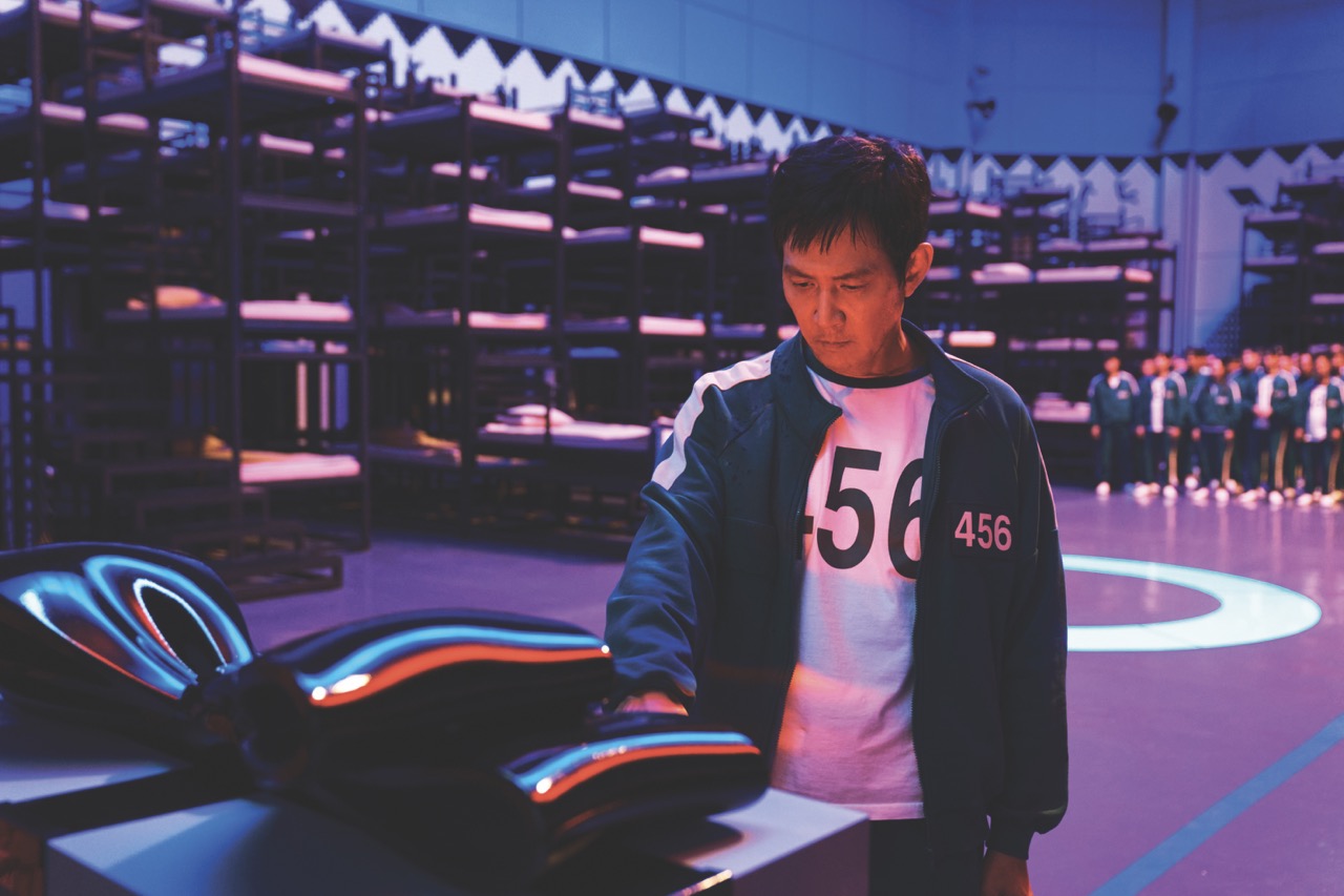
Chae also kept in regular contact with the costume and makeup departments, since each character’s look needed to shift slightly as the season progressed. “We paid close attention to details while reviewing filmed footage,” she shares. “In Cho Hyun-ju’s case, their makeup had to gradually wear off and their hair needed to be increasingly dishevelled. Similarly, we had to carefully depict the amount of blood on Gi-hun as the story unfolded. This required constant coordination.”
Good old-fashioned fun
Squid Game expertly bridges childlike innocence and adult anxieties; each game manages to tap into both mindsets. “For Season 2, we focused more on the types of games played, how the characters reacted within them and the relationships between players,” Chae details. “For example, the pentathlon was designed to capture the essence of Korean elementary school sports day.”
Chae describes the annual event: “Unlike competitive games where players attack each other or directly compete, sports days emphasised teamwork and unity. There was a strange phenomenon – regardless of which team you were on, participants would cheer for each other with genuine enthusiasm. Success was impossible alone – only by working together could you cross the finish line.”
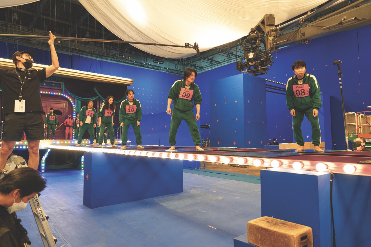
This sentiment is also apparent in Squid Game, where natural bonds form between certain players, yet this raises the stakes for all involved. Chae wanted the sets to demonstrate this tension. She claims the Mingle set was ‘a favourite among the cast and crew’. “It was designed using vibrant bulbs and colourful doors to create a dazzling, yet eerie atmosphere resembling fireworks. Since the entire group of participants had to physically climb onto it and move around while playing, we wanted the set to feel intensely real, capturing both urgency and fear.”
The mind behind the mask
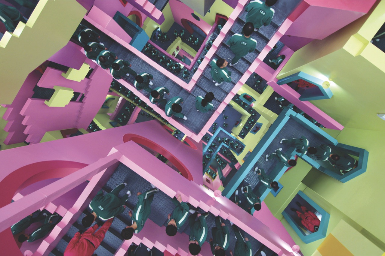
Seasons 1 and 2 are both full of cultural references, from MC Escher’s surrealist works to the show’s logo, which contains shapes from the real game Squid. “We wanted to create an environment of infinite staircases – a never-ending loop with no clear beginning or end – to evoke a sense of entrapment. It was extremely challenging to physically construct this and, at times, we ourselves even got lost or struggled to find the exit,” Chae laughs. “We aimed to include as many layers as possible, so the participants would appear like tiny ants, emphasising the idea that the masterminds behind the game were manipulating them like toys.”
Season 2 includes more of the Front Man, the series’ main antagonist and head of Squid Game. Chae wanted the set to reflect his psyche. “What’s his perspective on humanity?” she asked herself. “If he had a wife and child, surely he would have been to an amusement park, creating happy memories together. And yet, he is the designer of this space: this brutal and merciless game arena.”
Reflecting on her Squid Game tenure, which spans all three seasons, Chae feels ‘immense gratitude’ towards the whole team who made it happen. “They truly deserve endless applause,” she enthuses. “It makes me incredibly happy to share my designs with viewers and fans around the world once again,” she beams, before adding, “but my personal favourite set will actually appear in Season 3!”
Squid Game Seasons 1 and 2 are now streaming on Netflix
This story appears in the February 2025 issue of Definition