Distorted perspectives
Posted on Jan 24, 2022 by Alex Fice
DOP Byron Shah tells us how anamorphic lenses and a telescoping crane help lure us into a false sense of security for Season 3 of You
Words Emily Williamson
When the much-anticipated third season of You premiered last year, fans were treated to characteristic high drama and psychological messiness. Joe Goldberg (Penn Badgley) faces many new challenges – most notably, marriage and fatherhood. We follow Joe and his wife Love (Victoria Pedretti), as they do their best to settle into suburban family life and move on from less-than-stellar pasts.
You is a thought-provoking, nuanced show. To have an audience empathise with a psychopathic stalker and murderer – even one as charming and handsome as Joe – seems like a big ask. But the writing and production has always done this deftly, and Season 3 is no different. Following the revelations at the end of Season 2, Joe and Love’s complicated relationship makes for a journey that breaks many of the show’s ethical dilemmas within the narrative. This shapes much of the storytelling – and influences cinematographic decisions.
DOP Byron Shah explains that Covid-19 lockdowns afforded an unexpected advantage to the production of You. “We had a really nice prep, because it was during the shutdown when no one was working. We were able to spend about three months meeting, to talk about the look of the show.” Shah worked with Cort Fey, who also shot for Season 2. This time spent together contributes to a strong thematic consistency – something difficult to achieve, as DOPs don’t often have much opportunity to collaborate when working on different episodes of the same series.
“Having a very clear sense of the tone – and letting all instinctual decisions flow from that place – doesn’t always happen.” Shah notes that this synchronicity was vital on a project like You, where the subtle nuances in cinematography are essential in helping the audience relate to its main characters. “For us to empathise with that kind of dehumanisation is really asking a lot. It’s only possible if you don’t realise it’s happening. The cinematographic elements play a big part, because you need to be lured and seduced.”
Tone cold killer
A great deal of this tone and aesthetic can be attributed to the distortion from the chosen anamorphic lenses. “We ended up shooting with these Todd-AO anamorphics, which are very rare, beautiful and unique. The same set were deployed on Season 1 – we decided to go back to the look of the first season a bit more aggressively.” The visual effect of the lenses – with their vignetting, blurring and distortion around the edges – helps create a subtle sense that something’s not quite right.
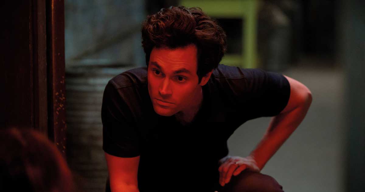
Shah discusses how we’re brought into Joe’s world, where he and Love are masquerading as the perfect couple. But their sadistic sensibilities encroach on domestic fantasy. As such, the crew took extra care to position much of the action in the centre of the frame, so that this distortion and resultant feeling of unease were almost subconscious – and only made overt when certain props were placed in the edges. “We were very careful when putting the story on those edges. When you’re lured into the tale, it looks normal, because you’re really only paying attention to the centre of the frame. Until it’s time to make you realise, and feel subconsciously that you’re looking through a very distorted perspective.” An example is when Joe returns from his life-altering camping trip in episode 5, placing his new crossbow to the bottom of the frame.
The visual artefacts from the lenses are even more blatant in this production than they might otherwise be. This is due to the employment of a 2:1 aspect ratio, and shooting in 6K resolution for lenses intended for a Super 35 format. Shah explains: “When an old-school anamorphic movie came out, it would be 2.4:1. By shooting 2:1, there’s a lot more of the vertical area that’s exposed on the lenses, and you’re outside of the area that was originally designed. Basically, we were overscanning in both directions, because we ended up shooting 6K. We were expanding sideways, top and bottom to shoot a lot of the funky edges of the lenses.” The team were looking to strike a balance, and didn’t intend for the distortion to become overt and distracting for the narrative.
This season was shot on the Sony Venice – as opposed to the Red Monstro and Arri Alexa LF for Seasons 1 and 2, respectively – and this decision was made in part because of the adaptability of aspect ratio. “The camera gave us the most flexibility when it came to overscanning – because it allows for different aspect ratios and resolutions. It therefore enabled us to just find the sweet spot – for most of the lenses, that is. Some were a little bit too vignetted on the edges, so those had to be slightly less than 6K. We were on the edge of where you would really just be paying too much attention to it,” states Shah. These choices result in a season that elevates the show’s already strong visual style.
The team chose to break from anamorphics when giving the audience a glimpse into Joe’s past. “The flashbacks are different from the rest of the story. We were in the boy’s home, shooting spherical and wider lenses, trying to have a more subjective viewpoint,” he explains. “This was so it felt more like Joe’s version of reality, rather than an objective sense of what the truth might have been. That did a pretty strong job of letting us feel that Joe’s just making the best of it – he is almost doing the right thing.” These scenes are integral to having the viewer in Joe’s corner. The choice of spherical lenses eradicates all aforementioned unease caused by the distortion, because we are not intended to feel morally confused by Joe’s actions when he is an innocent child.
Another way the team chose to subtly present a subjective perspective was to use movement to facilitate the feeling that we’re seeing the action via someone’s eyes, rather than the objective detachment of a camera lens.
I’d say, 70% of the time we were on a short, telescoping crane. This allowed us to give a sinuous, deliberately subjective perspective
“One important aspect of the cinematographic approach was the moving camera. I’d say 70% of the time
we were on a short, telescoping crane. This allowed us to give a sinuous perspective to the shots that, again, is deliberately not objective,” Shah says. “It works on a pretty subtle level, where instead of the camera just sitting and watching things unfold, it’s always coming from somebody’s point of view.” This also accentuates the paranoia of Love and Joe, who are worried about the prying eyes of their neighbours.
Framing for murder
The roller coaster that is the central relationship becomes increasingly chaotic over the course of the season, and is eventually totally derailed. The show’s cinematography matches the tone and pace of a toxic relationship – its highs associated with brighter environments and physical closeness, while its lows
are punctuated by darkness, distance
and uncertainty.
“When they’re in sync, they’re in close proximity physically, even if the world is bigger and kind of ambiguous around them,” Shah explains, citing the scene where Love is watching the media circus next door through the window, before Joe comes to comfort her on the couch. “There’s already a lot of friction between them, as they’re in this predicament because she couldn’t contain her rage, while he couldn’t contain his lust. But there’s a moment when they’re fighting together to make things right.”
The cinematography presents a much more hostile picture at times, when Joe and Love are positioned more directly as adversaries. “That’s distinct from the moments where Joe is realising that Love is an enemy to be dealt with. For example, the dinner scene when she tries to murder him with the poison on the handle of the knife,” he muses. “In that case, they’re sitting there together, but they’re apart. She goes away to the kitchen. He’s alone. They’re shot in discrete singles in such a way to suggest distance and separation between them.” The shot lengths and types were chosen specifically – to either minimise or exacerbate physical closeness between the couple, and be symbolic of the health of their union.
Regardless of where we are in their toxic cycle, any soft moment between them is undercut by an unease that underscores their nauseating waltz. “One of the ways we sought to portray that was to use a cool fill and warm light. So, there’s always a difference in colour temperature in the house. It’s never simple and easy, as there’s always a feeling of things being unresolved. That’s pretty much the whole season of interiors.”
Bringing conflict into the visuals in almost imperceptible ways is a truly masterful means of representing the underlying antagonism. More extreme lighting is utilised when this tension is overt, like in violent situations. Here, the aesthetic leans into horror visuals. “When things go really bonkers with violence, that is all played darker and more ambiguous – cooler and greener.”
Bringing conflict into the visuals is a masterful means of representing antagonism in the narrative
The horror motifs are in contrast to bright, warm visuals in episode 8, where our couple invite neighbours Sherry (Shalita Grant) and Cary (Travis Van Winkle) to explore polyamory. The narrative suggests that this can be Joe’s escape from the relationship.
“That was deliberately played happy and warm. Like, this could go great, this could be exactly how Joe wants it to,” Shah points out. “As the evening unravels, and especially as Joe and Love get into an argument downstairs, we reintroduce the cooler colours in contrast with the warmer highlights. This creates a notion of imbalance, and we get a darker palette for a greater sense of danger.” It all culminates when Joe and Love are downstairs, in almost complete darkness, fearing the couple upstairs – who may know their terrible secret – will cause their downfall. In this moment, it’s easy to forget that Sherry and Cary are innocent, and Joe and Love are the real threat. Therein lies the crux of what makes You so addictive.
The latest season of You breaks the format created over the previous two, which is a risk to take with such a successful show. However, it allows us to engage with our protagonist in new ways, and delve into more facets of his perspective. The production choices help mould and influence the audience in a way that is chilling and exciting; allowing us to explore the moral quandary that the script provides. Joe is a liar, a manipulator, a cheat, a stalker and a murderer – and yet we all find ourselves wanting him to be OK. It begs the question who the real villain is here: Joe, or… you?
Watch You now on Netflix


