Dream State
Posted on Sep 30, 2019 by Julian Mitchell
Is Midsommar the most gruesome but aesthetically beautiful metaphor for a break-up you’ve ever seen?
Words Julian Mitchell/ Pictures A24
We met DOP Pawel Pogorzelski when he helped us understand the advantage of Panavision’s Light Iron Color 2 – the tech that won our Tech Innovation award for Colour Science this year. Pogorzelski was honest enough to admit he wasn’t a really technical guy, but he did know the LiColor2 onboard the Panavision digital cameras he wielded for Midsommar was incredibly helpful in finding the look he and director Ari Aster were after.
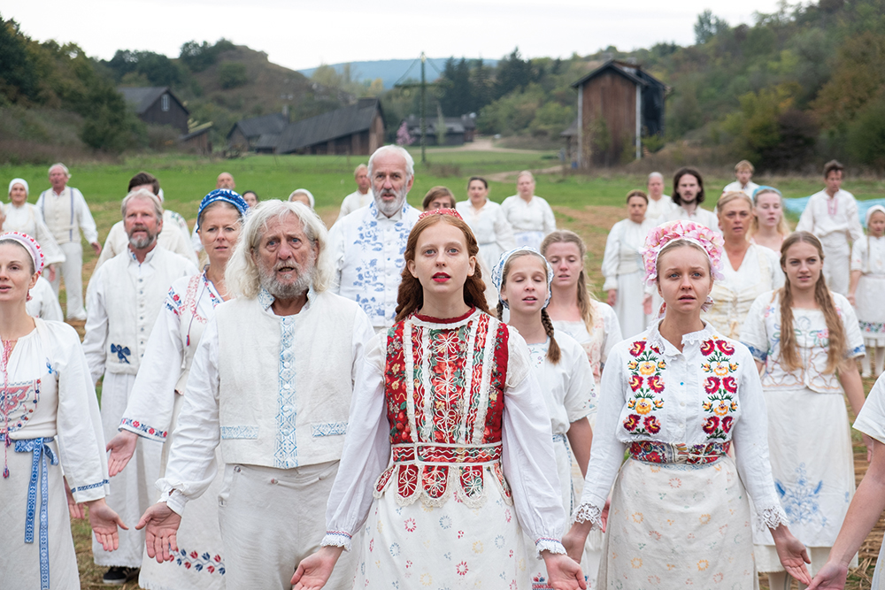
 The Panavision LiColor2 colour science managed the high summer sun and bright clothing
“I am not a technical DOP,” Pogorzelski explains. “I know most of the basics, but I make decisions using my gut and the feeling a sensor gives me for a particular project. I don’t like the way the Red camera looks, so when I first tested cameras [film, the Alexa and the DXL2] for Midsommar, I was apprehensive about the DXL2, as I knew it had a Red sensor.”
Pogorzelski tested the cameras in Los Angeles in February last year on a hot, sunny day with stand-ins dressed in white. Once he received the film footage, he went to Panavision to watch the tests projected and was blown away by the latitude and colour rendition of the DXL2 sensor with LiColor2. “The reference and idea with colour was to be inspired by (not emulate) three-strip Technicolor film. So, colour manipulation was very important,” he says.
 Director Ari Aster (left) with Pawel Pogorzelski (right)
We had a beautiful LUT created by Joe Gawler at Harbor- we had a lot of leeway in the grade
The aim was to achieve rich, saturated colours without making them feel garish. “We had a beautiful LUT created by Joe Gawler at Harbor [Harbor Picture Company in New York] and when we got into the colour grade, we had a lot of leeway to play with. Midsommar is very rich, but the skin tones look amazing and the green looks really great. I only mention this, because I feel that green grass is really difficult to get right on digital,” Pogorzelski enthuses. He adds: “Using LiColor2 on set gives me confidence to push the boundaries, knowing I will have what I need in the grade. I can see clearly the richness in the colour rendition. Once we set the LUT, I really just used the LiColor as a film stock. It then allows me to do the rest of it in-camera with lights. It’s just easier for me that way. Having said that, the DI helped mitigate those colour and contrast shifts when the sun changed in the middle of the day.”
AFI history
Ari Aster and Pogorzelski attended the American Film Institute at the same time and made Hereditary together – a more traditional horror tale, but with a similar attention to detail. “We’ve worked together for ten years,” admits Pogorzelski. “And we did a whole bunch of shorts before we made Hereditary, which was released last year. We saw Midsommar differently – very much as a fairy tale – which is where the ‘floaty’ camera movement in this Swedish summer backdrop came from.” Cleverly, much of the horror takes place under the high summer sun, creating the sense that outside in the daylight is not a safe place to be.

We were referencing films by Michael Powell and Emeric Pressburger like The Red Shoes and Black Narcissus
The camera package, combined with the Panavision Artiste lenses, gave Pogorzelski the safety net he wanted, meaning he could achieve the extreme white essential to the ‘fairy tale’ theme. “I was getting rich colours through the use of the Panavision camera and colour science with a wide latitude, while still exposing the centre quite brightly. The whites were still there and the skin tones held up. I was constantly right on the edge of clipping, but that was when the new Panavision lenses in the centre really performed,” he says. “These are brand-new lenses, but factory detuned Primo 70s, which have softer blacks and gave me that little glow.”
 Director Ari Aster with the cast. The shoot took place in Sweden and Hungary
The three-strip Technicolor inspiration for Midsommar was solidified by the LUT designed by Harbor. “We were getting rich, vibrant, pastel colours, referencing films by Michael Powell and Emeric Pressburger like The Red Shoes, A Matter of Life and Death and Black Narcissus. They were our inspiration for the colour of our film. Add the new Panavision Artiste lenses and a couple of filters to let the whites glow a little bit, maybe a little bit of halation… It’s all to do with the fairy-tale angle. We wanted to make the people glow, but in a very subtle way. It also helped to make the whites a bit creamier and prettier,” explains Pogorzelski.
Camera movement
The film’s cinematography is something many reviews mention since, unlike the dark, expositional aesthetic of many horror movies, Midsommar’s fairy-tale look lulls viewers into a false sense of security with bright whites and floaty camera movement. For this, Pogorzelski was keen to use as much grip equipment as possible, including technocranes, drones, three-axis heads and various dollies. “We had a Steadicam dolly and a whole bunch of different tools that we tested with the key grips,” he explains. “We had to be careful with the budget, especially as we had sets to build and dress. So we had to limit the use of the technocrane to when we absolutely needed it. If not, could we use something else to replace it?”

But Pogorzelski’s history with Aster helped to streamline the filmmaking process. “I’ve worked so much with Ari that I know what he’s looking for with the camera movement – we’ve got a shorthand that helps us both and speeds up decisions. Ari comes with a preliminary shot list, and I can quickly look at it and see what gear is needed. This gives the production some idea of how long we will need certain pieces of gear – like the expensive technocrane.”
 Ari Aster and actor Will Poulter, who played mark in Midsommer
Sun supplement
The opening of the movie was shot in the autumn sun of Sweden, then the production moved to Hungary. Pogorzelski and his gaffer wanted to cover all the cast, especially in the larger scenes, with consistent bright light, so looked at using Arrimax lights. “I wanted them to fill up the space, but needed a lot of diffusion to get the right effect. Unfortunately, they didn’t really do anything, so we ended up using large bounce panels and moved them around with muslin as part of the diffusion. That helped me with the contrast and brought up the shadows that I wanted,” he recalls.

The new Artiste lenses took away the sharpness of the digital, but also lifted the blacks, he says. “In post, we could make sure the blacks weren’t crushed by the digital, but retain a little creaminess. The film itself went through its different phases and quite a lot has been cut. There were a few dinner scenes with everyone sat around tables, but they were shot over two or three days and the weather changed, so the DI really helped to centre that sweet spot where we wanted to scene to fall naturally without forcing the look of the movie.”

With so much work done for the acquisition side of the movie – like the use of the new LiColor2 from Panavision and a LUT to create a consistent look for the movie – the DI became a correction and fine-tuning exercise. “The LUT was a denser one, and the camera had a lot of colour range and latitude in it to keep me safe and encourage me to be bold at the same time. It was a great experience,” Pogorzelski concludes.


