A Quiet Place Part II: Silence on set…
Posted on Jun 18, 2021
With minimal sound, A Quiet Place Part II’s visuals have to speak for themselves. DOP Polly Morgan explains how she shot this action-packed sequel
Words Lee Renwick / pictures Paramount Pictures
It’s a bold choice to forgo audio when making a modern film. That’s not to diminish A Quiet Place’s minimal sound effects and sparse, yet thrilling score, but a distinct lack of dialogue can’t be overlooked. However, the end product was loved by viewers and critics alike.
It’s perhaps a bolder choice, then, to pick up that much-admired baton and run with it. But that’s exactly what DOP Polly Morgan did with the movie’s sequel. Following a premiere last year, then a Covid-induced delay, A Quiet Place Part II is set for widespread UK and USA cinematic release from 28 May – and initial signs are very promising.
Kodak moments
“From the very beginning, I wanted the movie to feel like a continuation,” Morgan tells us. “Apart from the prologue – day one of the creatures’ attack – it picks up directly where the first one left off, with the Abbott family stuck in the farmhouse basement. For the viewer, I didn’t want there to be a disconnect, especially if they watched both films back-to-back.”
An early step was ensuring a close visual match in terms of gear, since Charlotte Bruus Christensen shot the first film on Kodak 35mm film, with a selection of Panavision anamorphic lenses. “Naturally, we wanted to do the same.”
However, since film labs are less common nowadays, the negatives had to be flown from Buffalo in New York, to Los Angeles to be processed there. Morgan recalls: “It was nerve-wracking, because there’s so many things that can go wrong with celluloid, but I was very passionate about using it. I always shoot with Panavision lenses where possible anyway, but the Primo and T Series anamorphics certainly helped retain the first film’s look.”
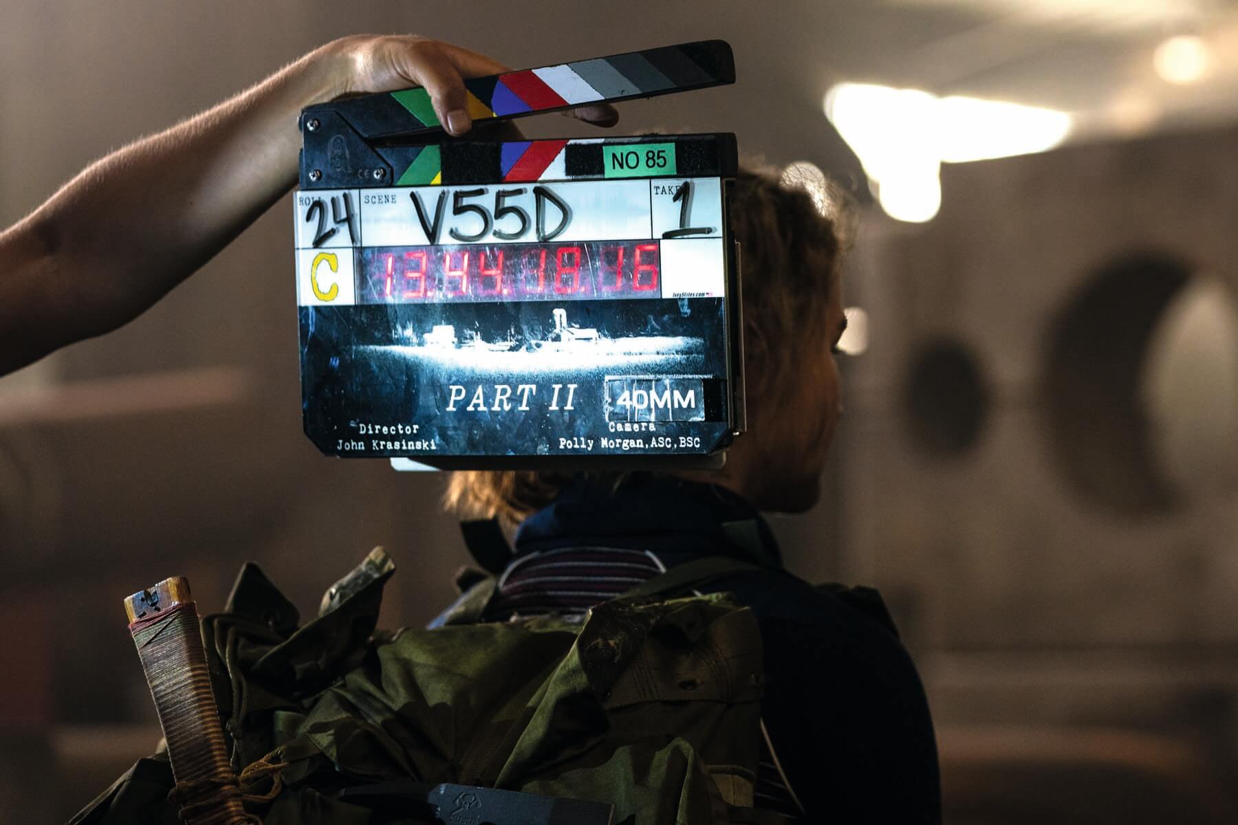
Of course, the best sequels don’t just emulate – they build on what’s come before. As Morgan explains, A Quiet Place Part II was no different. “Things get more expansive in look and feel as the Abbotts leave their home. Unlike the first one, it needed to have broad scope, because the family are basically running for their lives. The farmhouse needed a very specific match, just inherently. But, after they’ve gone out into the bigger world – where they encounter new people, new circumstances and an evolving story – that obviously takes the visuals in a different direction.”
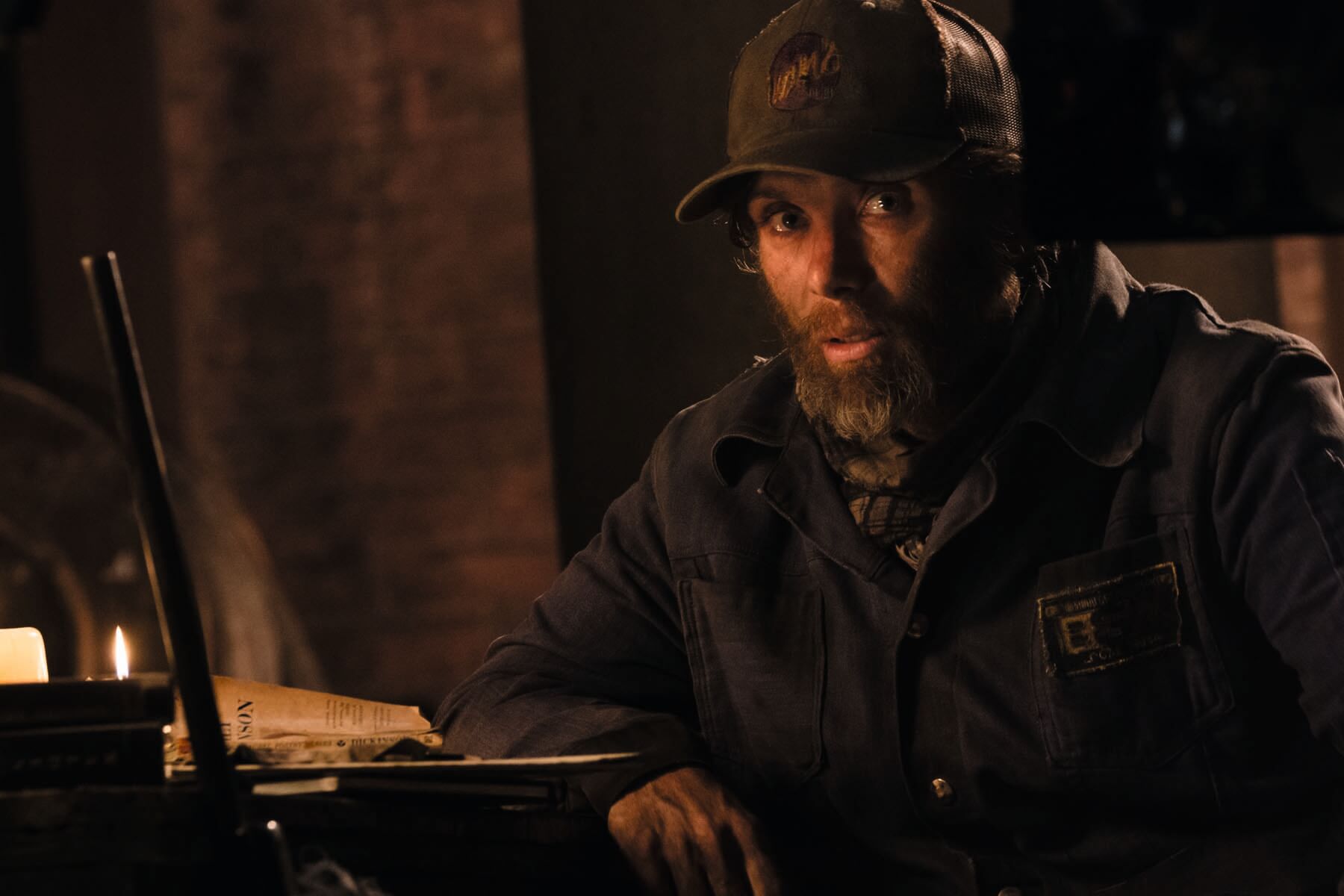
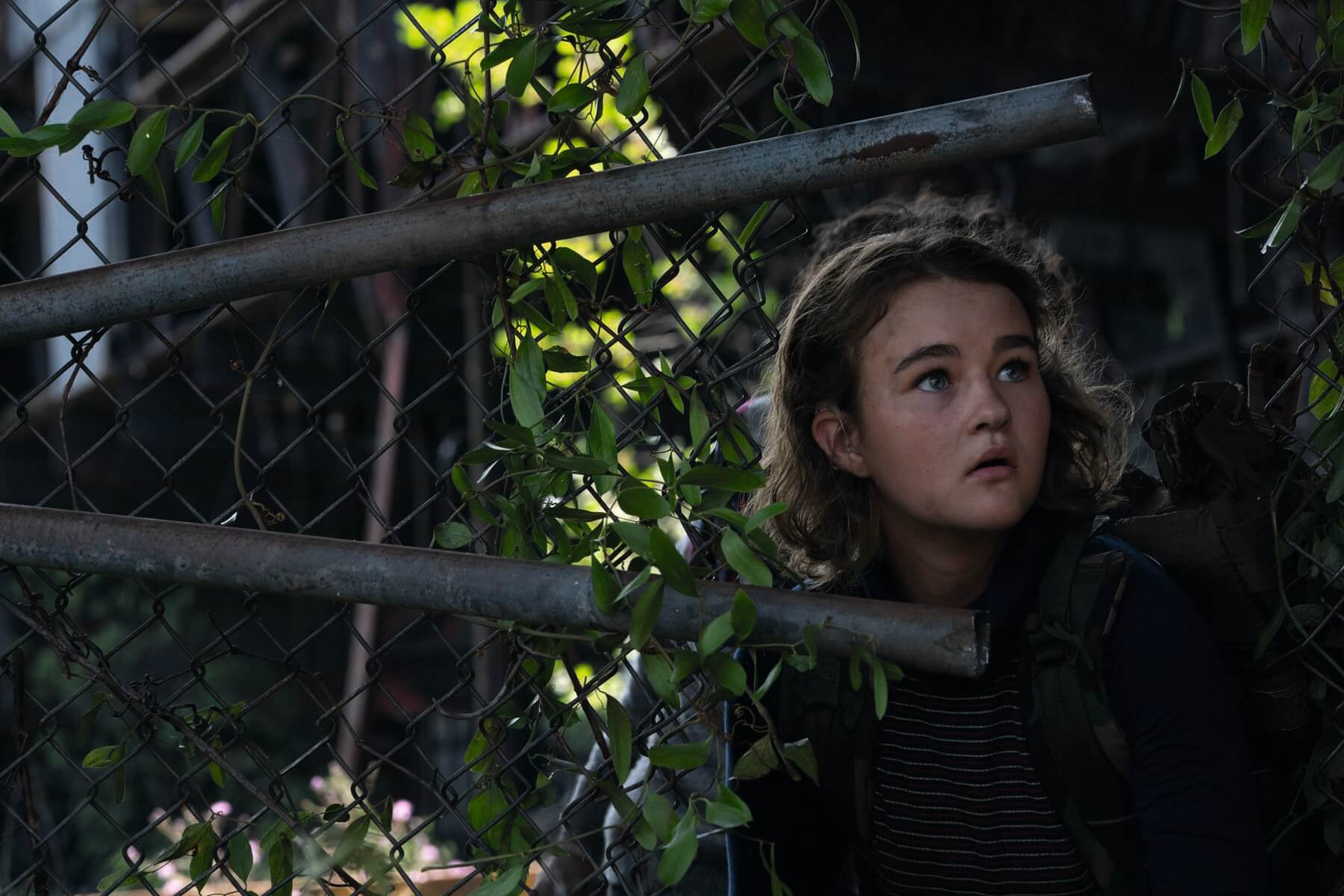
For the Abbotts, and for Morgan (with her hand in lighting their world), leaving the family home led to another significant change. “It’s an apocalyptic world and we had a lot of conversations about the lack of electricity,” she says. “We really leant into the naturalism that came from that, but wanted some colour and warmth to the film – not a cold, post-apocalyptic feel. At heart, both films are family dramas.”
Morgan adds: “My lighting and colour choices were motivated by the natural world. It’s a nice, strong palette. The sunsets would flare, the emulated moonlight wasn’t too blue, and there was plenty of fire and candlelight.”
Lighting the action
When Morgan mentions the Abbott family running for their lives, that’s not an exaggeration. “It’s one thing to capture someone jogging, but a person in full sprint is a totally different ball game,” she says.
“The desire was to be as subjective as possible. We wanted the viewer to be with the characters through everything they dealt with. There were many long takes that had both the creature and the character in frame, with no escape for the camera, just like the character.”
However, Morgan explains that this approach resulted in more complicated lighting set-ups. “I rarely got to light beautiful close-ups, instead having to fill enough space to let the camera do what it needed to do.”
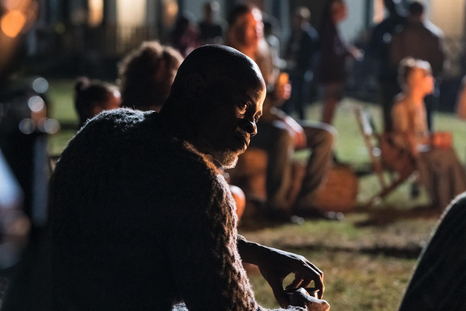
For this, she used a lot of S360-C and S60-C Skypanels from Arri, all on a dimmer board so they could be controlled within a shot. “For example, if we were moving closer from a wide shot and I needed to beauty light Emily [Blunt] a little, then we could adjust the lighting on a cue,” she says.
“We also had some units from LRX that were essentially remote heads, either for fresnels or PAR lights. I used those to push through the windows, depending on how punchy I wanted the light to be.”
Some of the sequences got so large, Morgan felt like she was “directing traffic in line with the camera”. She recalls: “I was on the walkie-talkie saying, ‘Turn this light off, bring this up’, because we were moving so fast. I had to control the lighting direction as quickly as we were recording.”
On top of what was being precisely presented and captured on location, there was also the matter of the camera movement itself. This required professional tools and the experience to wield them smoothly in equal measure. “We had a GF-8 crane by Grip Factory Munich as part of our package, along with an Aero Jib, a Libra head – which was with us every day – and then we had a Mo-Sys head that would sit on the jib arm. It was all about picking the right tool for the job,” she says.
“Again, it came back to that subjectivity. We didn’t want a long lens – we wanted a wide lens that was very close, even as characters were running as fast as they could. We used electric cars often, but at times, our poor Steadicam operator was running backwards dodging all sorts of obstacles!” Morgan laughs.
Her experience on past productions with very fluid camera movement was part of the reason that director John Krasinski thought she would be well-suited to the job. Her approach was all about “taking it to extremes and lighting to suit”.
In a tight spot
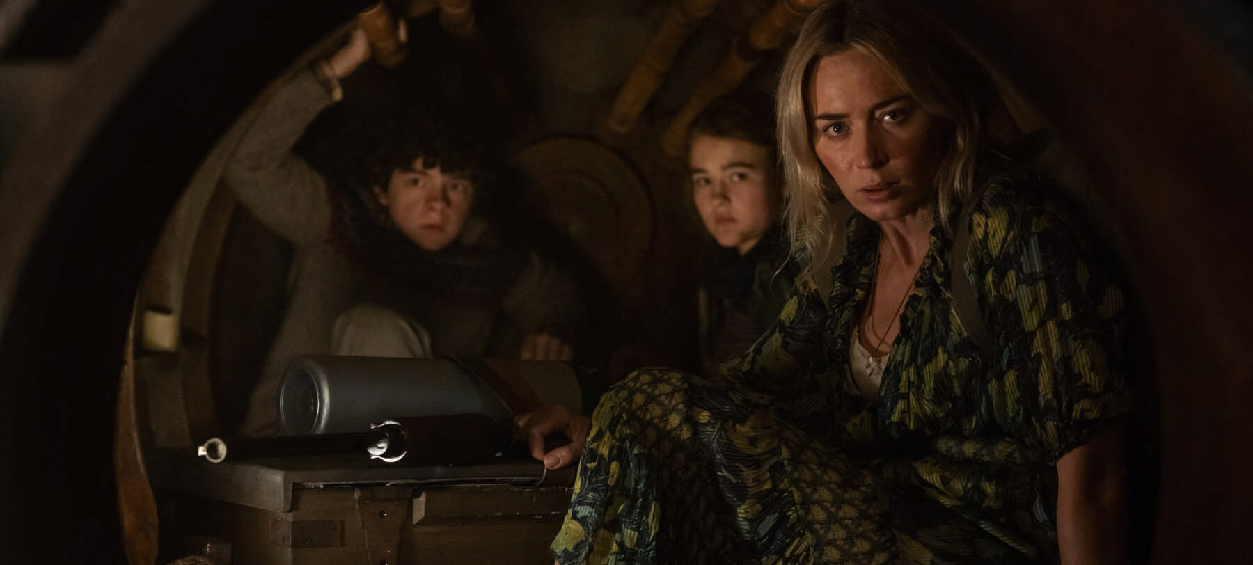
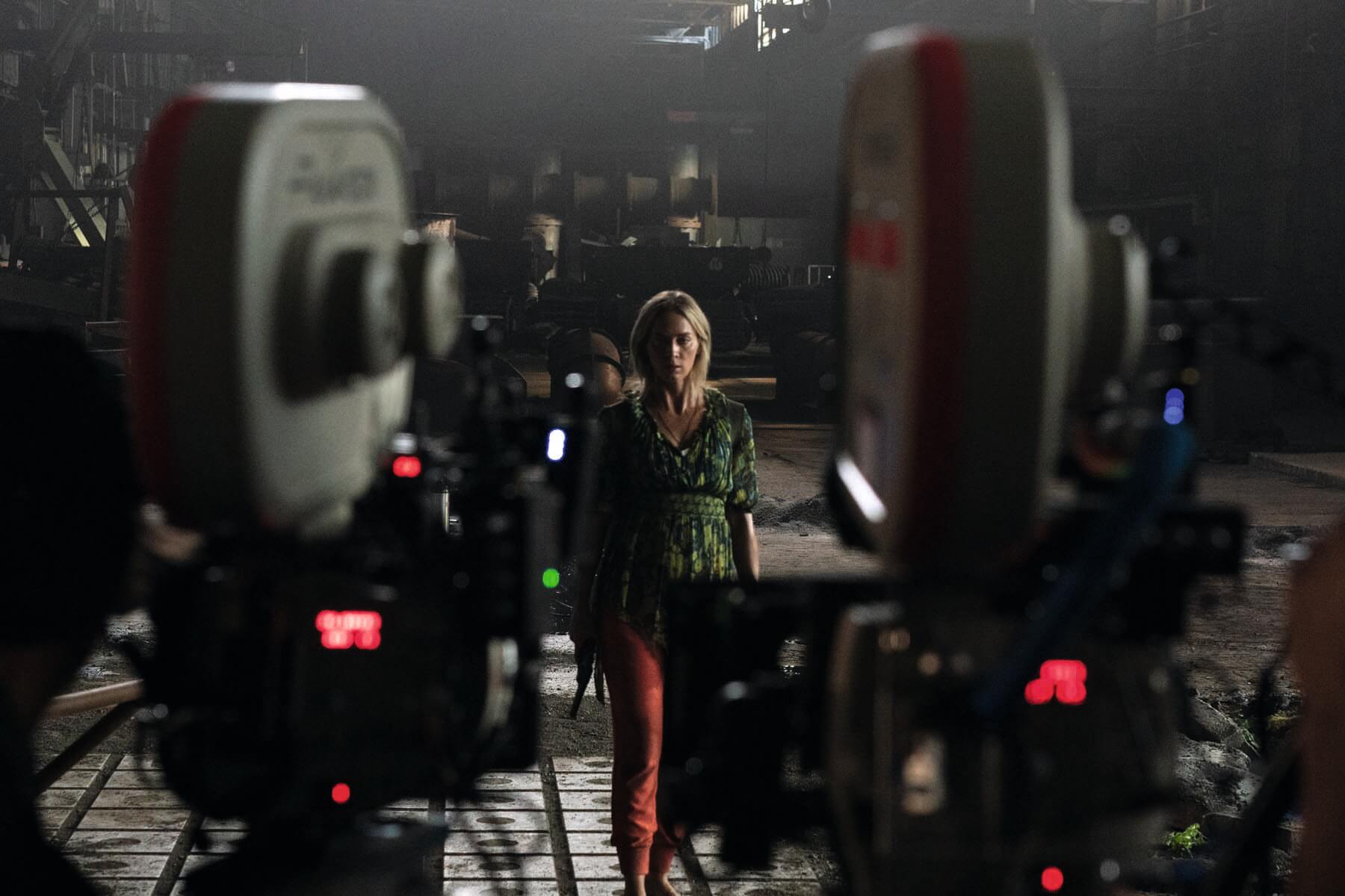
At the opposite end of the production spectrum, the small-scale scenes posed even more of a challenge, as Morgan explains. “The characters find themselves in an underground room and an old furnace. The former was a set, so we could pull walls to light, only it was very time heavy. We used Astera tubes, which were excellent, either hidden behind pillars or hung from the ceiling.
“The latter, also a set build, was even smaller. The production designer left small, removable panels for lighting, but we could never do it. Our approach was to put the camera in on a head, then push and pull down the length of the furnace to move from actor to actor. This means you would have seen the panels in shot.”
The solution involved tiny Litegear LED pads, with Velcro to hide them behind the furnace’s rivets or props. “The difficulty was, how to light a dark furnace so it looks natural, but with enough light on your actors’ faces – all in that tiny set. Much more than those huge sequences, it was the biggest challenge,” she concludes.
But other elements of the shoot were much more straightforward, especially when it came to VFX. “We worked with ILM and Scott Farrar, who designed the creatures,” explains Morgan. “They were amazingly freeing in terms of allowing me to focus more of my attention elsewhere.”
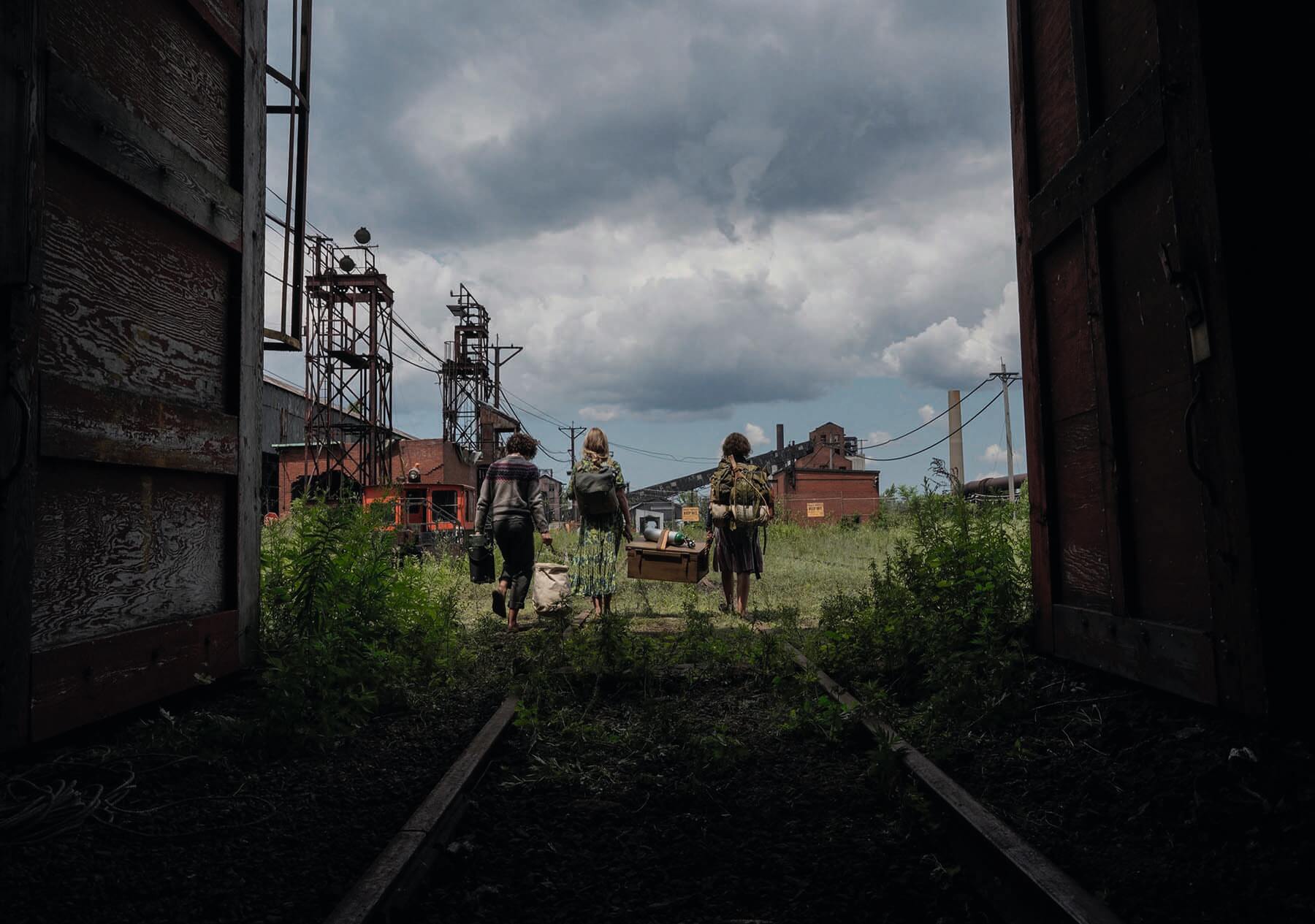
The biggest blue screen set-up for the film was featured early on, involving the top of the water tower. For Part I, the whole tower was real. But for the sequel, only part of it was rebuilt on a stage, then the team worked VFX magic on the surroundings.
“To capture the creatures’ movements, we often dressed stunt performers in green and tracked them,” says Morgan. “In one sequence, they were speeding across a landscape on motorbikes. Sometimes, you just need something there with the correct pace to achieve natural camera movement. Other times, we gauged the height and ensured we left space in the frame.”
Whether or not A Quiet Place Part II can fill the sizeable shoes of its predecessor on other fronts, only time will tell. What’s certain is Morgan has made considerable efforts to create something unusual. A homage that forges its own path. A gripping horror grounded in warm nostalgia. And a visual delight that’s sure to please.
Watch A Quiet Place Part II in UK and US cinemas from 28 may.
Originally featured in the June 2021 issue of Definition magazine.


