2021, we love you
Posted on Feb 4, 2022 by Alex Fice
Image: © Apple TV+
With the industry proudly back on its feet, last year saw countless iconic looks across film and TV. We celebrate the optics that shaped them
Words Lee Renwick / Images Various
If you were to rank the many constituent parts that go into making the cinema we adore, where would you place lenses? If you ask us, the answer is highly.
They’re the vessels through which the real world is filtered before it falls upon the sensor – their finely tuned elements imbuing looks as unique as they are distinctive. They’re engagingly pin-sharp, or seamless in what they depict, or dreamy in their imperfections. They are the eyes of the camera before our own eyes can feast upon the screen, and we adore them.
Last year was challenging for film and television. Productions ground to a halt, cinema doors were shuttered and the economic impact was vast. But, ever the fast-paced industry, it wasn’t long before the meteoric comeback. The year 2021 saw some fine cinematography, and we were lucky enough to cover much of it. In doing so, we could focus on important details, like lighting, which cannot be overstated; camera set-up, which makes it all possible; and the seemingly unavoidable trials and tribulations of bringing a script to life.
So, it’s time to take a moment to focus more closely on the beloved glass that elevated some distinguished favourites we weren’t able to catch on release, as the months flew by.
Heavenly Father
After a year-long festival circuit, Florian Zeller’s The Father kicked 2021 off in style. It received critical and audience acclaim, and secured Anthony Hopkins another Oscar, just shy of 30 years since his first – for The Silence of the Lambs.
Ben Smithard’s nuanced camera work was integral to the film’s high drama and cagey atmosphere. As production began, he selected a set of Zeiss Supreme Primes.
“I used Supremes on Downton Abbey right before The Father, and have always admired Zeiss optics. They are neutral and I like to have a full set. I always end up using a wide range of focal lengths – it’s not easy to go into a production with just four lenses, especially when the focus is on people.
“Inevitably, I always end up supplementing my primes with zooms, too,” Smithard continues. “Usually Angénieux. As a result, some optical balancing is needed during the grade, so my preference is a sharper set of primes. It’s personal taste, and we can always alter the look later if desired. With zooms especially, it’s better to use as modern an option as possible. Many old ones tend to fall apart.”
Practicality was a key concern, given the cramped flat that paves way for the film’s narrative.
“Generally, I don’t like to float walls on-set,” Smithard explains. “If we had to change focal length from one shot to the next, because we couldn’t get the camera where we wanted, I felt secure in the knowledge that nobody would really notice. With a larger set and reduced distances between focal lengths, like the Supremes, I could capture one shot on 29mm and the matching shot on 35mm, without a mass of difference between them.
“Consistently fast apertures across the range were beneficial. I had complete control over the lighting within the flat, so it wasn’t a total game changer, and I didn’t go in with the intention of shooting everything wide open at T1.5. It means you can work faster, though, and often comes in handy.”
While a lens ripe with character is often enchanting, it’s not right for every story. Perhaps in another world, a distorted view would have aligned with The Father’s themes of confusion and paranoia. But, the clean character and reliability of Zeiss lenses led Smithard to capture the performance of the year in heart-wrenching clarity.
“I don’t want surprises from lenses while shooting,” he says. “If the director and I are looking to compose characters to the edges of frame, you need the lens to render that just as well as the centre. I don’t want restrictions.
“It wasn’t a tense set, but I put a degree of pressure on myself, because missing something could have been detrimental to the finished film. The performances were incredible, and who’s to say the actors could have done the exact same thing a second time, skilled as they are? Occasionally, something magic happens, and I need to ensure we have that take.
“The story we were telling was there on a minute-to-minute basis, but there’s always a risk of presenting a performance wrong
in a single second.
“Time is important – giving the actors and director as much of it as possible. Sometimes, you need to change a lens quickly and know you can rely on it. We were dealing with Anthony Hopkins, Olivia Colman, Olivia Williams and Rufus Sewell all at the top of their game. Whatever they did, I wanted to make sure I captured it. It was right for the film,” Smithard concludes.
Painting the streets
A spin-off of the gritty 4 Blocks, German series Para: We Are King may not be as renowned as other productions celebrated here, but its lens story is no less unique. In fact, DOP Matthias Bolliger’s process is rather extraordinary.
“The cinematography is as explosive as the four heroines themselves,” he effuses. “After some testing, we discovered a set of old-school classics – some Cooke S2/S3s, rehoused by P+S Technik. I expected the soft look of vintage glass, having used it on a previous series. But there was something unique about this set.
“When I got the chance to look through them, I discovered fungal spores all through the internals. There were distinctive shadows and a unique highlight flare, especially with the 50mm Panchro. I was fascinated, so I noted down the serial number. These were the exact lenses for the show.”
Not satisfied the look was murky enough for the rough Berlin streets where the characters chase their fortunes, Bolliger looked to filters. Working with the Arri Alexa Mini’s impressive sensor, he had plenty of clarity to bend.
“I used Schneider-Kreuznach Radiant Softs to fine-tune the look, adding Classic Softs at times, to complement the unique quality. I experimented with Diopter Splits – at first correctly, to focus subjects on different planes – but then reversed them to give a stylised blur. It was a fast, low-cost means of creating a tilt-shift effect, and certainly shaped Para,” he notes.
A royal portrait
At the end of the year, Spencer beguiled Anglophiles with a tender depiction of the late Diana, Princess of Wales. Leitz director of communications, Seth Emmons, offers some insight on the Summilux-C lenses used by Claire Mathon to capture its nostalgia.
“The Summilux-C lenses are well-known for being sharp, while maintaining a soft focus fall-off that brings great depth and humanity to faces. At T1.4, they create a gentle dreaminess that suits period pieces – and a more portrait-like style of cinematography – nicely. There’s also a slightly warm colour cast, which is seen by many to complement skin tones.”
Appropriately shot on a mixture of Super 16 and 35, the feature’s aesthetic remains distinctly timeless. No doubt thanks to the compelling combination of new and old. An endlessly breezy, intimate quality of camera work played a strong hand in the framing of Kristen Stewart’s Diana. And a desire to keep the camera package light is evident in the choice of lens and Arricam LT.
In many ways, it was quite a year for Leitz. Used on steamy hit Bridgerton, the ingeniously reimagined Cruella, sci-fi epic The Midnight Sky and Oscar-winning Mank (all of which feature in recent issues), it seems their charm knows no bounds.
Going for gold
Much like Para: We Are King, post-war drama Blood on the Crown enabled some exciting filter developments. The award-winning Keefa Chan worked alongside Formatt-Hitech to revive an old favourite, and give it a new lease of life in the modern day.
“Broadly, heavy diffusion was very popular for a time – but that fell off slightly with the rise of digital,” explains Formatt-Hitech’s David Lutwyche. “It’s coming back more now, alongside incredibly sharp lenses and extremely high-resolution cameras, only much more subtly. The cinematographers we supply predominantly want to take the slightly clinical edge out of a lens – especially for a period film like this.
“Keefa used our ten-stop ND for Blood on the Crown, which was very beneficial shooting in bright Maltese sun. We also updated our Soft Gold diffusion filter, specifically for digital. It adds softness and some warmth, which can be seen in almost every scene.
“Production started before we’d redesigned the technology, so Keefa’s R&D work was integral. It was vital to ensure we offered something DOPs wanted and needed, directly.”
American in football
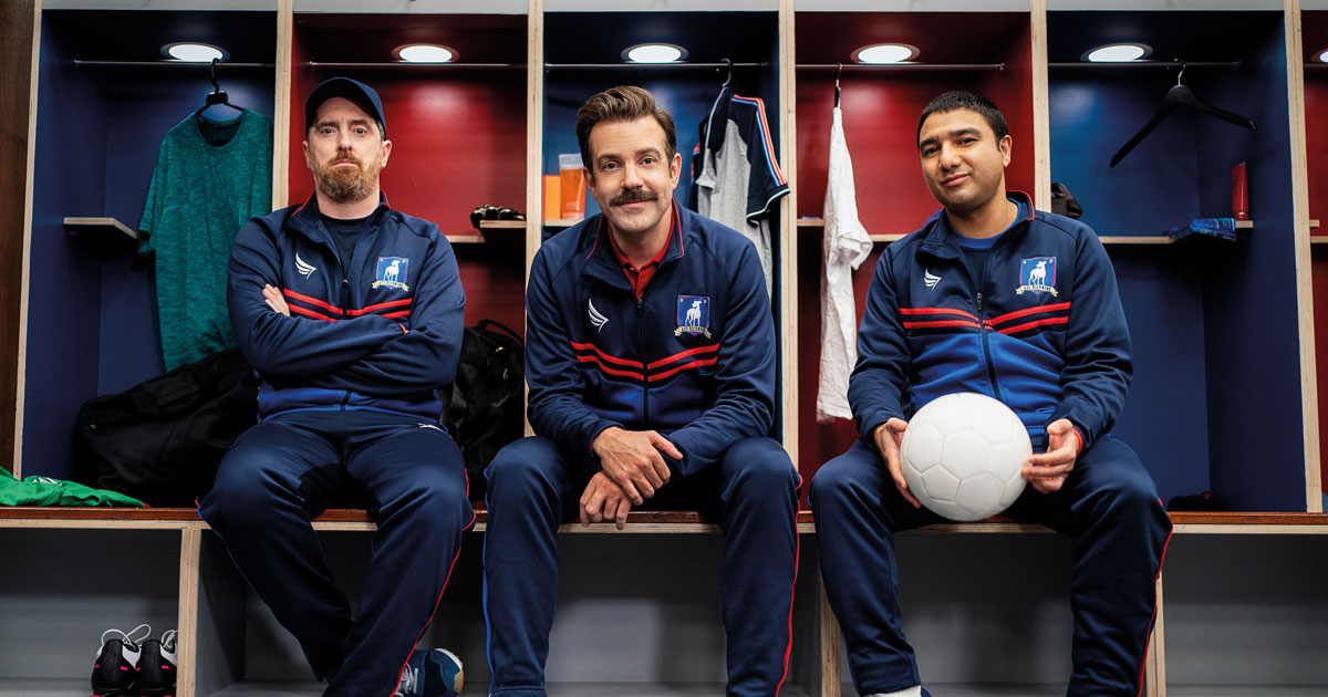
Jason Sudeikis and team’s Ted Lasso was an instant hit when it aired in late 2020, but it wasn’t until the show swept an armful of Emmys last year that it hit the zeitgeist. By the time Season 2 was released, it was eagerly awaited by countless viewers across the world.
John Sorapure established the show’s polished visual style alongside fellow DOP, David Rom. After capturing the lion’s share of Season 1, he handed the reins to others for much of the follow-up – but not before the iconic first two returning episodes.
Continue reading the full article here.


