Painting a story: The Devil All the Time
Posted on Dec 23, 2020
Part American gothic, part winding drama, The Devil All the Time is many things, not least beautiful. Cinematographer Lol Crawley tells us just how he did it.
Words Lee Renwick / pictures Netflix
In a film packed with A-list performers playing monumentally large characters, sprawling narratives and exquisite production design, blink and you could miss Lol Crawley’s nuanced visuals. For those with an eye for cinematography, The Devil All the Time is a real treat. For anyone else, his approach works its subtle magic well enough to grasp their attention.
A large part of the film’s success can be attributed to its characters. Of course, writer and director, Antonio Campos’s baleful lot are well-penned and superbly performed, but there’s more to it than that. There’s a visual language, acknowledged or not, that creates an inescapable air.
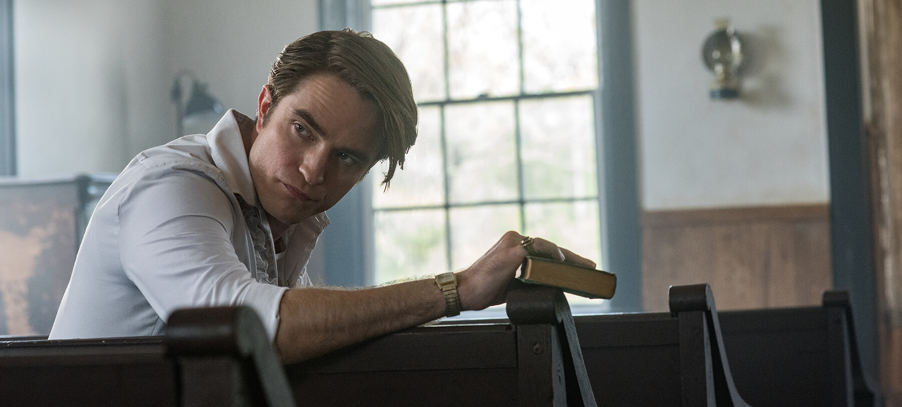
Bill Skarsgård’s traumatised and rageful Willard looms, Tom Holland’s damaged Arvin is held at arm’s length, save for a few introspective moments, and Robert Pattinson’s Reverend Teagardin flits between a frame-filling showman and a scoundrel slinking around the edges of the screen.
“There’s a scene that springs to mind, with Teagardin’s sermon,” Crawley tells us. “We very much chose to keep him in centre frame with a lower camera position to give him the authority he was commanding. If you compare that to Harry Melling’s earlier sermon with the spilling of the spiders, which was all shot handheld to really convey a sense of unpredictability, there’s a strong contrast there.”
He continues: “I’ve always been a fan of just lighting the space, largely in a naturalistic way, and letting the characters or actors inhabit that, as opposed to locking them down too much. Certainly, lighting-wise, I think it’s all about trying to create a complete world.
“Of course, some scenes were more carefully planned based on the shot list and choreography, with shots informed by the language of the scene.”
Set between the 1940s and 1960s in the rural Midwest, light sources were limited. Naturally, the production had to follow suit, leaving Crawley with the challenge of using very few on-screen options. Thankfully, it was one he faced head-on.
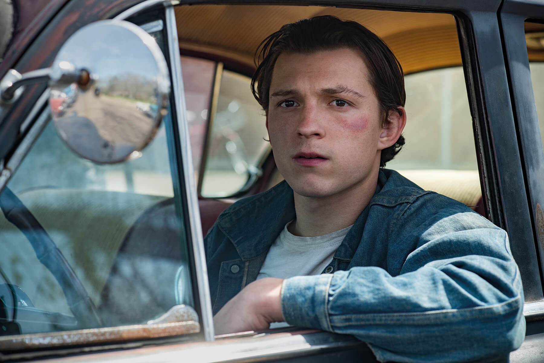
“I really embraced the limitations of the period and it offered me a lot of creative potential,” he enthuses. “I’m a fan of being as bold as possible with the lighting – again, I lean into a certain naturalism. I want things to feel real. I don’t want the moonlight to feel overly Hollywood blue. I want you to see the world and I want it to be believable.
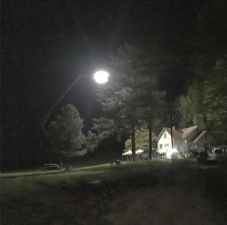
“During the scene where we’re introduced to adult Arvin, for example, the room was lit only by the birthday cake candles, a little bit of light coming through the window and a single small light source above the table they’re sat around. I relish these moments of getting to be so bold, especially shooting on film – to be right on the edge of underexposure.
“So, period-practical lighting and these single-source lights like oil lamps and candles are a challenge, undoubtedly, but it’s so rewarding when you get it right.”
Before moving too far from the film’s other elements, Crawley takes some time to reflect on the bigger picture. Certainly, The Devil All the Time is a wholly unified film, as many of the best are and as many others strive to be.
“I think elements like Emma Potter’s costumes, Craig Lathrop’s production design and my photography do all work very well together,” he explains. “I’d put that down to the simple point that everybody needs a director. Some people have an idea that the director’s role is to direct the actors – and, of course, that is the case – but he or she is also directing everything else and looking at the movie as a whole. I think also, especially early on, their job is to make sure they’ve got a good team and to choose collaborators that they can work well with and that understand the film.”
Looking at himself as part of a whole, Crawley surmises: “It’s my job as a cinematographer to offer up ideas in prep and during the shoot, and the ones that are suited to the tone we’re trying to create will stick. Between Antonio and me, our approach was very classical. We were just trying to go for a very strong, assured, robust photography that served the characters and served the story.”
Each frame a painting
There are many shots, particularly within those low-light scenes Crawley enjoyed so much, that possess a real painterly feel – a certain quality that’s hard to define for many viewers, but offers a taste of Rembrandt and his contemporaries.
“Shooting on film is such a large part of it in my mind,” Crawley explains. “There’s just this quality to celluloid that isn’t looking to be as high resolution as possible. Especially when you shoot film the way I choose to shoot film, which is to underexpose and push process, it increases not only the grain and texture in the film, but it affects the shadows.”
The shadows in this film could be considered a character in their own right. Characters lurk in them, they invade the screen and they play into the southern gothic tone greatly. Thematically, the film holds an overarching feeling of dark versus light, and Crawley created an appropriate chiaroscuro to match.
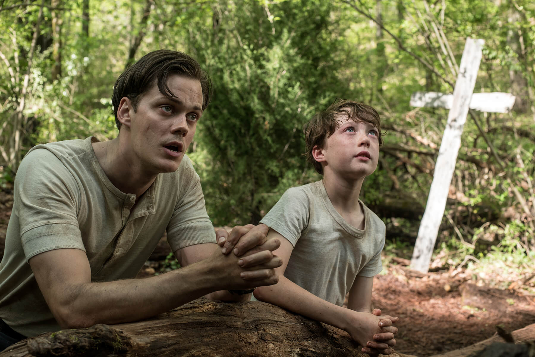
“Rather than going for what’s always been celebrated in film, which is those inky blacks, what I’ve been trying to do through my process is to find some very subtle colours in those blacks. Purples, browns and dark oranges mostly,” he says.
“It’s rare that a painter of that era would use pure black in the way that many photographers are seeking to. What the painters would do is build up those shadows with certain deep, dark colours. I think it’s fascinating that with film you can try to use a very painterly approach and be inspired by it in that way.”
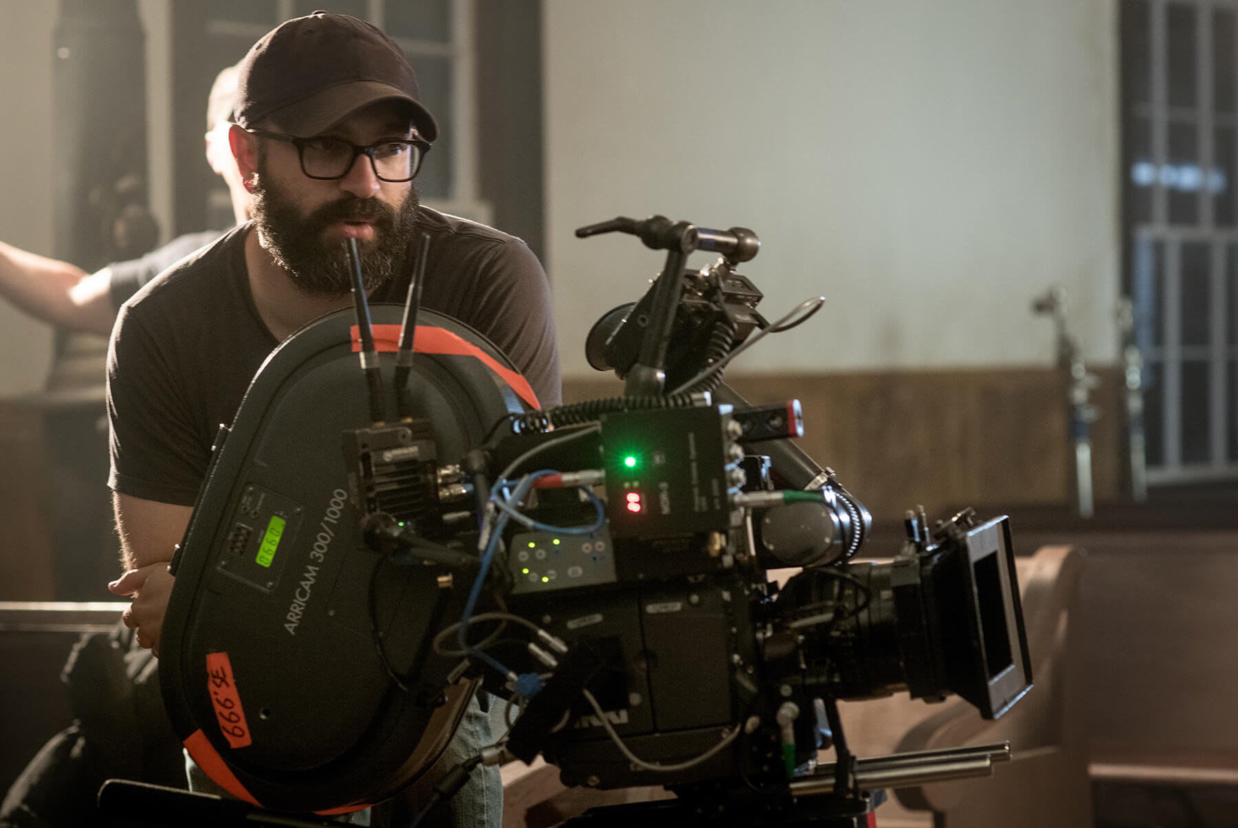
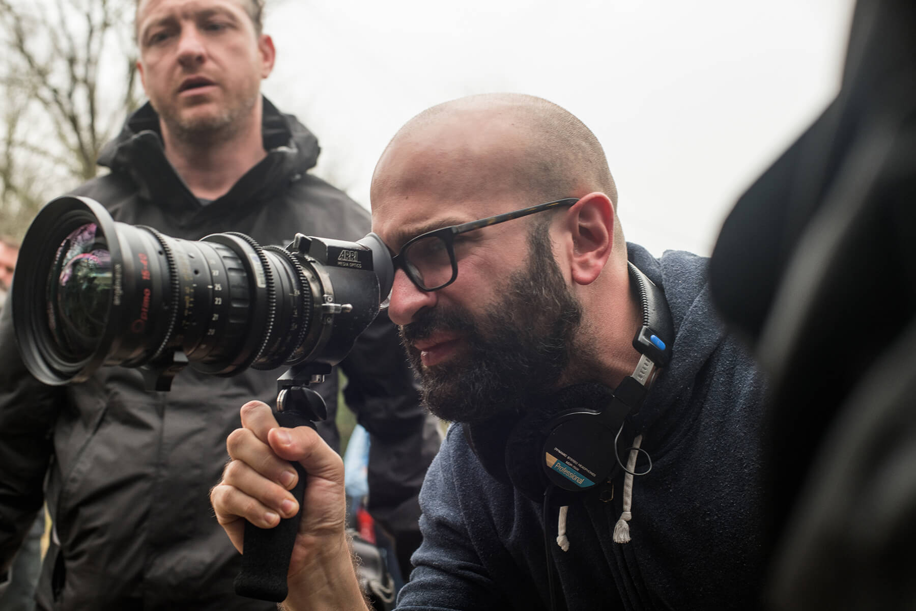
Specifically, Crawley used the Arricam ST and LT camera packages, loaded with Kodak 250D and 500T film stocks, often push processed by one or two stops, because “I love those stocks and know them so well”.
“Early in the film, we wanted more grain and more texture, but in the later scenes we wanted a cleaner look, so I didn’t push process those,” he explains. “I wanted a unity to the photography, especially because there are so many voices in the film with the many characters. We felt early on that if we really pushed those scenes in different directions photographically, that it would feel too much like a patchwork.”
There were few downsides to the medium, but the shoot wasn’t entirely without difficulty. “I suppose any real issues were just to do with continuity of light. The most advanced digital cameras today are incredibly sensitive in low light, which can be a benefit, of course.
“When shooting film, you have to introduce more light into the scene than you otherwise would. So, keeping continuity of light or even just keeping light levels up was one of the biggest challenges,” he explains.
When it came to lens choice, Crawley wanted a look in line with strong and classic vision, so opted for a set of Cooke S4/i primes as his primary glass. “We also looked at using closer focusing lenses and went for the Canon K35 Primes,” he tells us. “This helped practically during moments like the prayer log, which is a very difficult location to access, but also at times when we wanted to get particularly intimate with the characters. The camera would be physically close, handheld, and the K35s let us capture a beautiful very shallow depth-of-field.”
What we’re left with is a visual delight – a film that’s strong on all fronts, reflective of the work that went into its creation.
This feature originally appeared in the December 2020 issue of Definition.


