Grading Ripley
Posted on Jun 4, 2024 by Samara Husbands
Company 3’s Stefan Sonnenfeld and Cody Baker discuss collaborating with Steven Zaillian with Robert Elswit on Netflix’s Ripley
What was the brief, and how did the preliminary conversations with the director and DP take shape? Were they looking to recreate a specific look of photography or films of the era in which the story was set?
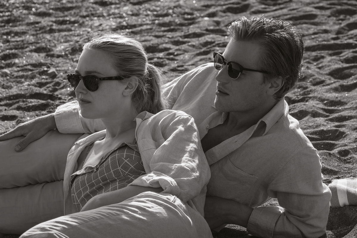
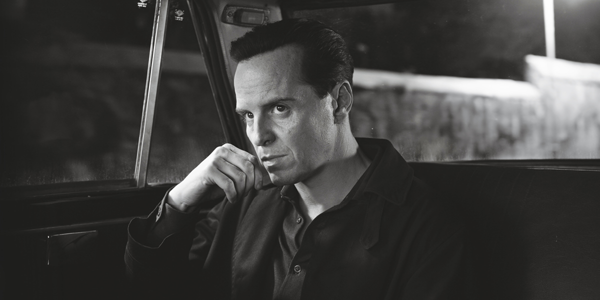
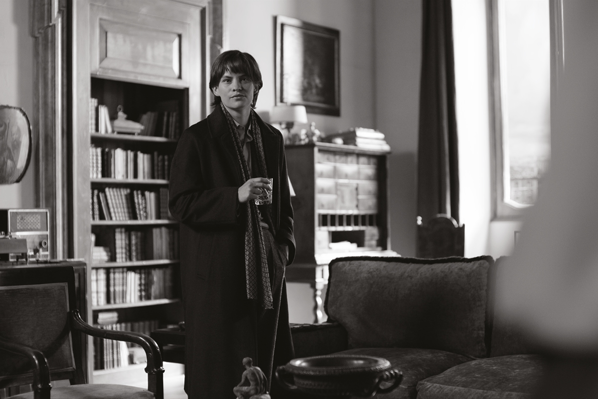
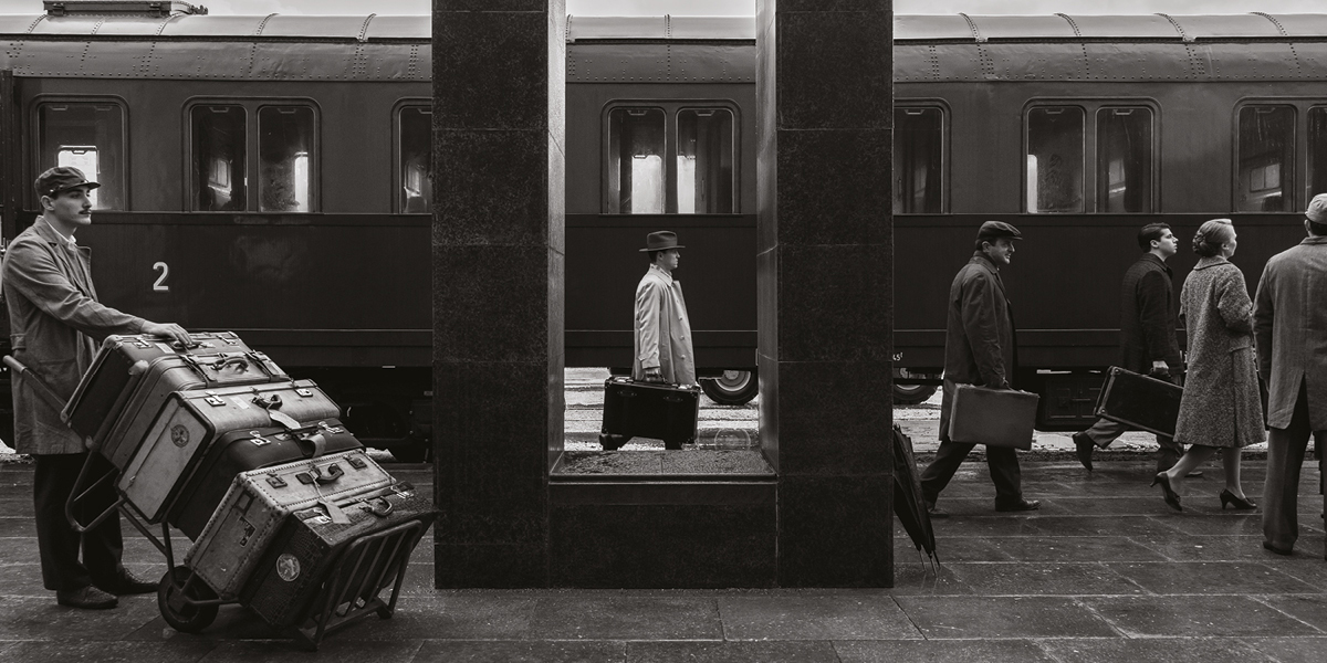
Stefan Sonnenfeld: They wanted it to have a very rich, cinematic, classic black and white look. It wasn’t about emulating anything specific from the era.
What were some key challenges/creative opportunities in the grade, and working in B&W?
SS: They shot in colour but used a show LUT that showed the images in black and white on set and then in dailies. Then, we used the tools and techniques at our disposal to help enhance the imagery without using colour.
Were there any particular features and functions of DaVinci Resolve that played a key role during this particular grade and can you tell us what and how?
SS: So much of the work is about contrast, which works differently in black and white than it usually does in colour. So, we made a lot of Power Windows throughout to isolate portions of the frame and either bring them up or down.
“Dodging” and “burning” — lightening and darkening portions of an image — is something traditional photochemical printers have generally used, especially in black and white, because all you have is the tones to work with. That’s the kind of thing you did with Power Windows.
SS: Yes. We did quite a lot of that.
Cody Baker: Going into the story, there are references to Caravaggio and the contrast between light and dark is a major theme throughout the whole show. You can feel it in the way that it’s lit and shot and it’s something that we took even further in the grade.
Since it started in colour, were you able to use keys to isolate parts of the frame and bring them up and down?
CB: Yes, there were times where we wanted to bring the luminance of something down or up. The colour information allowed us to pull good clean keys where that made more sense than using Windows. For example, we affected skies with keys quite a lot.
Can you compare the difference between grading black-and-white and colour imagery?
CB: It’s sort of like the opposite of what I would do with colour, where a lot of my natural tendency is to bring down distracting bright areas, walls and reflections and things like that.
We take the opposite approach in black and white, where we often want to accentuate those things to help balance the frame. If you did that in colour, you’d just say, ‘Oh, that’s a big bright wall. It looks hideous!’ So, we’d be much more likely to bring something like that down for colour.
Similarly, if you’re working in colour and something is set in a really dark night, a lot of times we can bring everything down to make it feel like night, where the whole ambient exposure is low, and it looks just right. But in black and white that would probably just feel muddy.
More of the look is about contrast, which can mean brightening areas of the frame that are already bright and darkening parts of the frame in a balanced way.
Did you do an HDR version? If so, does that benefit a black and white show the way it can a color one or would it compromise the black and white, period feel?
CB: We did do an HDR version. [Steven Zaillian] really liked the HDR because it made the bright areas of the images even brighter and that added to the contras, which helped make everything feel even more dynamic.
Read our interview with Ripley’s cinematographer, Robert Elswit, here.


