Wanna Play?
Posted on Oct 31, 2019 by Julian Mitchell
It Chapter Two is beautiful to look at, but how did DOP Checco Varese develop the film’s horror aesthetic beyond the hit 2017 reboot?
Words Julian Mitchell / Pictures Warner Bros
What is it with scary clowns? As we approach Halloween, the thought of seeing Pennywise the clown from Stephen King’s It books (and the subsequent miniseries and films) has seen one trick-or-treat event in Detroit banning them for this year’s scare fest. The 2016 sightings of the It clowns across the US persuaded some locals residents they were living the terror from the film as the clowns chased and generally terrified children, even luring them into woods. Pennywise is now the most searched for Halloween costume.
So, old Pennywise became the horror figure he always wanted to be and gave director Andy Muschietti a huge horror hit in 2017 with It – the film grossed over $700 million worldwide.

No surprise, then, that It Chapter Two was quickly green-lit and produced with a nine-month shoot last year, again directed by Muschietti, but this time shot by Checco Varese; most famous for Guillermo del Toro’s Pacific Rim and Amazon Video’s version of Tom Clancy’s Jack Ryan.
Film reviews can hurt film crews, but they can also compliment them – and It Chapter Two’s critics have largely praised the look of the film – something Varese appreciates. “It’s great to get a comment from anyone, because it’s a lot of work. If someone acknowledges what we do, it’s great,” he says.

Darker and more violent
The critics have been less generous with their praise for the movie as a whole. But how did Varese and the director settle on the aesthetics for this film?
“The first movie takes place 27 years before Chapter Two,” he explains. “Chapter one dealt with the Losers’ Club – the group of kids featured in the movie. Because it was kids and in summer (even though Pennywise was attacking them), the movie was more playful and joyous. It has a patina of young kids in the summer months, even though it was a scary movie and deals with the fears and tragedies of young people.
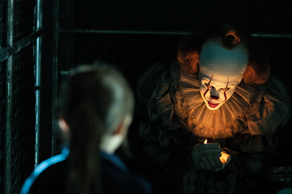
“It Chapter Two was a combination of the fears of the younger people, but also the fears of the adults. Those adult fears are related to their experiences of life and so are deeper and rooted in their trauma. The whole concept was to make it darker and more violent. Those fears produce a more claustrophobic and darker environment.”
 DOP Checco Varese at work
Andy Muschietti, the director, masterfully planned the first film around the summer, with plenty of warm colours and greenery. “The only thing that reveals some kind of supernatural feeling is that the skies are darker and greener instead of pure blue,” says Varese. “In our version, we kept that feeling and a very fundamentalist or pragmatic honouring of the first movie, so when the audience sees it, it takes them back to the first experience.”
He explains: “The whole premise was that we should believe we are watching something shot in conjunction with the first movie. But, 27 years later, we could introduce a new look – it was a free-for-all. That’s what we attempted, and I think we succeeded, not in copying, but honouring the work of my predecessor Chung-hoon Chung. When we flash forward or back to the contemporary part, it is a totally different feeling and technique.”
Anamorphic, but not
There were subtle technical differences between the two movies. For one, the first film was shot with anamorphic lenses. Director Muschietti wanted to retain the anamorphic feeling for the second film, but wanted to go spherical. Varese points out: “Anamorphic lenses have wonderful elements to them, with elongated figures and controlled astigmatism – the out-of-focus background is a little different than in the spherical world. Andy [Muschietti] wanted to have a different experience for shooting, yet maintain the anamorphic look, so we used a new set of lenses from Hawk called MiniHawks. They preserved the astigmatism and bokeh of the anamorphic in a very wonderful way. We used two sets of lenses, one for the past and one for the present.”
 The Losers’ Club all grown up
In It Chapter Two, the look of the past is more filled with light – more joyful and playful, whereas the present is darker and the contrast level is higher. “For instance, in the first few scenes with Beverley in her apartment: she wakes up in the middle of the night to a phone call and doesn’t turn on any lights. It’s raining outside and there is a little glow on the windows and we see, in a very silhouetted way, her packing and then her husband arguing with her. You almost don’t see their faces, but only their silhouettes caught against the windows. That was a very specific and deliberate decision not to see them – or to see very little of them,” Varese explains.
Embrace the darkness
As new, more low-light friendly sensors emerge and cinematic lighting becomes more of a modelling technique than a revealing one, as Varese says, you have to embrace the darkness.
 Checco Varese discusses a shot with director Andy Muschietti and Bill Hader, who plays Richie Tozier
He clarifies: “You have to embrace it and be happy with it. It’s always more difficult to pretend it’s dark and yet be able to see; you have to bathe the environment with a little bit of light even though the characters may have a torch, for instance. So, all of a sudden, you may have five or six guys who have flashlights, but you have to pretend for the audience they can’t see in the darkness. You need to see, as an audience, what they’re not seeing, because the scares are related to that. It’s a very fine balance, but a deliberate fine balance that requires a lot of trial and error.”
For Varese, finding this balance is a combination of all the usual lighting techniques, and relies on the set. He wanted to create a claustrophobic atmosphere, which is something felt rather than seen. You can feel it in a wide, open space, but that requires a lighting plan, as Varese explains. “You can have a big light, but expose only for the highlights, so everything else becomes dark, or you can have a cluster of little lights that light corners and surfaces. It has a lot to do with a brilliant production design and a great art department. You go on-set and ask to make this shiny or that reflective, so it reflects the window, but it doesn’t add light to it; you only see a lot of reflective surfaces. All that helps you make it feel darker without being dark. Darkness is about the amount of light you don’t have, not the amount of light you do.”
A good example of this is the scene where James McAvoy’s character goes into a house of mirrors. It’s very well-lit, but the mirrors give you a sense of darkness, because you can’t see anything beyond them and, as an audience, you know a mirror is very thin glass, “so anything can happen behind it”, adds Varese. “It’s what you don’t see that makes it scary. That’s a lot of the fun and the trickery of filmmaking.”
You have to embrace the darkness and be happy with it. It’s always more difficult to pretend it’s dark and yet be able to see
Gear up

It Chapter Two was shot on the Arri Alexa, with four in the first unit, of which two were SXT (the more comprehensively equipped camera), along with two Alexa Minis, which were more for handheld shots and the smaller spaces. As Varese mentioned, he used MiniHawk lenses for the past, while for the present he used Leica or Leitz Summicrons and a set of Angénieux zooms for the occasional crane, when they needed the distance.
Darkness is about the amount of light you don’t have, not the amount of light you do

When it comes to technical, Varese is generous in his praise for director Andy Muschietti. “Andy’s a very tactile director, very technical in a non-technical way. He’s like an artist. If he could touch the monitor and move the props and correct the lighting, I’m sure he would. Because of that, he’s very precise on the camera moves and the lens choices. He has a very precise language and you can see it in all his movies. He starts with a very wide and low-angle frame, as wide as a 14mm or, in the cavern at the end of the movie, a 10mm, to enjoy the sets and make them an intrinsic part of the movie. Then we usually changed to a 21mm or a 28mm that ended up being a close-up, so we worked on the widest possible side of the lenses. He was very exact on the moves– the camera was always moving, I don’t recall a shot that wasn’t moving, which was on purpose – it wasn’t a random choice.”

The camera movement was designed to reflect the journey of the characters, says Varese. “The Losers are going forward in their pursuit of Pennywise, but Pennywise is chasing them at the same time. So the camera is always on a technocrane, always on a dolly, it’s always pushing or pulling forward and the cinematic language is also a very fluid one.”
Light it up

Varese used a combination of legacy lighting and new LED systems, but he is not one for new fads just for the sake of them. He explains: “The way we shot It Chapter Two could have been achieved in 1981 – other than the VFX being bigger and better. It could have been done in the same way. So, I don’t think the light advancement is that big, but it is definitely an advancement. I could have relied on filament and tungsten technology, but most of the movie was with LED. It’s friendlier for the environment, and definitely gives you a better range of colour and changing the light on-set.”

Varese concludes: “I embrace new technology, but also honour what has come before. Using an analogy: I think directors of photography are like chefs, we all go to the same farmer’s market and buy the same tomatoes and each one of us does a different job, because, like chefs, you bring in what your parents taught you. So, yes, I use salt, but sometimes I use the new Himalayan pink salt to enhance the flavour of the dish.”

And what a delicious dish it is!


