It’s Been Emotional
Posted on Mar 18, 2019 by Alex Fice
Netflix’s Sex Education is a huge production with multiple set-ups, magnetic casting and a new camera. We talk to DOP Jamie Cairney
Words: Nicki Mills/ Pictures: Netflix

Definition: With so much episodic shooting happening, how did you want to make this show different? What was your plan or aesthetic from pre-production?
Jamie Cairney: As with all my projects, I don’t start with time, money or kit; I have to be led by the script. I need to feel some kind of connection with the story and the characters and, importantly, I need to believe it. The quality of Laurie Nunn’s writing and the depth to the characters made for a quick first read and the images formed quickly. I realised straight away: I have to shoot this!
The icing on the cake was that Ben Taylor would be directing, who I’ve worked with many times. Ben always pushes for the best and this is one of the reasons we get on so well. We spent a lot of time talking about what the look of the show would be. A key point for Ben was the idea of bringing an American high-school-film feel to the UK, but at the same time creating a sense the show could be set anywhere and at any time in the last 30 years.
This led us to several references. First, John Hughes – in particular an old favourite of ours, The Breakfast Club. Hughes shaped the cast and photographed them in such a way that everyone in the audience couldn’t fail to feel a connection with all the characters on some level. It’s like the camera was the unseen member of the group of misfits; one minute you’d be laughing with them, the next, crying. It was really important for Ben that we treat the characters of Sex Education in a similar way.
Another important reference for us was Dazed and Confused. Both of us always loved this film and we watched a very clean version together that looked like it was shot yesterday. If Mr Linklater has watched our show, I hope he can see his influence! We were certainly inspired by the colour palette and costumes in his film. Finally, with production designer Sam Harley, we spent lots of time enjoying Venetia Scott’s splendid photography.

“It’s like the camera was the unseen member of the group of misfits.”

Def: How did you feel about using the new Sony Venice? Can you tell us what you got from the Venice and how it performed?
JC: Being Netflix, this show was always going to be digital. I like to think of myself as ‘format agnostic’ in that I always take time to choose the right system for the job and happily flit between film and digital cameras. Obviously, whatever system and workflow we ultimately used would have to be approved by and adhere to the uncompromising Netflix standards. Some people bemoan this because it means they can’t use the most ubiquitous digital camera in the world, but I agree with the stance Netflix has taken – it has its eyes on the future, not the past.
There were several obvious options available to me. Ben, Sam and I had already started detailed conversations regarding colour, and I knew I needed something able to handle the wide, slightly unusual gamut we were moving towards.
This is where Sony stepped in: it offered me an opportunity to extensively test the Venice when there were only about three or four of them in existence! I was slightly sceptical, as I’m not a fan of the F55, but I have been very impressed with everything shot on the F65 – especially Rob Hardy’s work on Ex Machina. Sony was touting the Venice as an evolution of the F65, so I was keen to try it. Richard Lewis and Pablo Soriano at Sony UK were incredibly generous with their time and knowledge – these guys were pivotal to the camera’s development and let me do everything I could to try and ‘break’ the camera, then I graded the results with Pablo using DaVinci Resolve. Everyone knows Pablo is the absolute master of colour and I was pleasantly surprised by how easily he achieved nice pictures with just basic primaries applied. First impressions are important, right?


Def: Can you explain how you tested the camera?
JC: With a bit more time and work, Pablo showed me just how good the dynamic range of the camera is. While still not as good as film, in my tests it proved to be better than other digital systems. Of most interest was the 16-bit colour reproduction, which is far superior to any other system and extremely sensitive to the nuance of the colours we were putting in front of it. Basically, it seemed to be behaving like film transparency with colour, and a bit like film negative with shadow and highlight detail.
Although the camera has a 6K Full-Frame sensor, I was more interested in capturing in 4K. The bonus was, in this mode, Venice allows the use of any 35mm lens out there. I didn’t need expensive and scarce large format lenses or unusual mounts. I could pick up anything PL and pop it on. This opened up all the lens options in the world and, using the X-OCN ST codec, kept the data far more manageable than any other system shooting Raw at this resolution. Further testing continued in prep, where we took the Venice to the main location and spent several days testing lenses, skin tone, colour, exposure, LED lighting, filters and movement. The camera continued to perform really well and, with the backing of Kate Murrell and Eleven, we took a leap of faith and were the second production ever
to shoot on it.
Films at 59 in Bristol provided all our camera equipment. A special shout-out to the one and only Dave Wride, who was happy to go out and buy several Venice cameras when no one else had them and spent so much time perfecting our kit. Films at 59 and Dave have a really lovely down-to-earth personal approach. They invest themselves, give you time and knowledge, and give every job priority, no matter how big or small. I wouldn’t hesitate to recommend them.

Def: Could you explain the shooting schedules? What shooting plans did you have for each?
JC: The schedule was a pretty standard UK TV drama schedule. It’s all about being prepped and flexible at the same time, so I could give Ben everything and more, but also enjoy each day and be creative without the fear of something not being ready. Of course, none of this is possible without a superb team to make you look good and we were blessed with the best. Gaffer Gary Chaisty and his brilliant team were an absolute delight and implemented my lighting design with ease and good humour.
The schedule would change here and there or a location would be lost, and they took it in their stride, always smiling and always happy to graft. Gary also offered up plenty of great ideas and expertly lit scenes if we needed to run two sets at once.
The camera team was led by the stoic Ian Pearce, my long-suffering focus puller. Everyone loves Ian and he is a focus ninja. His input was so important, as the majority of the cast were quite new to being on camera. Ian spent time becoming their friend and helping them with the jargon and chaos of being on a film set. Furthermore, he was able to take any unexpected positions in his stride, so the cast never felt self-conscious or intimidated if they missed a mark.
However, the absolute key to the success of the show’s look and smooth running was production designer Sam Harley, who worked like a machine to keep the style consistently at a high standard. I think she didn’t sleep the whole time we were shooting. With around 105 sets and locations in her control, both Sam and her team moved mountains to get them up and running and available for us to shoot at a moment’s notice.
Sam’s attention to detail and awareness of my needs made every set loads of fun to be in. When you’re faced with high page counts, lots of characters and two cameras running constantly, having a top-drawer designer who personally makes sure everything is perfect on set and thinks about what is needed ten steps ahead pays dividends. Coupled with this, Sam is the loveliest, warmest person in this industry. Ben and I relished each time we were able to step off set and sit in her office to look at the delights she was preparing for us next

“Zeiss Master Primes and Fujinon Premier T2 zooms gave the wonderful paradox of soft but sharp.”
 Production designer Sam Harley managed around 105 sets and locations, which had to be available to shoot at a moment’s notice.
Def: What was your lens choice? Did you want to detune the digital with some old glass or look to use some more modern lenses? What focal lengths did you decide on? Did the large format nature of the Venice help you?
JC: Early on, Ben and I talked about anamorphic, but ultimately opted for spherical and, in testing, selected Zeiss Master Primes and Fujinon Premier 4K 18-85mm and 14.5-45mm T2 zooms. These lenses gave us the wonderful paradox of soft but sharp, which worked well with the variety of skin tones and ages we would be shooting. I knew I could use the same lens on any character without the fear of it being unflattering. The wide end of the Master Prime range is especially good and has many sizes on offer. We used the 14 and 16mm for bold graphic wides and the 21, 27 and 40mm for shooting masters and faces. Most of the show was shot on these sizes. Occasionally, we bought in a 10mm Ultra Prime. The Fujinon zooms are big but amazing. It’s difficult to tell the difference from the Masters and my two brilliant camera operators Nick Martin and Ilana Garrard made regular use of the 18-85mm.
Although we opted for spherical capture, when we made this decision, I offered up the idea of combining this with a post-produced effect to create a more vintage look at a level that was both not distracting, but also entirely controllable. David Fincher used this idea to great effect on Mindhunter, which was shot on the ultra-sharp combo of Red Helium with Leica Summilux. Initially, Squint, who handled our VFX work, was tasked with creating a plug-in for us, but this proved to be too complex. So Tom Urbye at The Look stepped in and did a great job of repurposing a tool on his system designed to correct aberration and distortion. He basically reversed it so it added these artefacts rather than removing them. This allowed us to completely control the ‘vintage’ look, unlike when you actually shoot with vintage lenses and have no control over distortion, abberation and softness.


Def: Tell us about the camera movement. What framing were you looking at and which movement technology did you want to achieve it?
JC: We wanted the show to feel energised and optimistic without moving the camera unnecessarily. We started from the perspective that the movement of the cast would inform the camera’s movement – and we blocked scenes accordingly. Our key grip, Gary Sheppard, is an extraordinary man whose strength, ideas and practicality know no limits. No matter where we wanted the camera, no matter how complex, he would always get it there in no time and with no fuss. When I tasked him with building a custom rig to track along the ceiling of the disused toilet set without much money or motorisation, he rose to the challenge and knocked it out the park.
Both camera operators and myself had a real soft spot for ‘Sheppy’ – he was such an asset to the camera team and made us laugh all day. When extra movement was required, such as in the school corridors, Ilana Garrard handled this beautifully with her Steadicam. Mike Drury joined us on several occasions with his Jimmy Jib and, when this wasn’t big enough, we used a Technocrane from Panavision Grips.
Compositionally, I’m always very specific and spend a lot of time thinking about the right approach for each project. Again, this has to be influenced by the story. I’d never be the guy to say: “Let’s make this show the ‘Loads of Headroom’ show” or whatever, just because I’d seen it on another show or because I’ve got no ideas.
An approach like that sticks out like a sore thumb, because it’ll be at odds with the script and always feels unjustified. The composition of Sex Education is the result of Ben and I talking at length about the right lens size to bring us close to the cast, so, when you watch the show, you can almost feel like one of their friends. We wanted the audience to be able to feel the mixed emotions, love and fear the characters do. This led to us mainly using the 27mm for mids and the 40mm for closer shots. The actual composition on a shot-by-shot basis is quite simple. A lot of the time it’s about observing a rehearsal and reacting to that. I really enjoy getting the feeling this is the right place to put the camera.

Def: Tell us about your lighting design. With so many set-ups, how did you include suitable lighting? What were your basic lighting kits?
JC: The lighting design for Sex Education was led partly by a desire to keep things natural, but also by the ‘optimistic’ American concept. I avoided making the lighting too depressing, which is normally how schools are represented in UK shows. We approached the interiors with big sources outside and a little bit of fill inside, combined with smoke. I like how smoke catches light; we used this a lot in Otis and Jean’s house, but I like it more for the softening effect it offers – very useful with all digital cameras! However, most colourists hate smoke and nearly all those I have worked with have slapped my wrists at some point for using it.
The lighting in the school had to be flexible by design, because of the sheer amount of material we needed to get through and the speed at which we had to do it. I had the pleasure of working with the most extraordinary practical spark by the name of Jamie Venn – he knows how much I owe him for the way in which he turned around a basically derelict location [the school]. He saved my bacon on a daily basis!
Our lighting kit was provided by John Lawton at Panalux. Panalux has been looking after me for absolutely yonks and I’m seriously indebted to them for everything they’ve done for me over the years. Also, John Lawton is an absolute king in the lighting world and he was a rock for me and Gary Chaisty throughout the shoot. He furnished us with everything – from the latest LED to the old faithful T12 and Silver Bullet. Nothing was a problem for him.
A lamp we made a lot of use of was the Kino Freestyle. During testing, we compared the colour and light quality of most LED fixtures. The Kino was the most accurate in terms of colour temperature, hue and quality of light, which, as we all know, is very different to traditional incandescent and discharge lighting. As the Venice is very sensitive to colour variations, it picks up on any green or magenta bias much sooner than other digital systems. The Kino was the only lamp we tested where we didn’t have to regularly remove green. It also happened to be the most flexible on set.

The Sony Venice’s colour reproduction accurately portrayed the show’s distinctive primary colours

Def: Tell us about the filtering you used. How did you shoot the actors and how did you achieve the look? Did you have different plans for different actors?
JC: We used a little bit of diffusion in front of the lens, plus smoke, as well as the vintage lens tool, which added softening. Our choice of lenses and careful lighting meant I didn’t have to offer special treatment to any of the cast.

Def: How closely did you work with costume and production design? Sex Education has a very specific look and features lots of primary colours.
JC: As always, I worked very closely with the director, production designer, costume designer and make-up in prep. Ben created lots of mood boards and each department then created their own versions. Slowly, the ideas were solidified and honed through many meetings and conversations until we arrived at a colour palette we all felt represented the script for Sex Education in the best possible way. A gamut was then created, which we all adhered to, mainly policed by Sam Harley. A lot of the colour choices were inspired by (as previously mentioned) Dazed and Confused and Venetia Scott.
105
The number of sets and locations on the show
16
The number of bits in the Sony Venice colour system

Def: Is there anything else you would like to tell us about? Anyone in particular you would like to thank?
JC: It’s really important I mention two key people, without whom none of this would have happened. First, Jon Jennings, our producer, who I think still hasn’t had a day off since the show was born. Jon is the most positive man alive and kept us going whenever things invariably got tough. He also managed a brilliant but young cast on a daily basis and helped get them through the biggest show of their lives. Second, our line producer, Simon Morris. What a legend! The hardest working person I’ve ever met, he helped me enormously and was always there listening when I (or anyone else) needed him. Sex Education would have ground to a halt without his prescience. He also makes a guest appearance. See if you can spot him!
Sex Education is currently streaming on Netflix
Official Secrets with Venice
With a debut at Sundance, Official Secrets picked the Sony Venice camera to deliver natural contrast and cinematic richness
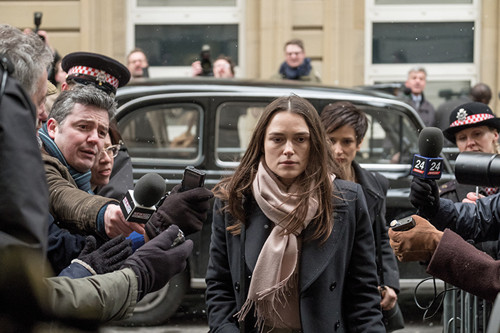
The Sony Venice has also been used for principal photography on a new political thriller called Official Secrets. The cast includes Keira Knightley, Ralph Fiennes and Matt Smith. Captured by cinematographer Florian Hoffmeister BSC, the feature made its debut at Sundance Film Festival. It is scheduled for distribution later in 2019 through eOne across its territories. Sierra/Affinity represents all other international territories outside the US.
Official Secrets is based on the true story of Katharine Gun, a former translator at GCHQ, who leaked top-secret information to the press concerning a joint US-UK illegal spying operation against UN Security Council members in their push for the 2003 invasion of Iraq. Gun was arrested under the Official Secrets Act 1989 and her story commanded attention on a global scale.
Sony’s Venice was selected to bring Gun’s story to life in the most accurate and telling way. Director of photography, Florian Hoffmeister BSC, explains: “I think that large format cinematography has become a great asset for digital filmmaking, and the Sony Venice represents a huge step forward in that field. We immediately knew we wanted to trial the camera and after a test shoot, through Movietech, all of my expectations were met when it came to colour and contrast.
“The camera has an incredible ability to deliver a natural richness in colour, which – in my experience – means a huge development in digital. With any camera I try to find the ‘sweet spot’, where the image itself comes alive through the way it communicates with the lenses and depicts the colour and light. The Venice kept its promise every time we lit a scene.
“As a true story, the agenda of Official Secrets was to tell the narrative in the most sensitive and accurate way. The Venice strongly fits with the cinematic, yet natural aesthetic we wished to achieve. We wanted to bring this vision to reality and with Keira coming on set completely natural, with very little make-up or styled hair, we needed a camera that produced atmospheric and distinguished images to translate the vulnerability of each take onto the screen. The richness of colour, naturalness of contrast and the immediacy of large format with the Venice allowed us to translate the story’s agenda perfectly.”
Using two of Sony’s Venice camera systems for principal photography, the production team avoided the use of anamorphic lenses and effectively added additional layers of glass in an attempt to maintain the natural and pure aesthetic of Official Secrets.
Camera lens and grip specialist Movietech (with initial supply from accredited Sony Venice reseller Top-Teks) supported the Official Secrets production team with a camera and lens package based around the Venice.
Official Secrets debuted at Sundance on 28 January


