The Girl Can’t Help It
Posted on Oct 31, 2018 by Julian Mitchell

ITV Drama has produced a feast for our televisions with a seven-episode retelling of Vanity Fair
ITV’s drama offering is on the rise again with a new adaptation of William Makepeace Thackeray’s Vanity Fair. Production company Mammoth Screen has made this episodic for ITV and Amazon Video but how is it different from any other British made period drama? DOP Ed Rutherford was sent the script while he was still shooting another ‘of the time’ dramas, Victoria. “You could tell by the script, the way it was written, the projection of character, the sense of the epoch. We’re talking about 1815 to 1823, we’re on the edge of the industrial revolution with all that social change about to happen, so a gender protagonist story was extremely exciting. James Strong the director certainly didn’t want a period drama in the sense that you might expect previously of terrestrial TV shows. It would be contemporary visual storytelling.”
Non-period period drama
 James Strong, Director of Vanity Fair
So Director James Strong was never a massive fan of period drama – it was down to him then to move away from that style. “The Jane Austen stuff doesn’t immediately appeal to me so the first big challenge was to produce a period drama that appealed to those who didn’t like them, like me. Also I wanted to shoot in a contemporary drama way, it just happens to be set in the 1800s. It’s easy to say that but what does that mean? It ends up with the choice of cameras and lenses being very important. We went for RED and the Primos as I wanted a modern scale so we got big 10mm lenses to give our locations scale; but it has intimacy also with some handheld shots. We wanted a slightly beautiful reality but sort of with a realness to it. The contemporary feel was reflected in all aspects including the performances. Where in real life people talk fast and interrupt each other, I wanted that in this period drama. I just wanted to give it a bit of attitude and a bit of swagger.”
 Camera Operator Roger Tooley with the RED Dragon camera.
Director and DOP were therefore on the same page as far as the look went; they wanted this ‘bold beautiful reality’, a strong colour palette, a dynamic, fluid camera. “We didn’t want to be afraid of pointing the camera towards what was important in the frame,” continued Ed. “We didn’t want a style that would overpower, but to have a slightly new wave feel. We wanted a certain freshness, an ability to break the rules. A bit like the main character Becky Sharp who was very much a rule breaker herself in a time when there was no social mobility. To get the chance to tell that story now with the gender politics of our time was very timely and exciting.”
Setting the style

Ed and James encouraged each other to push the look, not in an overbearing style way but more in its confidence in colour palette, camera work, optics and lighting style. Both were agreed on the tone of the piece they wanted to make but at the heart of this boldness must be a strong set of rules to stop the look running away with itself. Ed describes James’ set of rules for the shooting. “It’s fine to de-construct something but you have to be judicious with that so it has intent. When you do something that is episodic, like Vanity Fair’s seven episodes, it’s about staying true to the rules you are adhering to so the style is consistent and coherent as you move through the various story arcs. I really felt that we did that.
“James had this note, a Goethe quote, which he sent to me which read ‘As soon as one becomes aware of the intention the senses are numb’. He wanted us not to be ‘tricksy’ but he wanted us to be confident. My interpretation of that was to take Becky’s character and have a new wave feel. I thought of The 400 Blows movie directed by François Truffaut; the last shot of that film on the beach where the camera pans and then it zooms in to the kid. He then looks back and breaks the fourth wall. I can’t remember when I first saw that film but I do remember getting goosebumps with that new wave zoom if you like and then the breaking of the fourth wall. I’ve always loved that but it’s not very fashionable, the zoom certainly isn’t fashionable and breaking the fourth wall is controversial and can get you sacked if you do it at the wrong time. So we took that and it was controversial breaking the fourth wall, it provoked discussions with the executives but it’s been really exciting to see the cuts as we had options. It’s a little construct that’s run through; every now and again her character might do that look to camera. But it’s very fitting in a contemporary way as a revelation of her character against the maybe sombre character of the ensemble.”
 Olivia Cooke as Becky Sharp breaks the fourth wall with one of the show’s signature looks to camera.
Breaking the fourth wall was always in James’ mind. He got a bit of resistance initially to the idea but when it started coming through in the edit it was clear that it was making all the difference. “It makes you feel you’re with her and on her side. How do you manifest the feeling of a fun, maverick rule breaker? This was the only way I could think of: when she looks at you in key moments. It was so popular with the executives then we had to manufacture a few more by moving her eyes in post.”
New wave zoom
This encouraged Ed to use the zoom more, but in a way that tried to hide it, by using it on a Steadicam for example. “This isn’t done very much but is very exciting to do. When for instance we do a master for a scene we might use a Steadicam and push the zoom in to a character; generally that is Becky as she’s in most of the scenes. We would use it subtly, not in a dramatic way, just move the focal length but use it as a zoom rather than a track adjustment. Rather a camera that uses a zoom because you haven’t necessarily got a dolly; we’ve tried to use it with dramatic purpose like on the emotional beat of the scene. One of James’ rules was he wanted a zoom in every scene so pretty much we did that. Interestingly in the cuts we dialled back from this a bit.”
 Group shots were often shot as tableaus, ironically in a Vanity Fair Magazine Annie Leibowitz style.
With the zooms the camera would always find Becky in the scene and something that was significant in the frame. James didn’t want a wandering camera; if it was going to move it needed a reason to do so. But it was usually Becky that the camera followed, what she was thinking and what she was doing.
The secret for Ed and James was to keep the rules consistent over the seven episodes and that meant for new locations you would immediately go to a 10mm wide to introduce the new setting. James was sure that this practice developed a style you could almost forget about. “You just do those things and then see what it looks like in the edit. But I was pleased that we were consistent with it and it was coherent. Sometimes on shows you mean to do that but by day five you’ve sort of forgotten what you’re doing. For this we looked to develop a style and stuck to it.”
Ed is quick to applaud Mammoth the production company for encouraging different ways of shooting; of course they will rein you in if you go too far. “They don’t want something stuck in the mud, they want the expectation of emotional expression through the camera work. I think we’ve done some interesting things in-camera like the revolutions of the camera going in and out of new episodes. Trying to explain that to an executive sounds like you’re trying to shoot Scooby Doo or something, we did it in-camera by finding an old optic that allowed us to do that. James wanted to introduce the episodes with a statement if you like and that became the thing.”
Becky rules
In a story arc over 15 years Ed and James needed a set of rules to come back to when stories ranged from sleepy countryside folk to the Battle of Waterloo. As she is in most scenes Becky Sharp had her own set of rules for shooting her. “We had a set of rules for her where she generally felt isolated from an environment, or she felt connected to it or would aspire to it. So wherever we went with her on her journey we would shoot close and wide with her and we also shot mid-length lenses and we always centre-framed her. So when she was generally really happy and connected to her environment we shot her in the most beautiful way we could which was generally with mid-length lenses centre framed. We always tried to tie her in to her environment so we weren’t using long lenses and a shallow depth-of-focus, there was always a level of clarity to the environment. We use a wide lens in the scene to have a ‘painterly’ approach within our TV hour. With her it wouldn’t be so ‘cutty’ and we’d let the cuts breathe, also like a Polanski shot we’d be on her shoulder and go with her into a scene or a room.”

Over the course of the seven episodes you will find that Becky’s look gets rosier, the long lenses she might have been shot with at the start change to shorter focal lengths as her arc improves.
The set of rules included the lenses – which is where most rules start – and these are religiously adhered to. “Again with Becky we would shoot just below the eyeline. If it was a situation where she was isolated and she was using it for the next part of her journey, she also may be a bit less beautiful. But we would be bang on the eyeline in the traditional and classically strong way when she was more confident. Then we would have a little zoom, we would always have a zoom in her single shot, always have a little push in, every time.”
Group shots were also set up as more of a tableau, as Ed says ironically like an Annie Leibowitz Vanity Fair magazine shoot. “There would be movement but we tried to compose a scene with staging that allowed a tableau at some point to be used in the cut. They seem to have made it through with that graphic tableau feeling and those shots are usually square on and navel height. So we would hold a frame and action would come and go within it, you wouldn’t pan and develop it but just hold it static.”
Primo lenses and RED camera
Director James Strong used these tableaus in the edit but he was also on the hunt for more natural accidents he could point up and develop, like lens flare for instance. He would use the flare as a kind of expression of youth says Ed. “It’s a very youthful piece and the flare might represent the feeling when you’re on the cusp of adulthood when you feel indestructible. We saw this as quite feminine with the light coming in to the camera. We were using Primo lenses from Panavision which I love with the RED camera. They have a feeling of vintage glass as they’re softer on the edges but they’re rich with a rich contrast and fidelity but they do fall off on the sides slightly.
“We did a lot of camera testing, we tested everything back in the summer before we shot. We chose a format that was the first idea we had which was to shoot on a very resolved camera, more

resolved than an Alexa. Generally we shot at 5 or 6K, it’s a 4K delivery (also a HDR delivery) with quite a few VFX. We wanted a resolution and fidelity and a colour fidelity but also a look that embodied a kind of soul. If you’re too sharp with the camera and use very technical lenses like Master Primes without any diffusion, that image didn’t seem to have a soul to it. When we married the Primos to the RED we found a resolution to the wide shots across the frame that was unique to this combination. We looked at anamorphic but the costs were prohibitive although we embraced a 2:1 aspect ratio and ended up with a resolved camera with soulful glass. We wanted something that had its own sense of identity.
“The RED camera has come so far in the last couple of years. We shot with the skin tone OLPF so we back-filtered for a slightly warmer look and I found that with the RED in the commercials I’ve done in the last 18 months that they’ve made massive development in colour science. For me the introduction of the back-filter skin tone OLPF was really interesting and makes the colours pop say in the style of photographers like Saul Leiter where the colour pops in a kind of incidental way but designed nevertheless.”
Lighting design
Ed called the lighting design ‘creatively non-minimal’, so that means plenty of candlelight as you would expect but also plenty of augmentation. “We were candletastic! But we were judicious with the candle approach, as in no candles in the daytime scenes but we’d burn them big time at night. The daytime interiors were designed with a kind of window light feel, my feeling was a lightly diffused window light with not much fill. The images are contrasty but you can’t go too contrasty for TV as everyone wants to see the faces. So it’s managing the level of fill really, you still want that feeling of window light. For us we would shoot into the light if the light was soft, we’d just have a feeling of the light pushing in to the camera. I would do that with lighting off-camera and away from he characters but I would push the light into the lens a bit but certainly keep dark tones in the background with the feeling of the light pushing in. On location we would generally put big machines up and smash light through the windows.”
The saviour for some DOPs to help them deal with the depth in big rooms in listed buildings is to use some atmosphere or smoke, but the director had already told Ed that he didn’t want to see any smoke; another baulk at the traditional way of shooting period drama. “However I did use smoke lots of times, I just always made sure he didn’t hear it running! But we were hindered by using listed buildings as in a lot of the locations they didn’t want smoke and they wouldn’t allow us to build fires in the huge fireplaces.”

As well as the directional lighting pushing in to the lens there was always a beauty lighting feel for the character Becky. “I used more of a fashion lighting design for Becky. I concerned myself less with the other characters in that the light would wrap around them and be nice. Becky had a particular key light which was more ‘on the nose’ in a fashion sense with a bit of lift from the bottom. There was also a feeling of the light touching around her neck. It was more of a directional China Ball – sometimes traditional China Balls overfill for the interiors. I would also try and light her outside as well, if its was a contemporary show or a more traditional period show you wouldn’t be lighting the exteriors as such. I tried to get a big light, a big Fresnel, I tried to get away from HMI lighting, it was just an idea to use Tungsten light more outside. But you could put a big light on her from far away as a catch light, and even though it wasn’t lighting her she would catch it in her eyes. She was lifted by this, amplified in to something larger than life.”
Camera movement
Another rule from Director James Strong was not to put a camera where a human couldn’t go; like having a top shot for instance. “He really hated the top shot or in any camera traps that didn’t make sense. As far as moving it is concerned we used the Steadicam a lot but hopefully not in a floaty way. We always shot the Steadicam with a zoom on it so even if it was moving across the scene, the use of the zoom in it prevented it feeling floaty. We also used confident track and dolly, I would say, with the expressive Steadicam.”
Recreating the 1800s
Gary Brown, VFX Creative Director, technicolor London
“Technicolor VFX was the lead vendor on Vanity Fair, working on more than 350 shots, which encompassed significant 2D and 3D crowd replication and set extension, as well as period location creation and adjustments, after filming on-location in Budapest and various locations in England. Some of the 3D shots that we worked on were commissioned after filming had finished.
“In terms of key set piece scenes, the Battle of Waterloo and Vauxhall Pleasure Gardens required the most VFX work. For the Battle of Waterloo, we did a large amount of soldier and horse replication, set extension matte painting, explosions and blood. We also recreated Vauxhall Pleasure Gardens from old photographs from its heyday, including recreating a 3D hot air balloon.
Both scenes utilised a roaming 360˚ Steadicam, which was a major factor in creating the look and feel for the big set pieces, but it meant that we couldn’t erect conventional green screens. There was however an occasion where a green screen was crucial in the middle of one of these dynamic Steadicam shots. In this instance, we had crew crouching out of frame with a green screen collapsed on the floor as the camera swept past them, after which they jumped it into position for when the camera panned back in their direction.
You get that glance over the top of spectacles when suggesting renegade approaches like this in pre-prod meetings; however production put their faith in us and it totally worked.
The colour of Vanity Fair
Definition: In terms of colour, what was the look that James and Ed wanted to achieve on Vanity Fair?
Dan Coles, senior colourist: I’ve graded some amazing period dramas before, but having the chance to work with James and Ed on Vanity Fair at Technicolor was a very exciting opportunity!
Ed and I did some pre-production camera tests together where we effectively began our first discussions on the look of Vanity Fair – not just the grade itself but we also discussed cameras, lenses, filtration, costume, make-up, lighting, sets, locations, production design etc. The process was an immensely collaborative one – and was invaluable in helping to create the look for Vanity Fair.
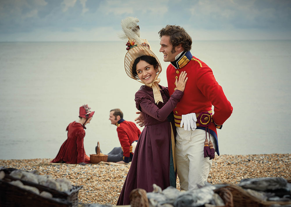
When it came to the grade itself James, Ed and I all felt that colours should not be subdued as is so often the way in period drama. On the contrary in fact, we felt we wanted them to pop – the red uniforms of the soldiers being the best example of this – and for there to always be a sense of richness to the on-screen image – rich in colour and also rich in contrast.
Some scenes, particularly night scenes, have a stronger sense of blue and other cooler tones but still retain a fairly strong sense of overall colour.
We wanted a filmic feel, and used shapes, diffusion and grads to add depth to the image whenever necessary. So really we ended up with a rich, glossy and saturated look – which totally suited the overall aim – to give a newer, much more modern feel to this classic.
Def: How would you sum up the majority of the work you did on the show?
DC: The majority of the work I did was in finessing the images and helping to achieve a really authentic and believable look for the period that suited our overall brief. Once the look of any particular scene is established then continuity is the most important part of the grading process – and also the most time consuming.
Def: Was there a deliberate plan not to follow the ‘dark and candlelit’ feeling of traditional period drama?
DC: It is fair to say we wanted to move away from the more traditional period drama look to achieve something that feels newer, exciting, ‘pop-y’, rich, vibrant and with a modern twist, however – not all of the time. Vanity Fair still has elements of darkness and moodiness – there are quite a few scenes in which darker and more muted colours work well and suit the narrative of the overall piece perfectly.


