Production: Eternity
Posted on Jan 5, 2026 by Admin
DOP Ruairí O’Brien, ISC, BSC discusses capturing the vibrant aesthetics of the afterlife in Eternity
Words Oliver Webb | Images Leah Gallo © Eternity Productions LLC
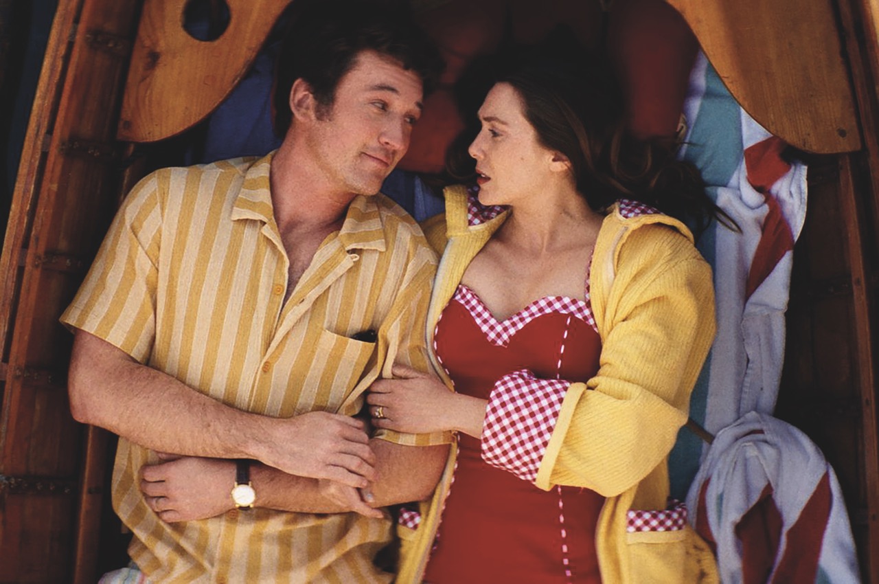
In an afterlife where souls have one week to decide where to spend eternity, Joan (Elizabeth Olsen) is faced with the impossible choice between Larry (Miles Teller), who she spent 65 years with and her first love Luke (Callum Turner), who died during the Korean War. Eternity sees director David Freyne and DOP Ruairí O’Brien, ISC, BSC reunite after their 2020 Irish comedy Dating Amber.
The first conversations O’Brien and Freyne had about the look of Eternity were not about the visuals, but the storytelling tone. “We both referenced The Apartment,” begins O’Brien. “There’s something very Jack Lemmon-esque about Elizabeth Olsen’s performance. I don’t know if David ever mentioned it to her, but it sometimes felt like I was watching Jack Lemmon reincarnated.”
O’Brien and Freyne discussed a number of visual references, including Agnes Varda’s 1958 documentary Du côté de la côte, which depicts beach life on the French Riviera. “It has these very unique colours,” says O’Brien. “We also spoke about The Daytrippers and The Graduate, which we both honed in on. David also mentioned Broadcast News, as well as A Matter of Life and Death as it was obviously a parallel story. We never copied anything directly or deliberately. It was an odd mix of different films, and was about trying to get somewhere in the middle of all that because there is no point in copying one particular style.”
O’Brien opted to shoot the film with the ARRI ALEXA 35, accompanied with Hawk anamorphic lenses. “We shot on anamorphic lenses because we were trying to have some of the sensibility of old Hollywood in our film, and to me the anamorphic look is part of it. It doesn’t hurt that the Hawk lenses were also very flattering to our cast. I wanted to have a slightly dreamy aesthetic in places, given that we were going to have various versions of heaven or hell, depending on how you see them. It felt right to have a slightly unreal quality. I keep coming back to the ALEXA as it consistently produces great pictures and colours.”
The first part of the shoot involved capturing infomercials to be inserted on TVs. “We looked for a cheap and cheesy format,” adds O’Brien. “It was funny turning up on day one of this big movie with a 25-year-old camera and producing super cheap-looking images. If you have imposter syndrome, they’re the moments when you’ll feel it most.”
The main body of the film focuses on the area known as The Junction, where the newly deceased arrive to decide where they will spend the rest of their eternity. The hall is filled with endless eternity stands to choose from (my personal favourite being ‘1930s Weimar Germany: Now Nazi free!’). “Each stand in The Junction has its own gag,” says O’Brien. “There’s the man-free world, queer world, space world and those little visual gags appear throughout the film.”
O’Brien was excited to play with the artificial nature of The Junction. “It was important to keep that air of artificiality in there,” he says. “It is all this kind of enhanced supermarket lighting. The ceiling was packed with ARRI SkyPanels, and below that we had a layer of silk. It was a vast set and a huge space to fill – like a football stadium. A lot of calculation and preparation went into getting that right, but once we were up and running it was a simple approach. Then when we went out to our different eternities, we decided to keep it much more stylised and naturalistic.”
Production designer Zazu Myers had already begun work on the design of The Junction by the time O’Brien came on board the project. “I didn’t change that much,” he says. “We had many conversations about where to put the stairs and whether we should have a lift and so on, but really the big, broad strokes were already in place. It wasn’t exactly as I had imagined, but I can’t imagine it any other way now, which shows how good the design is.”
O’Brien and Freyne toyed with the idea of the opening sequence being in black & white. “Our initial idea for life before death was to make it quite different. In the end this came down to a combination of using Ultra Prime lenses and a very different style in the grade. We decided against black & white for those scenes as we felt it might put people off.”
Production had settled on another colourist, but a meeting had already been scheduled with David Tomiak. “It would have been rude not to turn up,” admits O’Brien. “With no expectations we went along, really as a formality, and he blew us away with his creativity and ability. One of the great skills of a colourist is being able to interpret what a director and cinematographer are saying and he was great at that.”
For the archive tunnels featured in the film, Zazu Myers presented the idea of painted backdrops, which were inspired by classic Hollywood cinema of the fifties and sixties. “The archive tunnels looked deceptively simple,” explains O’Brien. “We only had three sections of that tunnel, so even though it’s infinite, you only had a short section to work with, which ended up being a challenge. We built a 3D model, previsualised all the shots and I presented a refined storyboard to David. We had two days of prep, but there were many moving parts to factor in, including the costume and hair changes, VFX and all of those elements.”
VFX was required for a number of sequences and O’Brien is hopeful that audiences won’t notice them. “We had to extend The Junction, as none of that world is there. There’s a shot where Miles looks over a balcony and you see a few floors above him, which didn’t exist. Then he’s looking down from the ninth floor, but we didn’t have nine floors! We had a great VFX company called Niche VFX we were able to really prep and plan with.”
Even though Vancouver is on the water there are no vistas looking out to sea. “You’re always looking at the city or the mountains in the background,” says O’Brien. “There are usually about a dozen huge ships in the bay too, so we knew there would be an element of painting out things. We visited every possible beach within our shooting radius until we found one. It might look like a remote eternity, but we were less than a minute’s walk from a main road.”
The production was not all plain sailing, however. “We managed to break two cranes in two days,” recalls O’Brien. “When the first one broke we knew we had limited time and no way to fix it, but with a resourceful crew and a little imagination, we simply rethought the plan. We had the big top shot we needed, looking down from above on two of our characters in a boat. So, we just dragged the boat into shallow water and shot from a tripod. Often the simple solutions are the best.”
The second crane broke on a big set piece that the crew had been planning, and without the crane there was no way to make it work. “One of the wheels had sheared off and that required welding to repair. I turned to key grip Will Parrot and within 15 minutes he and his guys had put down a huge dance floor and put rubber wheels on. We were back in business. You can’t beat having an imaginative and experienced crew.
“This film really felt like hanging out with friends. It was almost like playing with Lego as a little kid,” concludes O’Brien. “At one point during prep David said to me, ’I need a funny line for this moment, give me something’. I suggested something and it’s in the film. It’s a tiny throwaway line, but it’s great having that relationship with a director who is willing to let you collaborate on more than just the imagery. David had such a happy set and made everyone feel involved. Will Parrot approached us with a song he had written for the film and it is actually in there, playing very softly in the background of one of the bar scenes I believe.”
This story appears in the November/December 2025 issue of Definition


