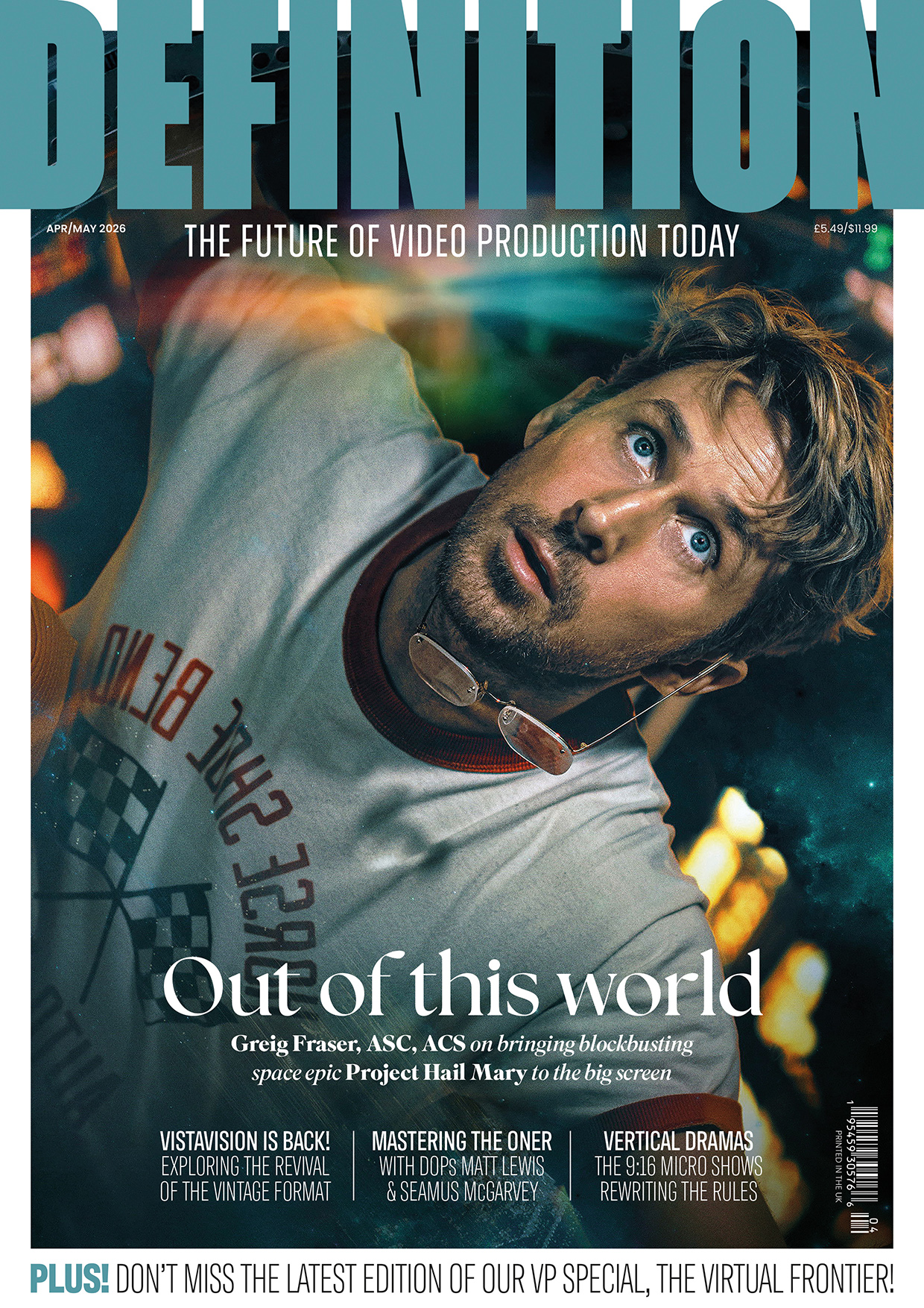
Creating The Gentlemen
Posted on Jun 13, 2024 by Samara Husbands
Get behind-the-scenes insights on the visual and audio elements of Netflix’s 2024 series, The Gentlemen, directed by Guy Ritchie and starring Theo James
The 2024 Netflix series, The Gentlemen, was created by Guy Ritchie as a spin-off to his 2019 film of the same name. The show features Theo James as Eddie Horniman, an Army officer who inherits his family’s estate and discovers it houses a large-scale cannabis operation. This unexpected inheritance plunges him into the world of organised crime and complex family dynamics.
The series, which was produced by Moonage Pictures, was led by director Guy Ritchie (episodes 1-2) and DoP Ed Wild, BSC (episodes 1-2). Episodes 3-4 were shot by DoP Bjorn Charpentier and episodes 5-8 by DoP Callan Green. The colour for the series was completed on Baselight by Company 3 colourists Jean-Clément Soret (episodes 1-3) and Matthieu Toullet (episodes 4-8).
A team reunited
Having worked together in the past, Wild and Ritchie had a common language, which aided their collaboration on the series.
“The Gentlemen was at the time the second project I have worked on with Guy (The Covenant being the first),” explains Wild. “So we had a bit of shorthand by the time we started The Gentlemen.”
Wild has also worked with colourist Jean-Clément Soret in the past, on the series Black Mirror.
“When Jean-Clément became available I was very excited as he understands the subtleties I was looking for,” adds Wild. “Jean-Clément is an artist whose work is subtle and unique and above all sensitive to the context and content. He is also a machine – tirelessly focused all day. Not an easy thing as a colourist, but essential on these fast TV grades.”
Jean-Clément led the way as the primary colourist, collaborating closely with Wild and Ritchie to establish the visual aesthetic for the first three episodes. Colourist Matthieu Toullet, also of Company 3, took over the grade on episodes 4-8.
“My relationship with JC spans over a decade,” says Toullet. “This makes our collaboration feel effortless, akin to playing a piano with four hands.”

A bold shoot
Although the series followed the 2019 film, it had quite a different focus and the team wanted to develop a rich and luxurious look for the series.
“It’s quite a heightened view of society, in a fun way,” explains Wild. “We wanted to push the frames and lighting in the same way Guy pushed the characters and plot. Guy is very bold and committed in all his choices on The Gentlemen series and he wanted the cinematography to be the same.”
Wild doesn’t believe in heavy look grades and prefers to shoot what’s put in front of him, lighting it how it wants to be seen.
“For me, the collaboration with Martyn John the designer and LouLou Bontemps the costume designer is key to achieving the look in camera with honesty,” explains Wild. “Early on we each share our mood boards and discuss freely what we think while remaining respectful to each other’s crafts. I think great images can only come from a strong single vision that’s driven by the director and followed through and enhanced by the HODs. The joy of a Guy Richie project is that every single department is on point making the same film and they all feel empowered to be bold in their choices and push their craft.”
Defining a colour space
“Ed and I have worked together a couple of times in the past and I was delighted when he invited me to work on the series with him,” says colourist Soret. “He contacted me way before the shoot with some strong visual references and we used some test images and material to build a LUT. It was good to be involved in the early stages of the collaboration and we spoke a little bit during the shoot as well.”
Soret utilised Baselight to create the LUT, defining a colour space that worked with the look they were aiming for.
“It’s a fairly simple process,” says Soret. “It’s largely trial and error, adding a bit of this and a bit of that – like adding salt and pepper, until it tastes good – until you have something that works for every possible situation. It can’t be as refined as a proper grade, but it’s a base which avoids some colours and increases others.”
“I always try to create a single LUT with the colourist in prep,” comments Wild. “It needs to be simple, keep consistency and be as close to intent as possible. I think it’s important the edit has the look and feel as close to finished as possible so they can react as instinctively as possible to the content rather than guessing what it will look like when it’s graded and bedded in.”
“Jean-Clément and Company 3 did a brilliant job with this, getting the show 90 percent there with the LUT,” adds Wild. “That is a hard thing to achieve, but Jean-Clément has such technical skill. He can place the black in such a subtle way where there is a black, but it falls softly to it. He loves skin as I do, which is not a given, and he understands balance of colour within a frame without creating a look.”

Starting the grade
Soret worked closely with Ritchie and Wild on episodes 1 and 2, aiming to create a bold look with heavy contrast, a strong saturation and copper skin tones.
“We wanted one consistent look for the series and to give it a strong identity,” explains Soret. “Guy really trusts his DoP, so I worked closely with Ed to get the grade to a place we were comfortable and then Guy would come in to provide feedback.”
Soret utilised tools in Baselight to create the look, including film grain.
“I like the grain in Baselight as it’s a very good digital emulation,” comments Soret. “And being in the timeline you can do it on a shot-by-shot basis, adding to the highlights or the lowlights, depending on if you want to create an over-exposed or under-exposed effect.”
One of Soret’s main challenges in the grade was dealing with weather conditions and balancing exterior light.
“It’s the usual thing, where the weather goes up and down and a scene or sequence is shot a bit too early or a bit too late,” explains Soret. “Ed works very precisely so all the interior scenes were an absolute joy to work on. The exterior brings the constraints of production, meaning they must shoot even if the light is too high or too low. Then it’s up to the colourist to repair.”
Soret also worked on episode 3, to create a bridge between the two pilots and to ensure some consistency on the following episode, which had a new director and DoP.
“We wanted to make sure Matthieu, who took on the grade from episodes 4-8, had a good base to continue,” comments Soret. “We had a de-brief together on episode 1-3 and then off he went to do his own thing. He’s an excellent colourist and I trust him 100%”

To the final grade
“The aristocratic world conjures images of ancient manors, centuries-old paintings, and a rich tapestry of dynastic heritage,” says Toullet. “Translated into colour, it should be characterised by deep, rich tones embedded with a pinch of darkness and dustiness.”
With every DoP, director and colourist bringing their own creative style, Toullet worked hard to ensure consistency.
“On one hand, the diverse creative styles of each individual can lead to a rich tapestry of visuals, offering viewers a varied and engaging experience,” comments Toullet. “However, ensuring consistency across episodes can be a challenge, as each contributor brings their unique perspective to the table.”
“Communication and collaboration become paramount to aligning creative visions and maintaining continuity throughout the series,” he adds.
Toullet worked closely with the director and DoPs on his episodes.
“Initially we would start with a first pass, exchanging ideas on the direction and exploring different options,” he explains. “After reviewing the episode, we’d incorporate feedback to refine specific shots or scenes. Finally, we’d thoroughly review the episode to address any remaining notes. I like to think of this process like sanding with different grades of sandpaper, gradually refining the final product.”
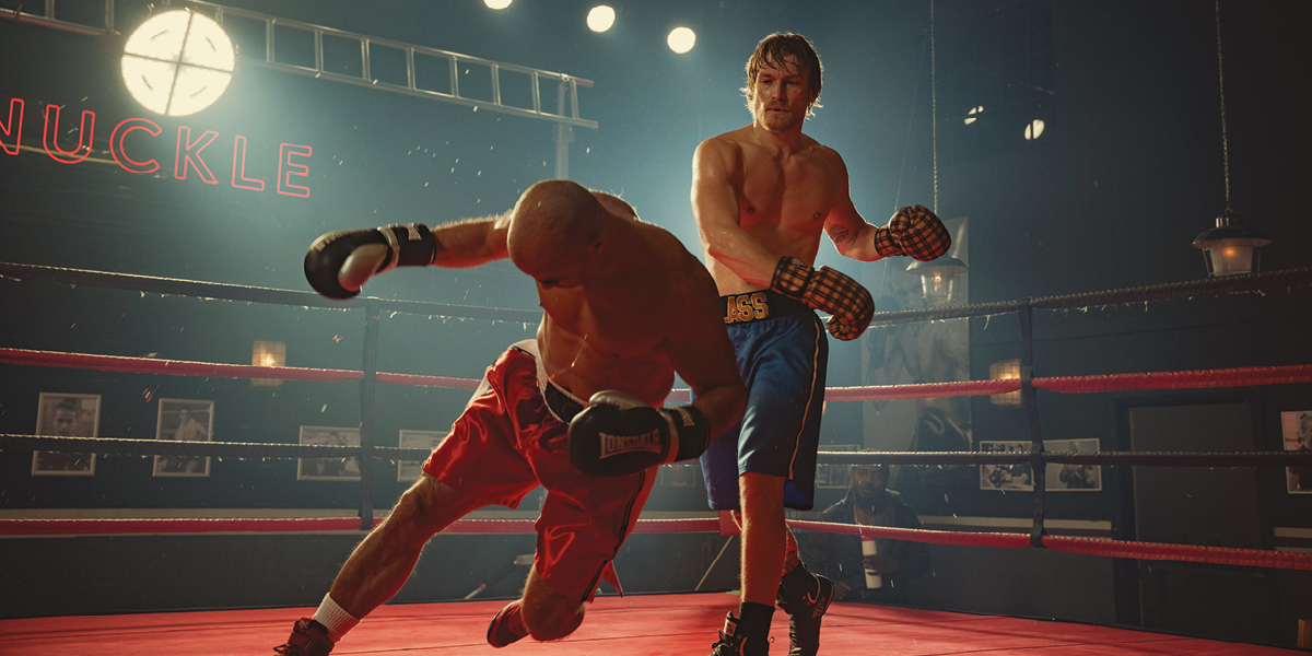
One of the most challenging scenes for Toullet was the underground carpark scene.
“When DoP Callan Green and I arrived at this scene, we were somewhat perplexed,” recalls Toullet. “The Show LUT on it came out very monochromatic and cold, which didn’t quite complement the pre- and post-scenes. We tried several tints and contrasts, but the scene lacked richness.
“Out of curiosity, we decided to treat it completely opposite to its initial direction by warming it up radically. All the colours took on an extra dimension, creating colours that didn’t exist originally. The highlights revealed a beautifully radiant sun-kissed effect, while all the shadows absorbed a nice colour palette ranging from green to blue and turquoise. These happy experiments remain truly memorable moments.”
“I’m incredibly proud to have been a part of The Gentlemen,” concludes Toullet. “But, if I had to choose, I’d say that episode 6 is my personal favourite. The boxing scene is simply incredible. Callan Green, the DoP, and Eran Creevy, the director, turned it into an epic moment, and grading it was an absolute pleasure. When I applied the grade to each shot, it was just surreal how everything aligned perfectly. Moreover, this episode is a pivotal moment in the series.”