Colour Capers
Posted on Jan 15, 2018 by Julian Mitchell
Paddington 2 takes the colour from the first film and bends the management rules. Technicolor senior colourist Peter Doyle explains how it was done
Words Julian Mitchell
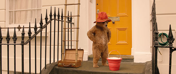
Paddington Bear is back, and the sequel is as charming and well made as the original: and it looks great. But have a closer look and you see something has happened to the colour, not of Paddington but the whole movie; something wonderful.
Critics have called it ‘day-glo’ or ‘full of primary colours’ or ‘like a storybook’. They have, by chance, picked up on the plan by director Paul King, DOP Eric Wilson and colourist Peter Doyle. This is the look that this triumvirate had planned as an extension of what the first film looked like. It’s a triumph of colour management as this time round Technicolor was booked to do a set-to-screen model, so to handle all the rushes, the colour management, all the VFX pulls including the colour, the DI and the various deliverables including the HDR 10. It was a full colour-management service for the film. The film was shot in ARRIRAW with ARRI ALEXAs and master prime lenses running at native resolution all the way through to the DI.
We asked Peter Doyle, a veteran of such films as the Harry Potter films and Lord of the Rings, if the new film was trying to enhance the story like a romantic comedy does. “Compared to the first one, it is definitely the same kind of world,” he says, “but I believe the looks are at least more consistent in the world that we created.
“Romantic comedies are an interesting sub-genre from a grading and lighting viewpoint in that there does seem to be an assumption that they need to be bright and poppy, I don’t have an opinion. Especially in a romantic dinner scene for instance where everyone is made to look fabulous. Paddington was slightly different, certainly it needed to be bright and poppy, it needed to be more light rather than just like a romcom. Paul King, the director, and Eric Wilson the DOP, wanted to have a depth, a kind of hyper-realism, ‘pantomime stage’ but not really: so the scary bits still remain theatrically scary. It’s quite fun in that respect to go for the realism but heighten it and keep it kind of storybook.

“I think technically what you might be seeing is a full implementation of a fully managed colour workflow. For the first film Technicolor wasn’t involved in the initial rushes; this time round we were able to implement this workflow with the use of ACES colour space for the exchange of the visual effects. The actual display colour space was ultra-wide gamut so ultimately it was Rec 2020 then folded down for the different display mediums. That allowed us to get these extremely pure reds but also keep a handle on the skin tones.”
Grading language
From an initial LUT design process to the final DI, creative language is used to explain to very experienced colourists like Peter what is needed. Peter takes that language and interprets it.
“When you grade a film it’s a very odd situation in terms of conversation. You have the creative team who have their idea of how this film should look and obviously that’s intellectualised and inside a bunch of people’s heads. The only real way of trying to describe that is to just use references – there is a standard way of working which is to refer typically to artists and photographers. Paul and Eric ended up using some of the same photographic references that I have been collecting over the years.
“For instance, there are the New York colour photographers from the 60s and 70s like Saul Leiter, Fred Herzog, and the slightly more modern ones who tend to get a bit more conceptual with their work like Mitch Epstein and Steve Shore. But there is a common theme to all these guys which is how they approached colour. It was these references that we all shared and one of the things that stood out was that they were using old film stocks, particularly in the case of Saul Leiter.

“He, at the time, had very little money so he used to buy old stock out of the chemists and he would do a deal with Labs in New York so they would keep a print or two in exchange for the processing costs. The end result was the colour being very distorted, because those guys were using film which is organic and pigment and gelatin based, the reproduction of the colours was quite organic. Modern electronic cameras like ALEXAs, REDs or Sonys are very linear and digital in the way they use their colours. Although a red jumper will be shown as red and will be seen as being correct, there’s a quality to that red which means that you actually reproduce colours which aren’t achievable in the real world.
“Whereas film, particularly aged with screwed-up colours just by their nature, reproduces very natural colours. It really is a layer of silver gelatin on a piece of plastic. So with that in mind we designed in this kind of colour space, Rec 2020. Within that we built a grade that really bent all the colours into this world that some call ‘storybook’, others would say ‘organic’. In technical ways it was really throwing away the extremely pure linear colours and sort of moving all the primaries in to almost the secondary colours. Even though you see red as red, it isn’t actually ultra pure red, there’s an extraordinary amount of blue in that red so it’s actually quite burgundy.
“In Paddington 2 the character Mary’s red jumper and shoes, which are key colour motifs throughout the film, they are actually variations of burgundy which then ties back to the fairground scene with the organ behind Hugh Grant’s character which actually has quite a lot of green, but if you look at that green it’s not like a very modern, electronic green, it’s very faded. There was a very conscious decision with quite a lot of effort at trying to reproduce those colours in a modern display medium in the DCI and the HDR. We put a lot of effort into seeing highlights for the DCI or normal computer monitor, that was for the trailer.”
Triumvirate

Getting the desired colour result is like a three-way handshake or maybe a hug, as Peter describes it. “Everything comes from production design and then it’s the choices that are made and some of the colours used for the walls and costume design. Hugh Grant’s character Phoenix Buchanan’s baby blue vest when he’s making a cup of tea through to the kind of golds.
“Also it’s the lighting and the reproduction of that lighting. Eric the DOP spent a lot of time using lights that reproduce and light these colours in a sympathetic way. It’s all about having a pure spread of colour within the white spectrum. The purity of the white means that the colours in the set design are reproduced and are readable by the camera sensor. The torture test for any colour reproduction medium would be a blue police car light. When we see this light with our eyes we see the extraordinary blue intensity of the light but we actually see the blue. That blue is what we call a narrow band colour meaning that it is so pure it is almost a single frequency of blue which also means that cameras which are RGB have a problem because that blue falls right in the middle of the blue and the green. In some cases it doesn’t actually see it. It might turn out black or go very clippy; it basically looks very unattractive.

“So to get around that we just got into some very advanced colour science, in technical language we moved the colour blue primary into a more appropriate spectrum which was close to the ARRI wide gamma blue but retained the ACES colour primaries for the red and green. You could say it was a hack and it was a non-compliant ACES but the reality is: when is it a colour space and when is it a colour grade? In my opinion I have always felt that the two are actually the same process – as in how to reproduce a colour in the right way. That meant that we had extremely pure and poppy colours but that can be reproduced by the display mediums. In this case the DCI Xenon projectors and the Rec 709 displays. We were able to really bend the primaries to fit the reproduction medium.
“It’s just working to make the colours take on a ‘natural worldness’ colour to them rather than the somewhat electronic, straight-out-of-the-box colour that any other digital camera will produce.”


