Killer instinct: The Killer
Posted on Jan 15, 2024 by Samara Husbands
The Killer: Killer Instinct
With six unique locations, grading The Killer was never going to be simple. Colourist Eric Weidt shares with Katie Kasperson how he captured David Fincher’s meticulous hitman
The latest film from David Fincher, The Killer, sees Michael Fassbender play the titular assassin – a Smiths-loving cynic who embarks on an international chase after a high-profile job goes awry.
The story takes our anti-hero from hazy Paris to humid Florida to wintry New York, with each location taking on its own challenge – both for the Killer and the film’s colourist Eric Weidt.
Going international
Based on Alexis Matz Nolent’s graphic novel series and inspired by Jean-Pierre Melville’s Le Samourai, The Killer combines a fast-paced plot with moody yet bold colours.
“I think Fincher is a big comic book fan,” begins Weidt, “especially in the art of framing to impart the beats of a story. Working in film, he brings that to movement as well – he’s seeking a visual rhythm that makes you forget it is highly constructed.
“David likes to push and pull colours, but always strikes an unconscious balance,” he continues. Weidt began working on The Killer while it was still at the pre-production stage, developing lookup tables alongside cinematographer Erik Messerschmidt ASC, who had previously worked with Fincher on Mank, for which he won an Academy Award.
“We created the show LUTs together for shooting the different locations, which we drove home in the grade,” recounts Weidt. “I started working with test footage early on, especially to process green- or blue-screen material.”
With six locations across Europe and North America, Weidt needed to differentiate each one without disrupting the film’s overall palette.
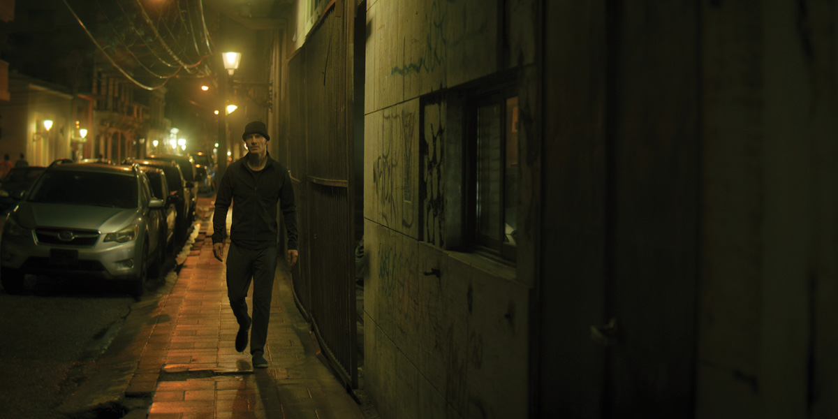
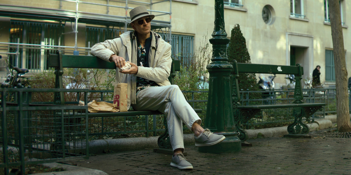
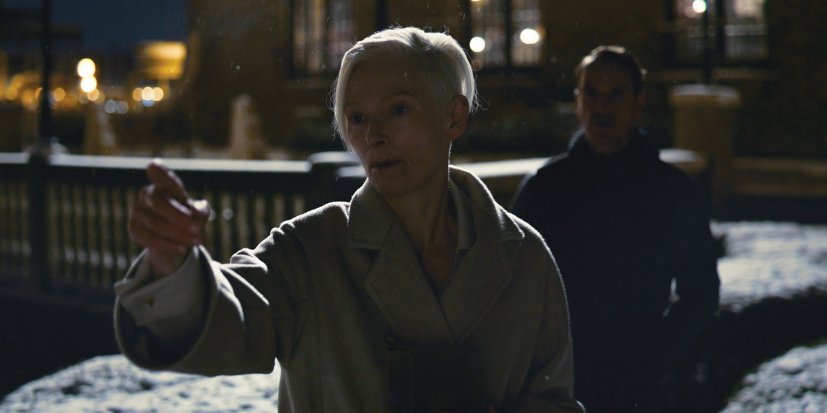
“There’s Paris at night, with tungsten street lighting; there’s the Dominican Republic, with a misty-humid-warm look going on; and there’s this winter white-point Chicago material,” explains Weidt. During the grading process, they started with a “yellow-blue split in Paris, a saturated warm-chocolate look in Dominican Republic, and an ice-cold northern US look,” which was then tailored to each individual scene.
Take the Floridian fight scene, for example – ‘where black was the modus operandi’, according to Weidt.
After following a character aptly nicknamed The Brute to and from a strip club, the Killer sedates his guard dog and breaks into his home before eventually being discovered.
“We wanted to push for detail, all the while knowing that more darkness would make it scarier. So, a perfect balance needed to be struck.”
Meanwhile, the Dominican Republic storyline was saturated and warm, allowing Weidt to play around with both darkness and light.
“We also added a halation filter as a kind of haze that would make it feel muggy and humid,” he explains, as well as touches of red in the daytime shadows.
Today’s tools
Le Samourai was released in 1967, a point in time when filmmaking was fairly limited by the technology available.
“Nowadays, we have many more tools, including HDR and cameras that practically have night-vision,” argues Weidt. “So, we’re able to have something that is super rich, but at the same time subtle. The audience feels like the story is methodical and deliberate – only going out of control at precise moments.”
A long-time TrueLight customer, Weidt employed Baselight for grading The Killer, calling it ‘part of [his] DNA’ as a colourist.
The overall process took around a year, with Weidt estimating somewhere between seven and ten iterations before they eventually signed off on the final grade seen in the film.
“I worked on an initial pass on Baselight with Erik,” Weidt recalls. “Then, we did rounds online, where David put notes throughout so I could go through and address them. Towards the end, David would come into a screening and give notes in real time, and I would drive it home from there.”
Weidt frequently used Baselight’s EXR alpha channels, multi-paste and defocus tools to create The Killer’s final look. “I took scenes and ordered them according to camera angle, so that I could balance them with impunity,” he describes. “We used defocus to drive home the right amount of depth, which can improve with subtle changes.”
Singing praise
These days, colourists and VFX artists often work in parallel, which sometimes proved a challenge for Weidt. At times, he would have to ‘re-track anything that was already dialled-in spatially’ if shots had been ‘repositioned, stabilised or made to look handheld’.
“Post-production is Fincher’s favourite part of filmmaking,” shares Weidt. “He may have been joking…
“I think some scenes in The Killer really sing, colour-wise,” he concludes. “Working with Fincher and Messerschmidt, that’s not hard to achieve.”
This feature was originally published in the January 2024 issue of Definition.


