Black Magic DaVinci Resolve 16 and editor keyboard
Posted on Dec 1, 2019
We look at the latest iteration of DaVinci Resolve and Blackmagic Design’s new dedicated keyboard hardware
 Pricing at £978/ $995
Words Adam Garstone / Pictures BLACKMAGIC
Blackmagic’s DaVinci Resolve is well named, it seems. It was already a capable grading tool when Blackmagic purchased DaVinci way back when, and they have developed and added to the software at a prodigious rate. It is a cliche that it’s become the Swiss Army knife of post-production, though Blackmagic has recognised that it’s quite possible to spend several minutes turning the thing over and over in your hands, bewildered by all the attachments, looking for the gizmo that gets Boy Scouts out of horses’ hooves.
Resolve 16 attempts to find a solution to that issue – at least as far as editing goes. Many editors simply need to cut their programmes together quickly, from news and current affairs to YouTube programming. For these people, Blackmagic has added a Cut page to Resolve, along with a new Editor Keyboard – the latter, perhaps perversely, giving the new generation of YouTubers the kind of interface familiar to those of us old enough to remember edit controllers like Sony’s BVE 9000. More on the keyboard later.
The cut page allows you to grab your media, review it, trim and re-edit
The ethos of the Cut page is that it allows you to grab your media, review it, assemble, trim and re-edit, and then output the finished product all from a single page, with tools optimised for speed over complexity. Of course, the timeline you are hacking in the Cut page is mirrored in the Edit page, so you could still assemble quickly in the former and finish in the latter, even if you have a more relaxed edit schedule.
 Version 16 of Resolve introduces the new dedicated keyboard
Cut page
The Cut page consists of three main panels. Upper left is usually your Media Pool window, though it can also show Transitions, Titles and Effects. The upper right panel is a single viewer, and the lower part of the screen is the Timeline.
The Timeline is split into two parts – a traditional ‘zoomed in’ view of the area you are currently working on, and an overview, showing the whole of the timeline in one. This arrangement means that you no longer have to zoom in and out all the time – indeed there are no zoom controls active in the timeline (which confused the bejeebus out of me before I realised how it works). You can even drag a clip from the magnified region and drop it into place in the overview timeline. It’s not that accurate, but it’s fast – and that is the point here. If you want to spend ten minutes agonising over a frame or two, then you should be in the Edit page.
once your masterpiece is trimmed, the cut page can still be used to add transitions, effect, text and graphics
There is a massive, outstanding and totally brilliant feature of the Cut page. My first task – on traditional NLEs – is to create (or ‘cause the edit assistant to create’) a sequence with all the clips in a bin in timecode order. For historical reasons I call this a KEM roll (KEM edit machines were used back in the days of film). You can use this ‘KEM roll’ to quickly skim through the contents of a bin and even cut straight from it into
the timeline.
The Cut page has a ‘Source Tape’ – essentially an invisible sequence of all the clips in a bin that behaves in exactly the same way as my KEM roll, but with added benefits. If you reorder the clips in the bin – perhaps by clip name instead of timecode – then the KEM roll re-orders, too. You can jump to an exact timecode by typing in the numerical value: great if you are assembling an interview from the timecode in a transcript, for instance. This feature alone, for me, justifies the existence of the Cut page. The Viewer also has a Fast Review button, which plays through the source tape in fast forward so that you can review your rushes quickly. It’s an intelligent fast forward though – shorter clips are played more slowly, so that you don’t miss them.
There are a few interesting editing features, although some are obviously influenced by other NLEs. The Timeline shows audio and video for a track grouped together – there aren’t usually separate audio and video tracks – however, you can add an audio-only track simply by dragging some audio onto the timeline. In another nod to competing systems, Track 1 acts as a Master track; lifts from this track will always ripple the timeline to close the gap, and all the other tracks will ripple to maintain their timing relationship to Track 1. Interestingly, however, if you lift a section of a clip in the Edit page, the Cut page maintains the gap by adding filler.
Insert options
There are a couple of unusual but useful extra insert options. When you are doing a quick first assembly, you use the Append edit, which always adds the source clip to the end of the Timeline, irrespective of playhead position or In and Out points. The Smart Insert inserts your source clip at the nearest edit point to the playhead.
There are, of course, the usual three-point edit functions – overwrite, insert and so on – but you can also add a clip to the next available empty track (for checker-boarding or superimposing/compositing) or add a clip slightly zoomed in, creating a close-up for those single-camera YouTube videos that don’t shoot any coverage. As an aside, I have started to wonder, watching YouTube videos, how long it will be before the paradigm of jump cuts in interviews or pieces-to-camera will become acceptable in broadcast TV…
Trimming is very fast indeed. As you would expect, selecting an edit (in Track 1) ripple trims in the usual way. There is a nice display in the Viewer of the number of frames you are trimming – you can interact with this display as if it’s a ‘trim mode’ as well. Once you have selected the edit you can use the keyboard to trim by individual frames.
Simply grab a clip anywhere to roll it in the timeline; there’s a little icon in the centre of each clip as you hover your cursor over it. Grab the icon to slip the clip.
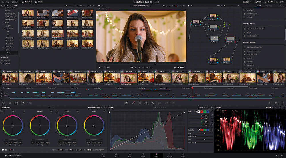
Trims in tracks other than Track 1 are overwrite trims, as Track 1 controls the position of all the other clips (yes, yes – it’s just like FCP X’s magnetic timeline. There, I’ve said it). Once your masterpiece is trimmed, the Cut page can still be used to add transitions, effects, text and graphics, and adjust clip audio levels. However, any key-framing, detailed audio mixing, adjustment of effects, complex colour correction and so on will need you to delve into the other pages in Resolve.
Quick export
It is possible, however, to export from the Cut page. Quick Export gives you options for H.264, H.265, YouTube, Vimeo and ProRes. You can add presets to the Quick Export feature by setting them up in the Deliver page.
Resolve’s new Cut page obviously borrows some concepts from the likes of FCP X – which is not necessarily a bad thing for quick edits. The glory with Resolve, however, is that should you start to bang up against the limitations of this kind of editing, you can flip to the Edit page and continue with the traditional NLE paradigm: the best of both worlds with just the click of a button.
New keyboard

To complement Resolve 16, Blackmagic has designed a new Editor Keyboard. The unit is connected to your computer, and powered by USB-C – there’s a USB hub built in, so you get a couple of USB-A connectors for your Resolve dongle and a mouse, for example. The Editor Keyboard is a well-made thing – not heavy but robust, with a metal body and a plastic palm rest. The plastic mounting on the rest had snapped on the review unit, but journalists are notoriously heavy-handed with other people’s property, and the damage didn’t prevent the unit from being used. What’s more, Blackmagic sells the key caps, switches and the rest as spare parts, so you can always repair any damage. The keys themselves are full travel, nicely weighted, and certified for over a million keystrokes.
The body is a pretty close colour match to the iMac Pro – indeed the keyboard is somewhat Mac orientated (the Command key is the giveaway). There are a couple of fold-down feet at the rear, to angle the keyboard, or you can sink it into a desk for that bespoke console look.
The key caps are labelled with the appropriate resolve shortcuts, working well with both cut and edit pages
The centre of the unit is a conventional QWERTY keyboard, with function keys and a numeric keypad. The key caps are labelled and coloured with the appropriate Resolve shortcuts – the keyboard works well with both Cut and Edit pages, though some of the keys are dedicated to the former.
I have always had a slight issue with keyboards of this type; personally I don’t use the default keyboard mapping of any software – I have switched back and forth between so many NLEs over the years I have a mapping that simplifies the transition for me, a sort of weird crossbreed of Avid, Final Cut, Premiere and so on. Nevertheless, if you are going to stick to Resolve (which is certainly no bad thing) then they provide a useful learning aid.
Frame accurate
The numeric keypad is dedicated to frame accurate navigation – as well as the numbers, there is a button to change from entering timecode to frames. There’s a 00 key, a key for setting clip duration, as well as plus and minus keys. Above the numeric keypad is a set of keys that controls the sort field of your clips by timecode, camera, duration or clip name.
To the right of the keyboard is a jog/shuttle/scroll wheel (which would be familiar to anyone who has used an edit controller or Betacam/DigiBeta tape machine), and two big Source and Timeline buttons. By default, the Source button sets the Cut page Viewer to the Source Tape setting, so you can zip through reviewing all your source clips using the weighted and rubberised wheel. Hitting the Timeline button, of course, selects the timeline so that the knob moves the playhead.
To the left of the QWERTY keyboard there is a panel of buttons dedicated to the main editing features. Big In and Out keys are self-explanatory. Above them are buttons for the Cut page’s ‘intelligent’ insert/overwrite functions: Smart Insert, Append to End, Ripple Overwrite, Source Overwrite, Place on Top, and Close Up.
Below are the trim buttons. These you press and hold to select the trim function (Trim In point, Trim Out point, Roll, Slip and so on) and then use the knob to perform the trim. The final three buttons in this group set transitions to Cut, Dissolve or Smooth Cut (which adds an optical flow-style morph transition, similar to Avid’s FluidMorph, FCP X’s Flow transition and Premiere’s Morph Cut).
It’s quite possible to use the keyboard to edit in the Cut page without touching the mouse – you can even edit with the Viewer full-screen. With a little practise (and re-learning to use Resolve’s default key mapping) it is very fast indeed. The jog wheel is weighty and accurate – you can spin it in Jog mode but there’s a clutch that engages in Shuttle mode to give it end stops and a centre detent. I’d like to have a sprung centre position in Shuttle mode as well.
There are a couple of issues with the Editor Keyboard. It’s HUGE – I use a Wacom tablet instead of a mouse and I could barely fit them both on my desk. Secondly, it costs nearly £1000 and I’m not sure that the extra facility it offers is worth it, especially given that the additional features – the jog/shuttle wheel and so on – don’t work with any other NLE
Best for post-production
That said, DaVinci Resolve 16 is now undoubtedly the most capable post-production software out there. No other package can demonstrate the same ability to edit, add top-notch effects, grade, mix and deliver, in a multi-user environment and on pretty much any platform – and the basic version is free. Resolve 16 adds a bunch of new capabilities alongside the Cut page, including facial recognition in the editor, which will automatically create bins for your characters, better GPU support in Fusion, AI-based grade matching in the Color page, foley sounds and new effects in Fairlight – it’s a big update. I also find encouraging the pace at which Blackmagic are developing Resolve – whilst other NLEs trickle out slightly underwhelming bug fixes and irritating UI changes, Resolve gets bigger, better, faster and stronger at an astonishing rate.
Personally, I would like to see more of the big post houses offering Resolve as an option, along with standing desks and tea made in a pot not in a mug. But then I’m a dreamer, I guess.


