Macbeth’s Colour Leads The Narrative
Posted on Oct 6, 2015 by Alex Fice
Goldcrest Post London Colourist Adam Glasman reveals why his latest feature film project, Justin Kurzel’s new adaptation of Macbeth starring Michael Fassbender, will bring you the classic Shakespeare play as you’ve never seen it before.
Already hailed as one of the best received films at Cannes Film Festival, this year’s upcoming retelling of Macbeth – due out in UK cinemas this October – certainly seems set to be one of the most highly anticipated movie releases of 2015.
Looking at the creative talent behind the scenes, it’s easy to see why. Michael Fassbender will be following in the footsteps of fellow X-Men mutants Patrick Stewart, James McAvoy and Ian McKellen as Macbeth. Alongside him, Oscar winning actress Marion Cotillard is performing as Lady Macbeth. Then there’s Australian Director Justin Kurzel, a relative newcomer to Hollywood who wowed audiences with his first feature film, “Snowtown”, in 2011.
Of course, even with such a cast and innovative director, adapting one of Shakespeare’s most infamous plays for the big screen was never going to be an easy feat. Luckily, Kurzel also had an all star crew to help, including fellow “Snowtown” team member and “True Detective” cinematographer, Adam Arkapaw, as well as Goldcrest Post colourist, Adam Glasman, whose credits include “Cold Mountain”, “Les Miserables”, “Casino Royale”, and “World War Z”.
“There are a few notable versions of Macbeth which are the points of reference for most people, and pretty much all of the major reviews I’ve read say that Justin Kunzel, the director, has made a very different kind of film,” begins Glasman. “He had a very clear, strong vision as to how the film would look and feel, it’s pretty unique when you see it.”
One of the main elements audiences may be surprised with, Glasman reveals, is the very real brutality of the film – combined with paired down dialogue due to characters such as the Drunken Porter, who provides some comic relief in Shakespeare’s original manuscript, being cut out entirely.

Also different is the way the final grade was approached in DaVinci Resolve. “Normally my job as the colourist is to apply colour seamlessly so that everything matches up and looks and sits comfortably together, but actually quite a few times in this film, we deliberately made things jump between shots,” Glasman remembers. “For instance, the opening battle has a cool blueish feel, and then for occasional shots we’d jump around so that we see the witches in the battle and everything becomes very yellow. That’s intentional; it’s not supposed to match. The fact that Macbeth’s hallucinating or certainly seeing something mystical meant that they could look different, because those shots are his point of view (POV), you see him in the battle and his POV is the witches and that’s where the colour jumps.”
Never is this stylisation more obvious than in one of Glasman’s favourite scenes in Macbeth, which was also one of the most challenging to get right: the final battle sequence. “I don’t know if you saw from the trailer but the final battle is quite bold. It’s very very red,” says Glasman. “As if Macbeth has entered his own version of hell.”
“It’s literally as red as the colour gamut allowed us to go which can be bizarrely problematic when matching things together,” he continues, revealing that part of the problem was that the intention was not to create a uniformly red grade, but to introduce red in the shadows going up to yellow in the highlights. “You’d think having that dominant colour would be easy because you’d just copy it from one shot to the next but it was really sensitive to mismatching. This would really jump out when you’d watch everything as a sequence.”
To perfect the scene, Glasman took advantage of the full toolset available in Resolve. “We used quite a lot of vignetting to enhance depth, and lifted faces through tracked shapes in certain places,” he explains. “I also carried out lots of selective defocusing through tracked shapes to decrease detail in the background tree line, and to a lesser extent also used noise reduction where shots were pushed, particularly slow motion shots from the Phantom camera.”
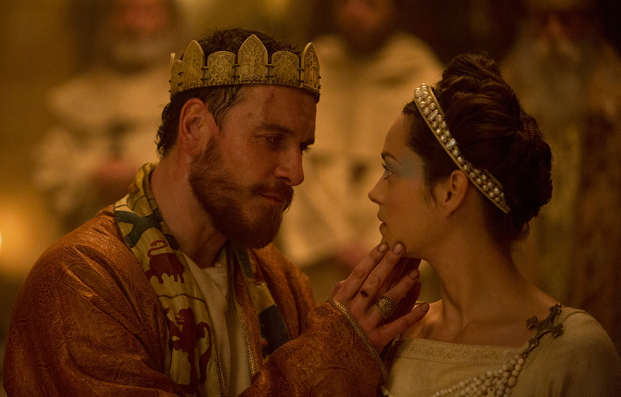
“I really like the end battle scene for the boldness of it. I also really like the look of the banquet scene which we gave a dusty gold feel to,” adds Glasman. “It’s the scene where Macbeth starts seeing Banquo even though he’s killed him, he’s hallucinating again and it was actually shot in Ely Cathedral. It really is quite beautiful. I think Adam Arkapaw’s cinematography looks stunning; it was shot in a beautiful location, and the costume design is amazing, as is the make-up.”
For any other filmmakers or colourists hoping to follow in his footsteps, he only has two main pieces of advice: to persevere and to practice. “I’ve been grading for long enough now that it’s second nature, I don’t have to think about what I want or what I’m doing, I can just do it and it makes the process much less painful for the clients,” he concludes. “And the only way to achieve that is to practice.”


