Dark Vision
Posted on Feb 18, 2019 by Alex Fice
DOP Stephen Murphy explains how he approached this bleak Irish period drama – particularly the lighting design
Words: Stephen Murphy / Pictures: BBC, Stephen Murphy, Teddy Cavendish
Myself and the director, Allan Cubitt, referenced several films throughout prep, including The Assassination of Jesse James by the Coward Robert Ford (shot by Roger Deakins), The Best Intentions (shot by Jörgen Persson) and Fanny and Alexander (shot by Sven Nykvist). As we spent time looking at locations and getting to know each other’s tastes, the visual style of the film began to form in my mind’s eye. I was inspired daily by the locations we found and as prep continued, I started seeing designs from [production designer] Gillian Devenney with a beautifully delicate colour palette. These were complemented by the costumes from Hazel Webb Crozier. Between us, we came up with the visual style.
I wanted a naturalistic style of photography that still had a very cinematic quality to it; what I’d call hyper-naturalism. I was keen to stay true to the idea that, without electricity or gas light, the interiors were sometimes quite dark, even during the day, so I worked towards a single-source lighting approach for day interior work and used candles and oil lamp for night interiors.
As it was a tight schedule, I had to work fast. Usually I prefer to adopt a ‘light the room not the shot’ approach, by which I mean I’ll usually have the set lit for at least 180 degrees with close-ups needing little to no additional lighting. This keeps everything moving quickly on set, which helps the actors immensely and I find it gives a more naturalistic-looking image.
 For day interiors, Stephen used large HMI sources outside windows, pushed through muslin.

“Night interiors were a challenge. In one of our primary locations, I wasn’t allowed rig to any roof or wall.”


HMI
For day interiors, I used large HMI sources outside windows, usually 18K ARRIMAXs and ARRI M90s, and pushed them through several layers of day-grey muslin. This became a large soft source, cut naturally by the size of the building windows. I’d then mix in a smaller, punchier source, like an M18 at full spot, and let that splash in through part of the window, usually to bounce off the floor. By keeping the harder source cut off above the actors shoulders, I got a nice mix of hard and soft light. This kept the texture of the light interesting, especially as an actor in a pale dress would pass through the hard light and momentarily bounce it around the room, changing the character of the shadows.
Night interiors presented a different challenge. Some of our locations had heavy restrictions in terms of what kind of rigging I could use. In one of our primary locations, I wasn’t allowed rig to any roof or wall, nor was I allowed to use naked flames (candles or oil lamps etc). My gaffer, Kevin Hetherington, worked closely with the art department to rig small battery-powered oil lamps, which then became our key light for many of the night interiors.
I’d use smaller tungsten Fresnels bounced on to the ceiling to create a room tone, usually about two and a half to three stops under key, and supplement that with some of the battery-powered practical oil lamps. Where possible, I’d also use covered wagons that Kevin had built for me. I’d keep the covered wagons filled with a random assortment of smaller wattage tungsten bulbs I’d had built in a variety of sizes so I could hide them behind tables etc. I also relied heavily on China balls, which are one of my favourite lights to use, rigged on Mega Boom arms and skirted to give me a soft controllable top light.

“I relied heavily on China balls, which are one of my favourite lights to use.”
Exposure
I’m quite particular about how I expose an image. I want my dailies to look as close to the final image as I can get them, and I tend to favour under exposure to help control how my images are printed. I learned my craft by shooting on film, so I still use light meters. Waveforms and false colour are meaningless to me. I know what they’re saying technically speaking, I just don’t get the artistic feedback I want from them – I can’t feel the light in the same way as I can when I use my meters. I can keep my exposures and contrast ratios very precise by metering carefully. I find I can work quicker, too.
This was shot on the ARRI Alexa Mini. I’m very familiar with the contrast curve of that camera and how it responds to under exposure.
In my head, I treat it as another film stock, and try to figure out where it fails and where it looks interesting. I usually keep the sensor at 800 ASA and just light to the T stop that I want to shoot at. I also tend to use a stack of contrast filters – Low, Ultraand Smoque filter to alter the contrast curve of the sensor.
I work a lot with Panavision’s anamorphic lenses. When this was in prep, I went to Greenford to test some of Panavision’s newer series of lenses. I knew I’d be shooting in confined spaces and small locations, so I wanted to use a set of lenses with modern mechanics and features, ie. good close focus and a physically small size. I tested the G Series and the T Series and fell in love with the latter. They have a beautifully creamy quality to them, have the anamorphic aberrations I like and still feel handmade. However, they have all the benefits of a modern spherical prime.
 Stephen loved Panavision’s T Series lenses for the beautifully creamy quality to them, as well as for the anamorphic aberrations.
Anamorphic Format
We wanted a classical-looking film, something cinematic and painterly. During prep we had talked about a few recent dramas that had been shot in similar locations and time periods that used a very modern visual style and Allan and me agreed we didn’t feel that was appropriate for this. For me, so much of the appeal of the script was about the poetry of the language being used, so I didn’t want to do anything with the camera that might detract from listening to that language, that stillness. Simplicity became a word I kept in mind throughout the shoot, both in the lighting design and the design of the coverage and camera movement. I’m quite fond of proscenium framing so I tried to design master shots that covered the scene in as simple a way as possible. If the camera needed to move to accommodate the blocking, then it moved. If it didn’t need to move, it didn’t.
I’m a big fan of the anamorphic format, and when I suggested it to Allan, he agreed wholeheartedly. We composed for the 2:1 aspect ratio, rather than the full 2.40:1. I carried a range of prime lenses with me,
but we really only used two or three with any frequency.
In keeping with our simplicity of style, we shot most of the show on just two lenses, the 35mm and 50mm. Master shots would start with the 35mm and for close-ups, I’d use the 50mm and push in a little tighter.
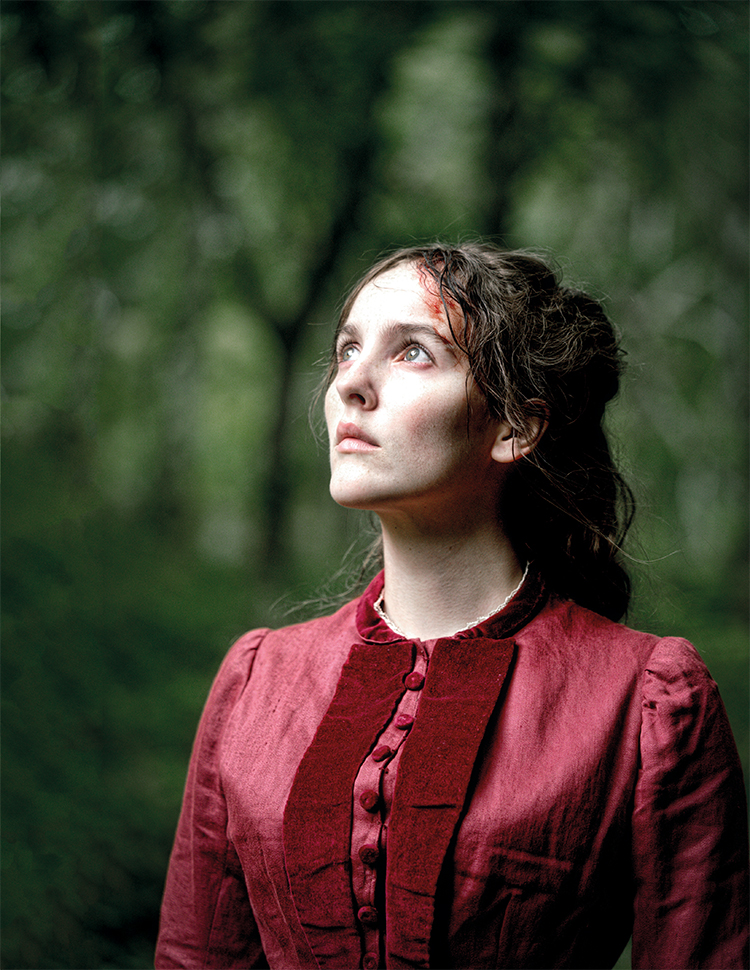
One of the beautiful things about the anamorphic format is how the background can literally open up behind an actor as you push in on a medium-length lens. I like seeing the set or the location behind an actor – not just a massive blur of out of focus shape and colour. I like depth and, despite the fact it has a shallower depth of field, an anamorphic lens at a stop of T4 still gives you a fantastic sense of depth
and scale.

“In keeping with our simplicity of style, we shot most of the show on just two lenses, the 35mm and 50mm.”
What I’ve been watching
– Stephen Murphy
In 2018, the things that stayed with me, photographically speaking, were the second series of Ozark, photographed by Ben Kutchins and Armando Salas, and Solo: A Star Wars Story, photographed by Bradford Young. I loved how still and dark the images in Ozark are – very brave exposures for a TV series. And I loved the visual darkness and texture of Solo. Quite difficult to get such a strong look through the studio system, especially in this era of risk-averse studios and superhero movies.
 Anamorphic format can open up the background behind an actor, rather than a blur.

Grade
During prep, I worked with dailies colourist Scott Ferguson at Yellowmoon in Belfast to develop a single LUT that I could use for the shoot. I shot make-up and costume tests with actor Ann Skelly (heroine Beth Winters) and tested some of the practicals that we were building. It gave everyone a sense of the quality of the images and how dark we might go. No one was worried about the level of darkness I’d used and I wasn’t concerned about it for TV broadcast.
We were committed to a cinematic image. I knew that meant some people would be watching what were supposed to be dark images on screens that weren’t optimised to display those images, but you can’t work towards the lowest denominator. You can’t shoot interesting images worrying about what they might look like on someone’s iPhone in a bright sunny office. You have to aim for a higher standard.
We all loved the dailies and we all loved how the images looked in the DI and we were supported every step of the way by the production and the BBC execs, which was refreshing. I would like to think that in this day and age of HD TVs most of the audience will have their televisions calibrated to a reasonable degree and will have seen the images as they were intended to be seen.

Flashbacks
Within the narrative of the series, there are a series of flashbacks and a dream sequence. We decided that treating the flashbacks in a different visual style would just work against the visual simplicity we were working towards with the rest of the film. There were enough other visual clues within the frame, change of costume, change of hair etc. to mark the different time periods, so we didn’t alter anything else photographically. For the dream sequence, though, we did do something slightly different. We shot close-ups with an eyeline directly down the lens, just to give a sense of unease or surreality to the sequence, and we worked with a more heightened, saturated colour palette.

“No one was worried about the level of darkness I’d used and I wasn’t concerned.”
Location
The entire shoot was shot on location in Northern Ireland. We were based in Belfast, but shot in a variety of locations. One of my favourite sets was the kitchen, which was a partial set build within an existing location at Myra Castle. The location itself had an incredible variety of subtle colours, soft greens and beautiful ochre bricks. Gillian’s set extension and dressing was just fantastic and it gave us a fabulous canvas to work on.
I couldn’t shoot a project of this quality without the support of a fantastic camera, grip and electric crew. I had a superb crew, led by focus puller, Andy Gardner, key grip, Ben Mosley, and gaffer, Kevin Hetherington. I also received tremendous support from the superb post team at Yellowmoon.


