Crashing Symbols
Posted on Jun 6, 2017 by Julian Mitchell
A Cure for Wellness is a beautifully made movie that uses all that cinema is good at to play with your mind and assault your senses, gradually leading you on a downwards spiral of graphic horror
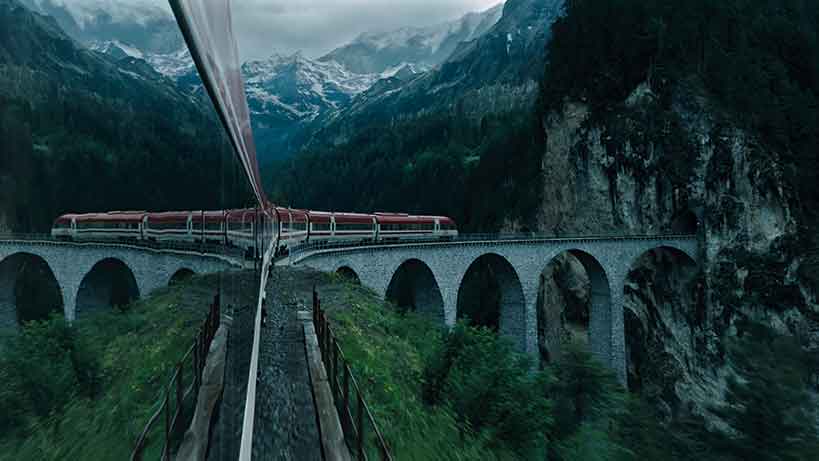
Director Gore Verbinski was quoted as saying that his film was for a ‘specific’ kind of audience. We think he meant people who like their horror with bucketloads of symbolism and hours of head scratching as to what it all means. We also thought it was for people like us who simply love sumptuous cinematic imagery regardless of genre.
If it was up to us all movies would be made with this degree of care for the image. The film is just gorgeous to behold: the framing, the set design, the lighting, the tonal quality – all amazing. Unfortunately, this wasn’t enough for everyone else as it bombed spectacularly at the world’s box offices.
But forget that for a second, as we did when we finally tracked down the DOP, Bojan Bazelli, on the set of his new movie Underwater, shooting on the ARRI Alexa 65 6K camera. Bazelli and Verbinksi have been partnered in three movies in the last few years: A Cure For Wellness, The Lone Ranger and The Ring. It is The Ring that is closest to A Cure For Wellness as it too is steeped in cinematic symbolism to aid the creeping horror. In The Ring the circle of the eye is a recurring theme, amongst others. In A Cure For Wellness it’s water, but you can also take your pick from circles, eyes… and don’t forget the eels. Water is all encompassing. What does it mean? Usually death, unfortunately.
The film’s symbolic nature encourages the lingering shot; giving Bojan the chance to flex his cinematography muscles.

 On set images of DOP Bojan Bazelli (left) while the visitors to the clinic wait for their cue.
Pre-production
When you have a director who paints each frame with creepy but irresistible eye candy and a production designer whose award-winning touch is in every shot, you can bet the DOP won’t fail to deliver something exquisite. Bojan shot with an ARRI Alexa XT camera in ARRI’s Open Gate mode with Leica Summilux-C, Zeiss Master Prime and Ultra Prime Lenses. Alexa XT cameras can switch from recording normal ARRIRAW to record the entire active image area of 3414×2198 photosites, giving a 1.55:1 Open Gate image with slightly shallower depth-of-field and no surround view. In this way Bojan can pass a ‘thick’ digital negative to his grader Company 3’s Stephen Nakamura.
A mouthwatering combination to attain supreme cinematic imagery. Open Gate also gave Bojan a way to achieve his 16:9-ish aspect ratio, chosen to protect the sweeping view of the structures of the castle, for instance, for when it’s later squeezed onto an iPad for modern viewing.
We wondered if, with such a promise of high levels of cinematography, Bojan ever considered film for the shoot, given that it’s still regarded as having the highest dynamic range.
“I have often asked myself if digital cinematography helped me capture imagery,” he says. “I’m not a promoter of the digital world but I’m a strong believer that it’s a new era in filmmaking. Those movies that
are shot on film are probably carefully chosen to be on film. I’m not saying I will never shoot film again but the project has to be so right for
the medium.”
Technically Bojan doesn’t see much between the two disciplines, but simply it is the way you can see the images as you shoot them that is the deciding factor. “In terms of lighting, tonality and the decision-making process I think they are very similar. If I had to shoot this movie on film, I would probably use identical tools except that I wouldn’t be having that luxury of seeing an image before it’s developed. If you’ve spent your life with film you really appreciate this feature of digital shooting.
“If you’re creating an image that has to say something, just the fact that you can see that image as you’re making it helps you ensure the process,” he continues. “So yes, we are spoiled. In the nineties there were systems that tried to mimic printing lights to emulate the image that film would see and many tools were created. There was always a desire to be able to see an image before it was developed. When the digital still cameras came on to the market they were great tools for cinematographers. I used them all the time because I was able to create my own relationship with the image on film and on the digital still camera. It helped me tremendously to make a decision.”
When ARRI’s ALEXA came along, Bojan started using it immediately and has never changed. “The digital era is with us and it’s going to be better and better every year. I’m currently shooting a movie on the ALEXA 65 camera, which is another amazing step – it’s a fantastic camera.”


 The film is packed with symbolism to reflect the protagonist’s state of mind, and this extends to the colour palette.
Symbols, framing and tone
Bojan lit the sets in a way that used a lot of practical lights to create a moody atmosphere, rather than an overly glossy film atmosphere. In doing so, he created rich environments and colours that are at once terrifying and beautiful. The desaturation from the grade gives the inside of the sanatorium this washed-out appearance with pastel blues and whites; they almost look like they’ve been dehydrated. In the lower levels, the forbidden section of the sanatorium, the colours become more black and deep green. It’s a descent into the mud after being in such a whitewashed environment when we first visit the sanatorium.
“The movie was built on symbolic images that represented the state of the protagonist’s mind,” he explains, “and we hoped for an interlocking in to the stories through images. In the movie there is symbolism in the colour, symbolism in framing and composition, symbolism in the different locations, Wall Street and the Swiss Alps. How it feels to be in a corporate environment against this other so-called healing place. We prepared for the colour palette in advance with the fabulous production designer Eve Stewart. Her input of the tones and colours that had to be predesigned were put in the mix and the rest of it came from our feelings and desire to represent something.
“Of course the big, big part of it is the shooting itself,” he continues. “I’m a big fan of preparation but nothing really prepares you for when you start shooting. That’s when you’re trying to recognise the elements you can select to filter in to the film as opposed to those who you think would not be representative of the idea.
 The movie wasn’t effects driven but sky replacement lent to the symbolic similarities between the towering Alps and Wall Street skyscrapers.
“It’s definitely with Gore, with his genius for using imagery to represent themes. That’s where we glean the ideas from. The macro circle of the eye in combination with the circle of a ring in a past movie and an animal eye. The circle is representative maybe of the corporate world, the symbolism of the shape of a window maybe combines with a window on a New York skyscraper. We’re trying to present the corporate world with the sick world where people are dying. The colour palette in terms of sickening tones with browns and greens in the sanatorium combines with other sickening tones of New York.
“Those things have their own life in pre-production and preparation and none of these are formed at that time. I think if you know enough about the subject, the process of selection when you’re shooting is easier and it all comes together.”
Colourist Stephen Nakamura bought in to what the director and DOP were aiming for through the dailies colour grade. “There’s a certain palette that the director has in mind and as long as we get the full dynamic range, the thick negative, we can always dial things in by colour correction,” he explains. “A Cure For Wellness is much more desaturated than the look that the camera captured; we know we can eventually get the look that Gore Verbinski wants through colour correction.
“With the dailies colourist he gets the certain look that he wants,” Stephen continues. “I get those dailies when I’m doing the finishing pass and use them as a kind of guide. Certainly when it’s all cut together it’s not going to look exactly like the dailies because dailies are colour corrected in Rec. 709 and I work in P3. So I try to achieve the look the directors want but at that point I may have to do some secondary work like the leaves and trees that may show up as being more green in one shot against the next. For instance, they might be more of a pine green than a yellower green. Also the bricks on the walls, I had to desaturate and change the hue of them because the director said he thought they looked too friendly.
“Also Bojan is so experienced that he can shoot scenes in a certain way knowing that later I could drop a whole bunch of windows and reshoot some lighting. When we’re together we typically go over a few scenes and I get what they’re looking for so I can move on with the rest of the movie and stay consistent. I get in to their minds and deal with clashing colours or too bright skies that I know will annoy them. So I’ll do all that work before they come in again.”
Stephen explains that his fellow graders in the features department felt that he had the best job going through at the time as A Cure for Wellness looked so good. The credit isn’t his he says. “It’s because Gore is such a visionary director and Bojan a very talented cinematographer. It has this very elegant filmic look, it has a very polished look to it. Despite all the tools we have as a colourist, you can’t fix something that isn’t already there. You can look at this movie without any sound and realise that these guys are incredibly professional as it just has a different quality.”


