Colour special: Power palette
Posted on Aug 20, 2025 by Admin
DOP Kim Ji-yong and colourist Park Jin-young reveal the creative choices behind the look of Squid Game Season 2
Squid Game, the South Korean dystopian thriller from creator Hwang Dong-hyuk, took the world by storm with its high-stakes premise and striking visuals. At the end of last year, the much-anticipated second season dropped on Netflix, delivering seven new eps of life-or-death drama.
For Season 2, cinematographer Kim Ji-yong teamed up with Baselight colourist Park Jin-young (of Dexter The Eye) to craft the show’s bold look – and after the huge success of the first series, Jin-young felt the weight of expectation.
“Among the many creative elements involved, it was one of the rare works where we gave deep thought to the role that colour can play,” Jin-young begins. “With Korean content gaining increased exposure in the global market, I felt a great sense of responsibility being part of Season 2 – and at the same time, it was an exciting opportunity.”
He continues: “The challenge was to carry over the iconic symbolism and colour identity from Season 1 while creating a deeper, heavier visual tone. This became the most fascinating part of the project for me.”
Kim Ji-yong and Park Jin-young have been creative partners for over 15 years, working together on a variety of projects – including The Age of Shadows (2016), The Fortress (2017) and Decision to Leave (2022). “We collaborated closely, grounded in mutual trust and understanding,” remarks Jin-young. “In our initial conversations, we agreed on respecting the vivid colours from Season 1 while shaping a moodier and more high-contrast tone to reflect the main character Gi-hun’s emotional evolution, as his inner transformation is central to this season.”
Throughout the shoot, the duo would review the footage in the grading suite and make decisions about the direction of colour grading based on each scene’s atmosphere and emotional context.
The colour and visual identity of the show were vital to the success of the first season, and Jin-young and Ji-yong wanted to honour this while visually reflecting the evolution of Gi-hun, the story and other characters.
“Since the show is already known for its vivid colours – which many people appreciate – I didn’t feel the need to create a new look,” explains Ji-yong. “Instead, I believed it was important to establish a moodier aesthetic with stronger contrast overall.
“It was important that Squid Game was still recognisably Squid Game and that we retained the powerful visual identity already established, while also bringing this new element to Season 2,” he continues.
“During testing, we discussed ways to create a more organic texture on screen,” Ji-yong elaborates. “We decided against creating any special on-set LUTs, opting instead to accurately capture the original colours of the set.”
“Gi-hun looks the same on the surface, but compared to Season 1 his facial expressions are more serious and sombre,” explains Jin-young. “The sets and spaces are similar, but the narrative is heavier. I thought that this shift should be expressed through enhanced contrast and controlled brightness.
“To do that, we deepened the overall mood and focused on harmonising the colours of the set, costumes and lighting in a refined way. This helped guide viewers through Gi-hun’s emotional journey and the narrative progression.”


The colour palette for Season 2 maintained a general consistency, but shifted in tone and style intentionally to reflect specific scenes or emotions.
“In the dormitory – where characters sleep and vote – we created a clear distinction between night and day using strong amber tones for night and subtle blue tones for daytime,” says Jin-young.
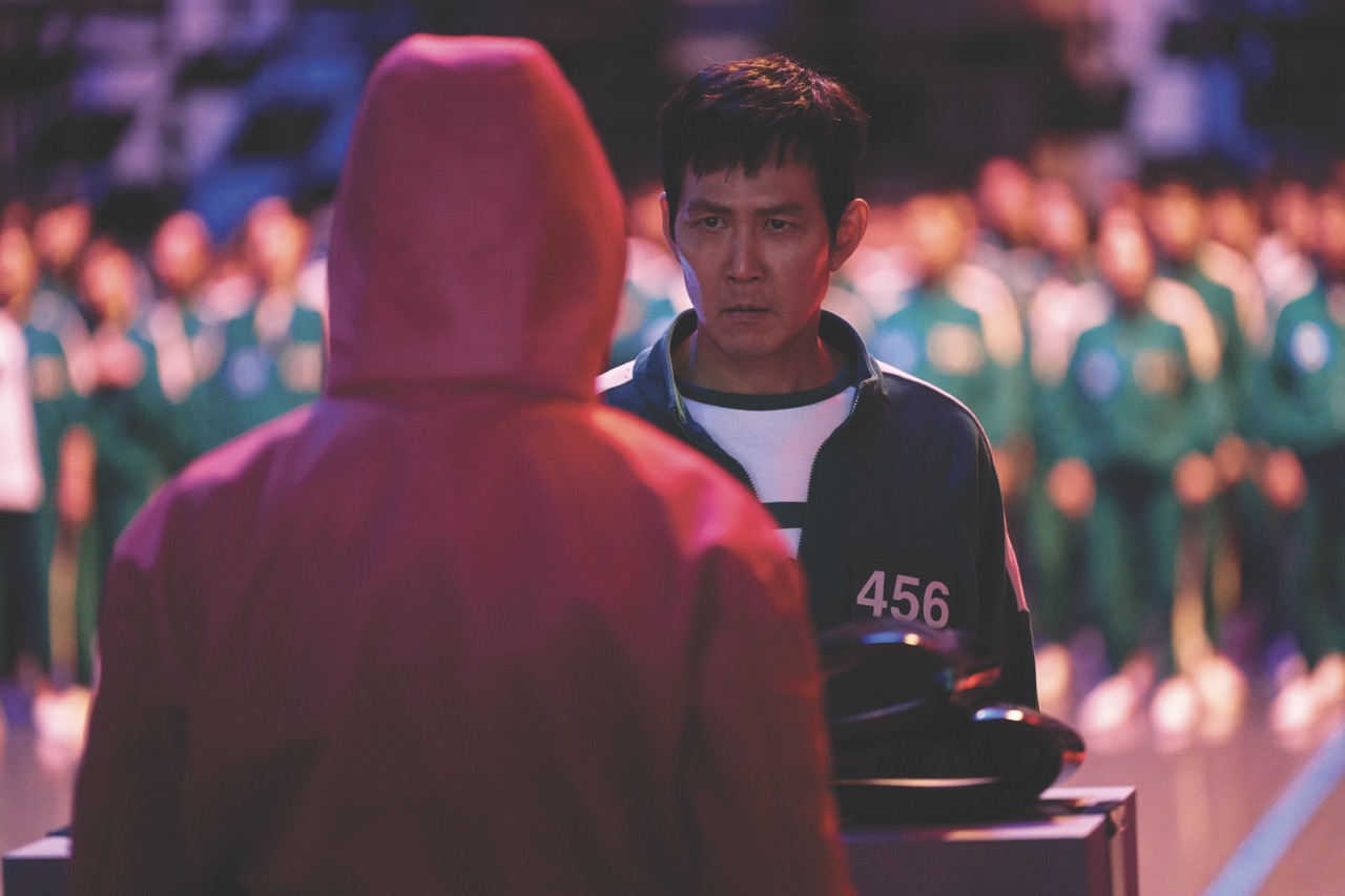
“In the Russian roulette scene between Gi-hun and the Recruiter, we used red neon lighting to express heightened tension and emotion. These shifts in colour helped emphasise each character’s emotional state and added to the overall storytelling atmosphere.”
Ji-yong also adopted this approach through the cinematography. “I am most proud of the close-up of the Recruiter during the Russian roulette game. The red neon light from outside the window reflects in his right eye, making it look bloodshot, which enhanced the intensity of his performance. I believe we successfully showcased Gong Yoo’s face in a way never seen before.”
Ji-yong continues: “The motel room in the final scene of episode 1 was designed to be quite realistic, while subtly incorporating the signature colours of Squid Game in an expressive manner. I carefully set up the lighting with colours that were both visually and narratively appropriate, ensuring it didn’t overpower the scene.
“With the footage offering many possibilities for post-production, talented colourist Park Jin-young brought these potentials to life, creating a rich visual experience,” adds Ji-yong. “The shadows were dark but not monotonous, while vivid red stood out in the midtones.”
The voting scene among the survivors is one of the most captivating elements of Season 2: “To enhance the visual impact here, I chose to design the lighting in the mass dormitory – where the voting takes place – differently from the previous season,” says Ji-yong. “The colours of the O and X on the floor were extended to illuminate the entire voting scene so that their overlapping colours could add both symbolism and visual depth.
“To bring this idea to life, I changed the colours of the pre-selected S60 lights on the ceiling to red and blue, allowing them to blend in the centre while still maintaining the distinct red and blue hues on either side. This concept was later refined and enhanced in post with the expertise of Jin-young,” adds Ji-yong.
Jin-young utilised many tools in Baselight to support the emotional colour journey of Season 2. “It delivers powerful grading functions and a flexible workflow, which allowed us to adjust the tone of each scene precisely to match its emotional context,” he says. “I frequently used a range of the primary grading tools like Video Grade, Curve Grade and Film Grade to support the grade.
“We also focused on narrowing the gap between bright highlights and deep shadows in HDR to create smoother contrast. In order to prevent the image from appearing overly digital, we used Baselight to soften the sharpness or add grain where needed.”
Squid Game Season 2 was shot with the ARRI ALEXA 35, which had the ability to “bring out the full potential of the image while also preserving the unique atmosphere and colour identity of the sets and art direction,” says Jin-young. “This balance was a major challenge.
“The large-scale game arenas demanded precise colour adjustments to convey spatial depth and visual diversity. My personal goal was to express a more elevated cinematic quality, even though the sets, costumes and overall structure remained continuous from Season 1.”
Jin-young continues: “I see this as a basic duty for any colourist. The differences may be subtle – something only I might recognise – but to me, that made the work even more meaningful and rewarding.”
One of the aspects Jin-young enjoyed most about this project was the challenge of preserving the unique colours and atmosphere of the set while enhancing the realism and spatial texture of each location.
“The larger game arenas in Season 2 offered a broader visual playground, and I’m proud of how we brought them to life,” he comments. “Each chapter of the story carries its own visual identity, and I feel the diverse colour treatments helped package those segments in a way that was not only cohesive, but also emotionally engaging.”
Find out more about colour control in our look at historically accurate colours.
This article appears in the July/August 2025 issue of Definition