REVIEW: Smoke For Mac
Posted on Oct 10, 2013 by Alex Fice
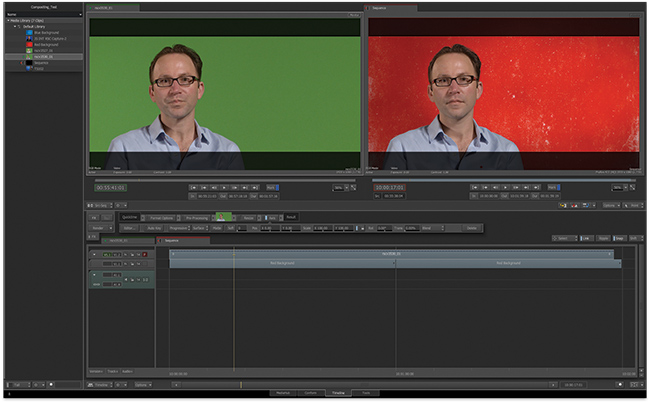
Keying from the timeline.‘Move away from the software bundle’, that was the advice from Autodesk to other NLE companies this time last year and they have been as good as their word in releasing Smoke For Mac 2013 as a single entity. As it turns out this enormously capable piece of software could be all you need to start and finish any job. ADAM GARSTONE is in awe.
ome products change the game. The Model T Ford, Volkswagen and Citroën 2CV were cars that ordinary people could afford to buy and (perhaps more importantly) afford to run. In film and TV, Avid and Lightworks made editing faster and cheaper, and cameras like RED and the Canon 5D Mk II changed moving image acquisition forever.
It’s perhaps only slightly hyperbolic to say that Autodesk have made a similar game changer with Smoke for Mac 2013. High-end finishing – compositing, effects and so on – has always suffered from two main ‘barriers to entry’ – the gear was eye-wateringly expensive, and incomprehensible to anyone but a specialist operator. Smoke for Mac 2013 addresses both of these issues, with a price reduction to around £3300 plus VAT and a complete user interface redesign to make it easier for an editor to pick up.
Smoke for Mac’s capabilities are enormous, so I’ll approach it as most first-time users will – as someone who is familiar with editing software, but who needs the extra capabilities that Smoke can offer.
Installation of a stand-alone system is pretty straightforward. There is a separate Smoke Setup application which handles things like where your media will be stored – then it’s time to run the main application.
In the first splash screen you set up users and projects. One really nice feature here is that you can set a user’s default keyboard mapping to FCP 7 – evidence of who their target market is with this new version, perhaps. Projects are set up with a series of pull-down menus – you do start to get the idea here that SfM is still a complex piece of software. Fortunately, this start page also has a link to the Smoke Learning Channel on YouTube. This is a really excellent resource of professional videos covering everything from basic installation to complex creativity with ConnectFX and Action nodes. It will be your friend! You can watch the videos at www.youtube.com/smokehowtos.

Keyer as an effect.Once you are into the application’s main screen, you’ll see four tabs – MediaHub, Conform, Timeline and Tools. You’ll generally start a new project in the MediaHub. Here you can locate media on disc to add to your database and import existing edits from other packages. SfM supports import of projects from Avid Media Composer (through AAF), Final Cut Pro 7 and X (through XML) or EDL. Of course, any application which generates files compatible with these will work too (Premiere Pro can generate AAF for instance – even though they can be a bit wonky). Motion effects, dissolves, basic wipes and so on are faithfully reproduced in the imported sequence.
Your clip and sequence database (the Media Library) is usually represented on the left hand side of the screen. Although SfM (is that a better abbreviation than SMac?) is a single screen application, you can move or hide panels like this Media Library panel. The Media Library can be arranged into folders and sub-folders, metadata can be displayed and used to sort the display and so on. To add media to the library, you use the right hand panel of the MediaHub. As well as providing flexible access to the system’s discs and thumbnails of media, you can bring up details of any clip, and play the footage, simply by double-clicking. I’ll mention one weirdness here – SfM grabs hold of my Wacom tablet settings and reassigns my double click button to something else, which is incredibly irritating – particularly as it leaves the new settings when you quit the application. The settings controlling the search and import of media are extremely powerful – you can override file header information, such as the framerate of a clip, search for footage using filenames, tape IDs and Avid UMIDs for flexible project import and so on. Obviously, if you want to edit your project completely within SfM, then all you’ll need to do is import the footage at this point.
Assuming, however, that you are importing an edit from another NLE, the Conform tab will help you fix any problems in the import – though with a bit of foresight (and following the excellent YouTube video) you shouldn’t have any problems. Nevertheless, here you can check the status of the linked files, search for any files that haven’t linked properly, and so on. Handing a project over to another piece of software has always been fraught but – probably because of the position that Smoke has always had in the post-production workflow – this is one of the most complete, flexible and accurate conform processes that you’ll come across.
Timeline Is Your Home
The Timeline tab is where most of your real work will be done. Open it up and you get an interface which is, at least at first sight, familiar to most editors. The basic paradigm shift with SfM 2013 over previous versions is that the timeline is at the centre of all operations. Not only does this timeline have all the familiar edit tools, but all the powerful effects, colour correction and compositing functions are launched from, and relate to this timeline.
The Timeline screen layout retains the (dismissible) Media Library display on the left. There are source and sequence monitors at the top of the screen, with transport controls and timecode displays, and the bottom of the screen shows your timeline sequence. There is a small panel between the monitors and the timeline (FX), which shows a simplified view of the effects applied to the current selected clip. This is in the form of a horizontal flow chart, with the raw clip on the left, the displayed, output clip of the right, and all your applied effects in between. For each applied effect, the basic parameters are also available in this panel – for instance, the ‘Axis’ effect allows you to resize, rotate and reposition the footage. There is also an Editor… button which will take you into the full screen editor for each effect. I’ll talk about some of the basic effects later.
The timeline has a number of tabs. A green tab shows you the ‘timeline’ corresponding to the clip you have in the source monitor and a red tab shows you a sequence timeline. You can have multiple sequences (red tabs) open.
Patch Bay
To the left of the timeline is a patch bay which allows you to lock and display tracks and so on. To control which track an edit operation effects, you use the little cross mark on the yellow playhead. Although this seems a little odd to an Avid or FCP editor, you soon get the idea. Moving the cross can be a bit fiddly with the mouse, but there is a keyboard shortcut available.
Assemble editing works as you would expect. You can perform three or four point edits, setting In and Out points exactly as you would in Avid or FCP. Autodesk have taken their colour cues from Avid – yellow means you are doing an insert/ripple edit, red an overwrite edit. The edit paradigm is, however, more like Final Cut Pro 7, with tools to perform selection, slip and slide edits and so on. One nice feature is the Slide Keyframes tool, which (unsurprisingly) slides only animation keyframes without touching the video and audio. A Ripple button selects whether the edit ripples the timeline and there are also buttons to control snapping and track linking – though the FCP keyboard shortcut doesn’t work for linking, for some reason. Dissolves and other transitions are added by positioning the playhead at the edit point and hitting the Video Transitions button on-screen. You get the option to add a dissolve, a wipe or an Axis effect. Dissolves can be turned into a dip to, or through a colour from the FX bar, and you can select from a huge library of pre-defined wipes – or create your own. Annoyingly, the library wipes just have the SMPTE number, not a description, so you’ll need to have a play to find your favourite ones (and make careful notes – unless you already know the SMPTE numbers by heart). However, all wipes actually use the compositor in Smoke, so you can do cool things like track a wipe to the image. An Axis transition is even more flexible – basically it’s a full 2.5D compositor so you can flip images around in 3D space, warp them, add keys and so on.
The Extension 1 release of SfM 2013 has added a trim view to its editing toolbox. Again, they haven’t tried to re-invent any wheels here – if you are familiar with Avid’s trim view they you can use the SfM one. The left viewer shows the outgoing frame, the right the incoming one. There are buttons to nudge the trim by one or five frames either way, and the JKL keys can be used to ‘play’ the trim point forwards or backwards. There is a button to play around the trim point, with on-screen boxes to select how many frames on each side get played. As a fast and accurate trim view, it’s simple and it works very well. Extension 1 also adds support for Blackmagic video I/O (AJA was already supported).
In terms of audio, there are some timeline, clip-based audio effects (Timewarp, Gate, Compressor, EQ) and some sends to the mixer (Delay, Reverb and Modulation) plus, of course, you can use the normal timeline editing tools, including keyframing gain.
Editing? Not Yet
The question becomes, then, would you edit a project in Smoke for Mac? The answer is, at least at the moment, probably no – at least for a film of any complexity. You can’t, for instance, output an OMF, AAF or EDL. Importantly, though, editing features are getting pretty good, and that makes some important points.
Firstly, should you need to do some extensive re-editing of a project once it has (supposedly) been picture locked and has made it’s way into finishing, then SfM is definitely up to the job – you wouldn’t need to go back to the Avid/Lightworks/whatever project and reconform.
Secondly, Smoke for Mac is still, essentially, a composting and effects tool. However, the redesign has made it totally useable for those mere mortals who know how a non-linear editor works.
Let’s take, for example, pulling a key.
You set your timeline up in just the same way that you would in any NLE (or you have imported the timeline from your NLE of choice) – your foreground is in the track above the background plate.
Simply select your foreground clip and add an Axis effect from the FX button. Enter the editor, select the keyer and sample the colour you want to remove in the MasterK menu. There are a myriad of controls to refine your key, including spill suppression, Shrink and Erode, and the ability to pull a reasonable key from the most terrible footage is unbelievable. Of course, with the painting, tracking and rotoscoping facilities of SfM, it’s possible to extract foreground features from pretty much any footage.
Again, the point here is that all we have done is add an effect to a clip in a timeline – albeit a very capable effect (see the screen grabs). We have not, however, needed to master the ConnectFX node based compositor to get access to this MasterKeyer – though you can go on to that as your familiarity with the software grows (as also illustrated).
More Tools
It’s important to stress that I have only touched the surface of the capabilities of SfM 2013. The final, Tools tab gives you access to some clip based tools, like Paint, Text, Denoise and so on, but once you delve into ConnectFX your mind will be well and truly boggled. Stack up multiple layers of video, constructed in 3D space, with true, shadow casting lighting effects. Track and rotoscope areas, and add colour correctors – one favourite feature of mine is the ability to define a parameter as a function of another, effectively automating complex animations from a single keyframed movement. You can even pull in 3D models and render them right in your composition. If you need to generate some slow motion footage, the motion compensated retiming algorithm is as good as they get (another feature that can be added as a simple effect to a timeline clip).
Autodesk have done a remarkable thing with Smoke for Mac 2013. If you’ll forgive the clichéd car analogy, they have produced a Rolls Royce for the price of a Ford Mondeo; a Ferrari that’s as easy to drive as a VW Polo.


