REVIEW – Smoke For Mac 2013 Preview
Posted on Nov 9, 2012 by Alex Fice
Smoke for Mac 2013, one reason to hang on for the new MAC PRO workstation?
ADAM GARSTONE is maybe joking around but he is serious when he says that a new NLE has entered the building, even though it’s really an effects heavyweight with pretentions but also a program that gives the Mac Pro extended life. Adam reviews an early preview version of the software.
I’ll start with an old joke – you can tell it about anybody in the tech industries, so I’m not singling anyone out here (I just picked a well-known individual), and it’s a bit long, so bear with me.
Bill Gates dies. At the Pearly Gates he is met by St. Peter:
“Hi Bill,” Peter says, “Which is it to be then – Heaven or Hell.”
“What do you mean?” Bill asks, confused.
“Well, you get the choice,” Peter explains. “So which is it to be?”
“Oh – I’m really not sure.”
“That’s not unusual,” Peter says kindly. “Come and have a look at both and then you can decide.”
St. Peter leads Bill over to a huge door, on which is inscribed, in large Gothic characters, ‘Hell’. He opens the door and shows Bill inside. Two beautiful girls come to his side, giving him a large Cuban cigar and a glass of finest Cognac.
“Smoke and drink as much as you like Mr. Gates,” they explain, “after all, it’s not going to kill you,” and they giggle and lead him away.
A few hours later, a weary but happy Bill Gates returns to the door to be met by St. Peter.
“What did you think of Hell?” Peter asks.
“I never thought I’d say this,” Bill says, “But Hell is fantastic. I can’t wait to see what Heaven looks like.”
“Come this way,” Peter says, and leads him over to a door identical to the first, except for its inscription – ‘Heaven’.
He opens the door and Bill steps inside.
It’s nice… but dull. Angels float about on clouds playing Lyres, the Heavenly Choir sings…
At the door, St. Peter meets Bill again and asks,
“So how was Heaven?”
“Lovely,” Bill says (trying to be nice), “But I think I prefer Hell please.”
“No problem,” St. Peter assures him, and leads him over to the door marked ‘Hell’. He quickly opens the door and shoves Bill inside.
It’s Purgatory. Fire licks around Bill’s clothes, burning them off. Devils with pitchforks and steel whips flay his skin from his body. The pain is intolerable. He turns back to St. Peter, who is laughing in the doorway.
“What’s happening?” Bill asks through the flames, “Where is the other place? It wasn’t like this before.”
St. Peter’s slowly closes the door, still laughing. The final thing that Bill Gates hears, as the door clangs shut, is St. Peter’s mocking call,
“Yes Bill – it was a great demo, wasn’t it?”
Yeah, OK, sorry about that, but thanks for keeping with it – the point I’m trying to make is that we don’t usually review demo or pre-production products – they are nothing like the version you are going to buy, so what’s the point?
I am going to make an exception, however, for the preview of Autodesk’s Smoke for Mac 2013, simply because it’s a very important release – both for Autodesk and for the post-production industry. This amazing finishing tool was priced at about $15,000 so buying it made your head spin and, if you came from an editing environment, it was so complex using it made your nose bleed.
Perhaps with an eye on the current turmoil in the NLE world, Autodesk are pricing the next release at under $3500. They have completely re-written the user interface to be more familiar to editors, and they have put out a couple of free, pre-release versions for anyone to try out (sign up for a version at http://usa.autodesk.com/smoke-for-mac/trial/).
 The Timeline window.
The latest pre-release still has many of Smoke’s features missing, for instance the conform tools aren’t there yet (though there is a perfectly workable path into Smoke from FCP 7 or Avid). Nevertheless, Autodesk are clearly aiming Smoke at more traditional editors, rather than dedicated finishing specialists.
Once the software is installed and running, Smoke asks you to set up a User – the default keyboard layout for a new user is one that closely matches FCP 7. Nice. Next you set up a new project and, once again, all the options presented will be familiar to any post-production professional. One slight oddity is that there is a separate application that edits the settings for where Smoke stores media files, which video I/O it uses and so on. At the moment, Smoke only supports AJAs products for broadcast I/O – I would hope that they are working with the other major hardware manufacturers so that Smoke can be installed on legacy hardware in any edit suite.
Starting a New Project
The main window of Smoke has (currently) three tabs, ‘MediaHub’, ‘Timeline’, and ‘Tools’. The MediaHub is where you do all of your file based stuff – importing projects from other NLEs, importing media clips etc. I won’t go through the procedure for getting a project into Smoke – there are excellent video tutorials on YouTube (just search for ‘Smoke Learning Channel’).
The Tools Tab
The Tools tab is new in the second pre-release, and features tools and effects to apply to clips before you edit them into your timeline. You can, for example, use the Paint module to paint an image, or generate text with the Text module (duh!). These modules are very comprehensive – the text tool can generate rolling and crawling text, text on a path and so on. The paint tool is also very fast indeed – I suspect these tools are GPU accelerated.
The Timeline Window
The Timeline Tab is where most of the work in Smoke is done. The window instantly looks familiar to most editors. There are two video viewers (Source and Record, Canvas and Viewer – whatever you want to call them) with timecode displays and transport controls and, below them, a timeline.
To the left is a view of your ‘bin’ tree containing all the sequences and clips for the project. You’ll have done most of the manipulation of this tree in the MediaHub, but you can still move things around and delete items in this tab.
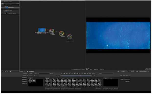
Between the timeline and the monitors is a display of the effects you have applied to the currently selected clip. This is in the form of a horizontal flow chart – the raw clip is at the left, the output is at the right, and you can add a variety of effects in between. You can edit the basic parameters of these effects directly from this view, or go into a dedicated effects editor for each effect. Again, I’m not going to go into the details of these effects – Smoke is an amazingly powerful effects tool – for instance the Master Keyer is just one feature of ‘Axis Effects’ and is the most powerful and comprehensive keyer I have ever used. If these ‘standard’ effects aren’t powerful enough for you, there is a node based, 3D effects engine which will even allow you to read and render 3D models directly into your composition.
 The ConnectFX 3D, Node based effects engine.
As I said, the timeline will look pretty familiar to most editors. To the left is a patch bay which allows you to lock and display tracks and so on. To control which track an edit operation effects, you use the little cross mark on the yellow playhead (for instance, in the position shown in the picture, we will be editing to track v1). Although this seems a little odd to an Avid or FCP editor, you soon get the idea. Moving the cross can be a bit fiddly with the mouse, but there is a keyboard shortcut available.
Assemble editing works as you would expect. You can perform three or four point edits, setting In and Out points exactly as you would in Avid or FCP.
Once your assembly is complete, edits can be manipulated with a set of tools that would be very familiar to the Final Cut user – slip, slide and so on. Edits can be selected to be Ripple edits (or not) and – this time with a nod to the Avid user – the edit cursor is yellow for ripple edits and red otherwise. There isn’t a Trim editor (yet?).
To add a transition effect, you need to select the cut between two clips (or between a clip and ‘black’) and hit the transition button. This allows you to add a dissolve effect, a wipe, or to use Axis Effects, which can, for instance, generate 3D animated movements.
Whilst the new editing facilities in Smoke are pretty straightforward, and pretty powerful, it certainly isn’t the fastest NLE to use – even after a fair amount of practice. There is no way to move an edit numerically, I miss the ability to select all clips to the right of my cursor – often used just to open a space to do something – and some people will really miss the trim editor. It may be, of course, that all of these features will be coming. This second pre-release version is certainly more complete, a lot faster, and more stable than the first pre-release.
I have completely glossed over the astounding effects capabilities of Smoke. I imagine that, in its first release, it will be continue to be used as an effects and finishing solution alongside a more ‘traditional’ NLE. However, as the editor improves, and if the software proves stable, I wouldn’t be at all surprised to see entire projects being edited from scratch. There is probably a joke in there somewhere, about Smoking the whole thing, but I think we’ve had enough jokes for one day.


