Retro Remake – The Darkest Hour
Posted on Feb 6, 2018 by Julian Mitchell
Reproducing historic events isn’t easy. Do you go the sepia route or do you widen your recreation palette?
There have been countless movies and TV programmes celebrating Winston Churchill but Darkest Hour might be the one to get the closest to the real man. Director Joe Wright, DOP Bruno Delbonnel and Senior Technicolor colourist Peter Doyle had extensive talks about how they should create the look. Peter wanted to dissect the colour look culture of the time. “We were zero-ing on the actual tone of the film, based on it really focusing on Gary’s performance as Winston and him spending a lot of time in war rooms and smaller locations.
“It was about the contrast between the war rooms and the Palaces upstairs. Also to be period with costumes and all that kind of thing. Then there was really just a lot of discussion how to portray a period film, some of the inevitable discussions were, should it be in 4:3, should it be sepia, should it be in black and white, what kind of things would make it feel ‘of the time’?
It was felt that a lot of those options would detract from the performance, the idea was that this was to be as visceral as possible – it should be like you are there.
“Also, anything that gets in the way of the performance and the audience is a negative. We agreed on the philosophy that it should be colour, it should be 1.85 aspect ratio and we should reproduce the fantastic costumes and set. Following on from that it became clear that we actually needed to display a lot of detail, even if the downstairs was dirty with nicotine stains and smoke and the exteriors were blacked down in terms of soot.
“That in turn prompted or motivated the idea that it should be a very sharp film and technically with very little diffusion. Having really zeroed in on a sharp film, colour and the ratio of 1.85 we just discussed, what did colour film look like in the Forties, we know the Thirties and Forties in terms of Newsreel but that typically is black and white. The initial concept though was that when we think of those films from those eras but in terms of still photography there was in fact quite a lot of colour but although those processes weren’t technically perfect there was an intrinsic beauty of how that colour was produced.”
 Bruno Delbonnel’s lighting design was classed as ‘old school’
Meaty digital negative
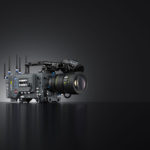
The single camera used on Darkest Hour was the ARRI Alexa SXT with Cooke S4 lenses. Bruno and Joe had looked at a lot of alternate lenses, the initial experimentation was to use very old fashion lenses or vintage lenses but again it felt, particularly in such an ensemble performance, that playing with depth of field and radical focus pulls would get a little distracting.
Peter was looking forward to a ‘thick’ negative coming his way, “The Cooke S4s have a very distinctive look and it’s a kind of combination of sharpness in the right place, so sharpness for eye lights and other detail. They have quite a lustre to them, quite a glow which makes them quite reactive to the set. So whilst they’re not flaring like a classic anamorphic, as you pan across a scene or if an actor walks up there’s a kind of glow that will follow them through. Certainly in the Parliament when he’s delivering the speeches it just meant that your main protagonist could be exceptionally bright and very focused whilst the Commons can fade off in to an almost painterly like texture.
 There was intentional contrast between the bright summer and the darkness of the interiors.
“We wanted to design this film for a cinema experience so we came up with a contrast range for the classic Xenon DCI projector, built the LUT, Bruno could do his exposure wedges and then really test the camera finding out where it was clipping, all the old school bracket-like tests. Bruno and the team went in and lit it with that in mind so my job didn’t include so much re-construction of the lighting as such. Certainly we play to the title, Darkest, we just spent some time seeing how dark we could get the shadows with men in black suits in lots of smoke against very dark wood paneling in shadows. Technical I spent quite some time getting a tone curve in the shadows that really works so the display medium like your television and the projector really reproduces that in the way that we wanted.”
This film was a Technicolor show from start to finish so it was Technicolor providing the on-set rushes with Mel Kangleon as the on-set colourist who would make sure all the different scenes were matched-in so editorial were able to cut some good looking rushes and then all that data was carried through to the DI. CODEX was used throughout from recording on-set all the way through the process.
remaking Retro colour
 The Commons set was designed to spotlight the performances of the speeches
Senior Technicolor colourist Peter Doyle isn’t one to accept an easy colour solution, his research of this period was deep. “I took myself off to the Victoria & Albert museum in London, which I do a lot, they have a fantastic photography collection and I did some research of colour photography of that period and I also went through my own library. I collect photo books and have been building up a collection of all the different colour processes that have been available. That’s a huge undertaking and I don’t think I’ll ever get there, but along the way what’s interesting is how varied the colour processes are, there are many different ways you can get there.
“It struck us that the photography of someone like Edward Steichen in particular kind of lends itself to the tone of the period particularly in terms of the Palace and the dinner party scenes. Also between Bruno Delbonnel and director Joe Wright a kind of core element for the placement of the film ended up that this particular summer was one of the brightest and hottest in quite a long time. That made for a very interesting dichotomy that the summer is lush and hot so you have all this warm light and then inside you have the contrast of the dimmed, bare light bulbs and the blackened down walls.
“I proposed reproducing this story with a colour that was almost like a postcard from a sunny holiday, so based on that I got hold of the oldest reversal or slide film stock I could get hold of that had been sitting in my fridge for ages and just built a colour model of that and so it meant that when we shot with the Alexa digital camera we really bent the colour and the contrast so it reacted as if it was a colour filmstock from that period. It’s more like one of my favourite colour processes which is called the Colour Carbon process – certainly Steichen was experimenting with at the time. It was usually reserved for very expensive advertising shots.
 The aesthetic changed from being initially based on vintage lenses to a refined sharp look.
“That worked incredibly well as it really reproduced skin tones in a very beautiful way, we’re talking British people in war time so people who are not tanned, are unhealthy, smoke too much so their skin tones would be quite pale. Also mindful that Gary in his performance would be giving quite animated deliveries and the nuance of flushed cheeks and very red skin during anger is something that really needed to be reproduced. We spent a long time making sure that the skin tones and the extraordinary prosthetics that Gary wore helped rather than hindered.
“There are lots of browns and hessians for the pale skin, very pale skin with incredibly intense lips. That colour model really worked for that, then with Bruno’s lighting it just meant we had that fantastic contrast range and we went from that.
“To achieve this tone you photograph colour charts with both a digital camera and these alternate processing that allows you to build a three dimensional colour model based on the difference between the two. You then build a second model that then bends the digital camera to reproduce as if it’s a film negative and then it all kind of sticks together. That only works if you have a DOP of the skill of somebody like Bruno Delbonnel, apart from the aesthetic considerations and being able to light a set fantastically. Technically a DOP like Bruno brings to the table very much the old school style of really lighting a set. So the file that you get is very much ‘old school’ like an old negative in as much as it’s really lit and exposed correctly. Bruno will light for consistency within the set so it means that I can build this quite extremely manipulative look, but the negative has been lit perfectly in a way that it actually matches.”
 ARRI’s Alexa SXT was used for the movie


