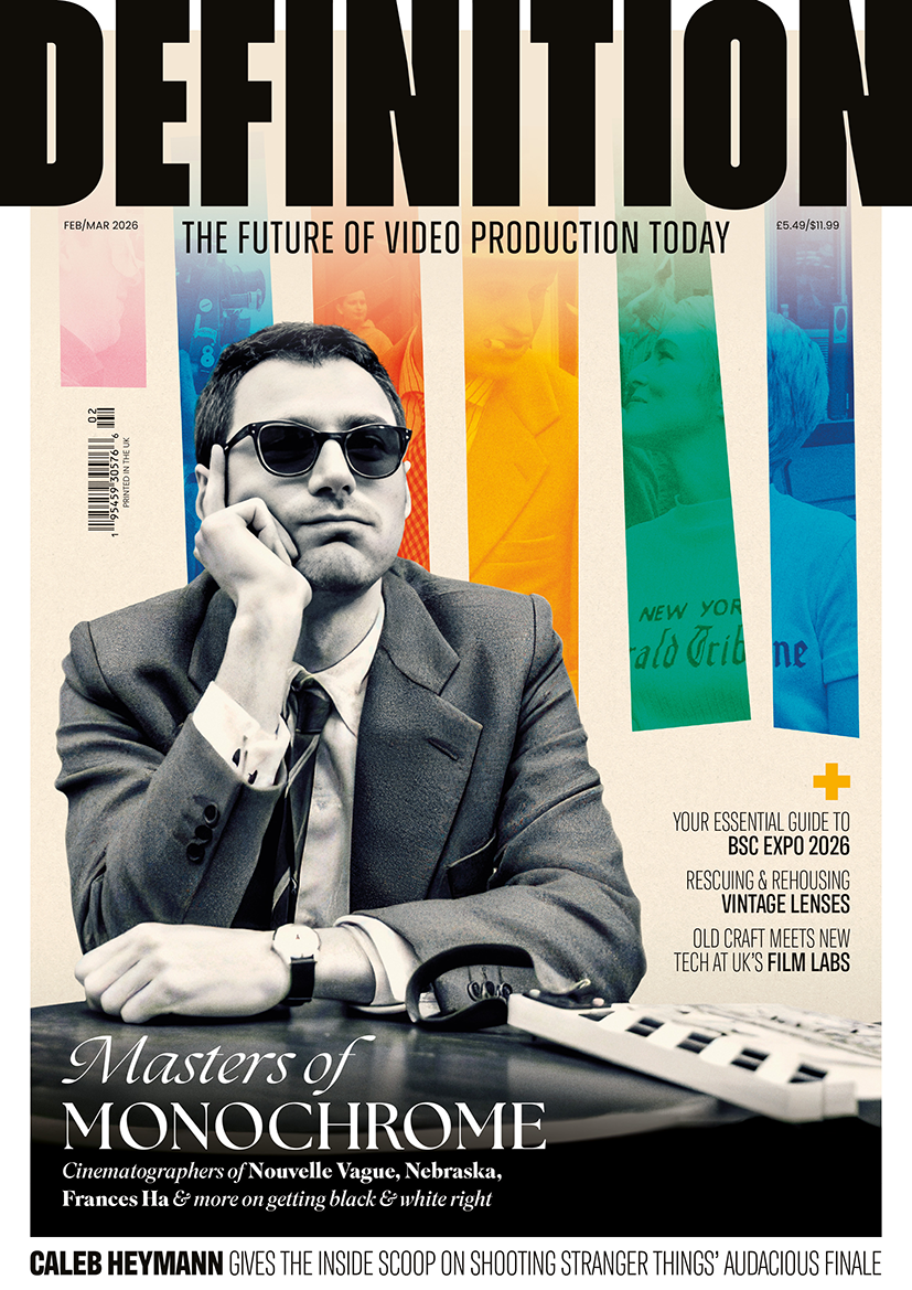
Mastering monochrome
Posted on Feb 18, 2026 by Admin
DOPs Phedon Papamichael, ASC, GSC, GCA, Edu Grau, ASC, AEC, David Chambille, AFC and Sam Levy share insights into the technical challenges behind black & white cinematography
Words Oliver Webb | Top image Jean Louis Fernandez
Shortly after the release of Nebraska, the legendary cinematographer Haskell Wexler, ASC (One Flew Over the Cuckoo’s Nest, In the Heat of the Night) phoned the film’s DOP, Phedon Papamichael, ASC, GSC, GCA, much to his surprise. “Haskell called and said: ‘Hey Phedon, what film stock did you use on that Nebraska thing?’” Papamichael recalls. “I felt bad telling him it was shot on an ALEXA, but it really shows how far film emulation has come.”
In 1967, Haskell Wexler received the Academy Award for best black & white cinematography for Who’s Afraid of Virginia Woolf? – the last film that was honoured before the black & white and colour categories merged. Since then, only 18 of the best cinematography nominees have been black & white films, with just three snapping up the award: Schindler’s List (excluding the red coat), Roma and Mank.
In recent years, however, there has been renewed interest in the style, with several Oscar nominated B&W films released in the last decade. Opting to shoot in monochrome usually comes down to several factors, and brings with it a set of unique technical challenges.
Contrast control
Colour filters transmit certain colours while absorbing others, and are an effective tool for controlling contrast in black & white images. As most scenes contain a range of colours, DOPs can use filters to enhance tonal separation and shape the visual impact of a shot.
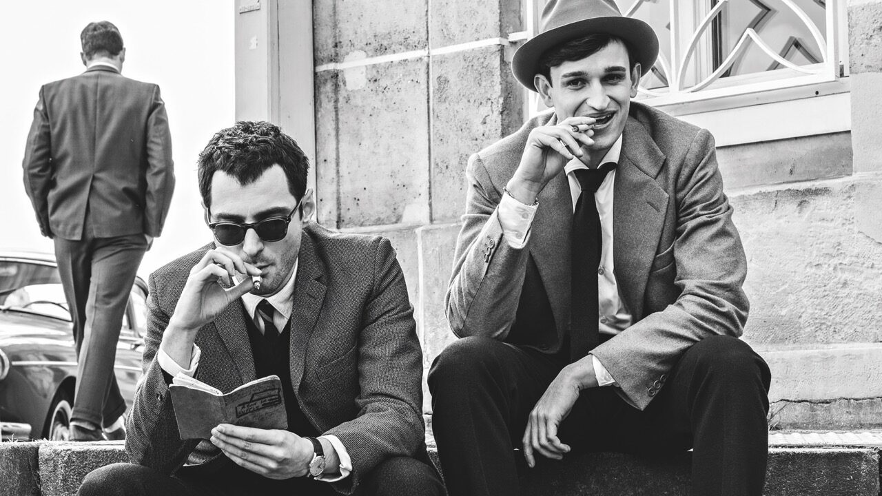
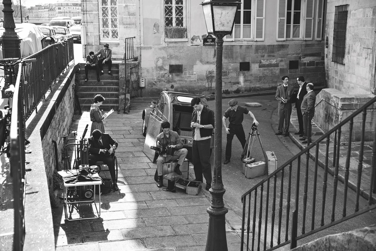
Black & white was always at the core of Nouvelle Vague, the latest project by David Chambille, AFC. While the majority of the film was created using digital camera technology, Chambille also shot on film using Ilford HP5, Kodak 5222 stock and the ARRI 2C camera. (This was mostly during the test period, and during the shoot it was used for grade references rather than actual footage.) “Richard Linklater’s main concern was to make a movie that could have been shot during that period,” says Chambille. “We really wanted to embrace the kind of stock and lenses they had at the time and the texture of that moment.”
Chambille was pleased when the director asked him how well he knew that era and what his ideas were to achieve the look of the film. “I was happy because shooting in black & white would allow me to dispense with the gels and simplify the process, but also because I personally love that era and know a great deal about its context – the lives of those directors, the economic and technical constraints and the style and aesthetics of the time. I was eager to share my passion for the cinematography of that period with Richard, and I had a lot of ideas about how to help him achieve that look.”
Chambille used colours on-set and in wardrobe to control tonalities. “We tried to mimic exact scenes from Breathless,” he says. “It wasn’t easy to find the same stuff, so we had to use colours to easily adjust in black & white and get the exact right tonality. We had a blue skirt, green curtains and a red desk. We adjusted the tonality using colour choices and filters. Sometimes, we used a red filter to increase overall contrast. For exteriors, a green filter brightened the scene.”
Sculpting with light
Papamichael argues that maintaining consistency is easier when shooting in monochrome because the colour temperature changes throughout the day. On Nebraska, he worked with a LUT. “I was operating off my monitor and the lighting was set to the black & white contrast level I intended for the final print,” he says. “I found it helpful working without the colour separation and just dealing with the black & white. I’m considering doing that even when I work in colour.”
Papamichael prefers a natural lighting approach to his work. “If there is a lamp, a practical or a window source, I always augment that,” he says. “I am always true to the direction of light and I do not like backlights too much.”
When Papamichael captured night exteriors for Nebraska, he utilised blue gels on his lights that were illuminating the sky or the streets. “I knew I could grab that colour and intensify or reduce its luminance completely, so I actually had control of adjusting light intensity. That was really effective.”
Edu Grau, ASC, AEC identifies some other potential complications when shooting in black & white. “Without colour separation, a subject’s hair can blend in with the background, making a scene feel flat,” he says. “You need to be careful how you compose light and dark within the frame, but that is also the case with colour. Everything is more elevated in this format and people tend to love your work more, as they think the result is more beautiful.”
Grau found that, during tests for Passing, shooting in colour was helpful for the post-production process. “For example, we hated the colour of one wall in the house, but it was too expensive to paint,” says Grau. “When you get the raw material in colour, you can choose a colour and make it completely different. Everything that’s red can be altered to be very dark, which was very practical for us. Obviously, we couldn’t have done that if we had shot in black & white. So, we relied on a colour camera to help us compose the image we wanted. Although we never saw a colour image on-set; everything was monitored in black & white.”
Sam Levy shares a similar perspective for his work on Frances Ha, despite filming in colour. “With my history of watching black & white films as a teenager and studying how to shoot black & white reversal films in college, I already knew a few helpful techniques. In a certain way, it’s easier. You’re really just dealing with tonalities of grey, rather than the full complexity of colour. It both matters and doesn’t matter what the capture format is, as long as you know that the film will ultimately be seen in black & white.”
, Frances Ha (centre) and Nebraska (right) spearhead the revival in black & white films. Image Netflix")
, Frances Ha (this image) and Nebraska (right) spearhead the revival in black & white films. Image Sam Levy")
, Frances Ha (centre) and Nebraska (this image) spearhead the revival in black & white films. Image Paramount")
Grading in greyscale
Chambille seriously considered shooting monochrome for Nouvelle Vague, but his colourist talked him out of it. “I never had a problem in colour grading because it was so easy to interact with the image,” he says. “We did not have the usual problems regarding skin tones or if the colour of the daylight is right, depending on the time of day.”
On the contrary, Chambille had more tools and acknowledges it was easier to adjust the background and foreground. “I didn’t really see the point of shooting monochrome, since shooting in colour allows you to achieve the same look but with more flexibility,” he admits.
While Papamichael shot Nebraska in colour, he admits that this wasn’t his say. “It took Paramount a while to finally agree to black & white, and they said we would also need a colour version. That ultimately meant we couldn’t shoot black & white film stock. ”I settled on ALEXA and tested various colourists before deciding to partner with Skip Kimball. I scanned the black & white that we did on the test and set the contrast and look to the film stock in the DI at Technicolor. I then told Skip to match the ALEXA to look as close as possible to the film.”
Kimball told Papamichael that the more saturated your image is, the more those colours can be used. “I have more control if the elements in the frame are primary colours,” says Papamichael.
“I didn’t really have very much time to do DI work, so during production we decided to work that way. There’s a white garage in the movie and I said to our production designer, ‘If you paint that red, I can make it any shade of grey we want.’ I also said to the wardrobe team, ‘If you give me red checkered shirts you can still have your patterns, but if it is either rich blue or red I can really control those for each scene.’ They didn’t really do it though because it didn’t look good in colour.”
Elevating performance
Skin tones are one of the most difficult elements to capture in black & white cinematography. DOPs need to rely on lighting, contrast and texture to convey the depth and subtleties of skin, which requires a precise balance. Too much contrast, for example, can make skin appear harsh or unnatural, while too little can flatten the image. Nevertheless, it can be highly flattering and enhance an actor’s performance.
Levy stresses that black & white is kind to faces. “Even though we had such wonderful actors on Frances Ha – including Greta Gerwig, Adam Driver and Mickey Sumner – it’s a very aesthetically forgiving medium,” he tells us. “Now that’s not why we chose it, but it’s another technical aspect of working in black & white.”
But Levy warns that you have to be careful when shooting in black & white because it is instantly very pretty. “You can’t trust pretty, it’s not enough,” he says. “There are a lot of mediocre movies that are pretty, and a lot of incredible films I love and admire that are not. I tend to be more drawn to things that are not conventionally pretty, as long as the film itself is good. I want to approach the work thoughtfully, without overthinking it.”
Papamichael agrees that there is something about lighting faces in black & white and letting things fall off in the background. “It puts more focus on the performances and emotions,” he says. “It’s often said that black & white is an actor’s best friend. There is something about letting the audience focus on the subtleties of the performance without the distraction of colours.”
 and Nebraska (left) were originally shot in colour. Image Netflix")
 and Nebraska (this image) were originally shot in colour. Image Paramount")
Monochrome magic
Levy recalls studying black & white photography early in his career. As a camera assistant, he gained experience working alongside renowned DOPs such as Harris Savides, ASC and Darius Khondji, AFC, ASC. “I studied Ansel Adams’ camera books and the zone system he designed,” he says. “It’s a great way to learn the craft and consider how to look at the world scientifically in black & white.”
He adds how unusual it is for feature films, especially in the mainstream, to be shot in black & white. “It immediately sets a film apart aesthetically and makes people more likely to talk about its photography. I felt lucky at the time to shoot Frances Ha – it’s very rare that you get an opportunity to do it and I haven’t gotten to since. Hopefully I’ll get to do another one.”
For Grau, it’s the most forgiving style of cinematography. “The difference between film and digital narrows when there is no colour, so digital is closer than ever to film in black & white,” he says. “It makes sense that a lot of filmmakers fell in love with black & white. Some of the movies we love the most are shot that way. It sends the imagination to a whole other level than colour.”
Papamichael, who started his career shooting black & white shorts, would love to return to the medium. “I come from stills originally. Prior to shooting my first shorts, I always had two Nikon F2 cameras on me. One always had a black & white film, and one always had Ektachrome loaded,” he concludes. “I would love it if someone told me I will only shoot black & white movies for the rest of my career. I’d be very happy.”
This article appears in the February/March 2026 issue of Definition