Apeing The Anime
Posted on Aug 30, 2017 by Julian Mitchell
The production journey of the live-action version of Ghost in the Shell was never going to be smooth – which piled the pressure on the DOP and VFX vendors
Words Julian Mitchell Pictures Paramount Pictures
The 2017 Ghost in the Shell live-action movie was hampered even before it was screened to the public. Outrage hashtags were liberally used to complain about the #whitewashing and the #cultural appropriation by the film’s producers of content that was originated in 1989 in the original Japanese manga comic. Animes followed the manga and have regularly been screened up until the last one in 2015. But it was the stand-alone movie of 1995 from which the new live-action movie took its lead, and, to a lesser degree, the TV series of the early noughties.
The 1995 movie was a mixture of traditional cel animation and CGI, and a story pegged to a fictitious New Port City (based on Hong Kong) in around 2029 that flirted with existential questions of what it is to be human in a cybernetic body or shell. Fans of the anime feared that Hollywood would dilute the concept, more Speed Racer than The Matrix. The casting of Scarlett Johansson as Major, the lead character, and not a Japanese native fueled the social media outrage even more. There was also peer pressure from creatives in Hollywood who had already been influenced by the anime, so you wouldn’t blame the production for donning tin helmets as they produced their version.
 Jess Hall (left) with Director Rupert Sanders.
DOP Jess Hall countered the baying pressure by doing his homework and appropriating in his own respectful way. He studied not just the previous films and graphic novel but researched Japanese art and more particularly the colours and perspectives that he found there. The choice of the ALEXA 65 camera wasn’t just to do with it being the camera of the moment but Jess wanted to match a medium-format’s perspective with the anime’s. “I wanted to atone the anime’s aesthetic. The medium-format by its nature compresses the perspective. Compressed perspective is something that exists in traditional Japanese art and to a certain extent in anime.
“But also with my own taste I was interested in using wide-angles which kind of echo manga’s feel. I’m not talking any kind of exaggerated perspective though, so there’s no keystoning or distortion. The ALEXA 65 format is also perfect for other formats like IMAX, 3D, HDR and standard 2D projection. The perspective that you can get in 1.85 framing was, as soon as I saw it, the way that I wanted to go.”
Digital – but not as you know it
Matching the anime aesthetic didn’t stop there as Jess pursued the right optics to resolve his vision. The quality he had in mind obviously had to include the lenses for the ALEXA 65, while the lens choice is widening, it’s still something of a trial and error exercise. Jess sought the help of Panavision lens engineers to make some custom glass, “The lenses were custom made with Dan Sasaki who is VP of Optical Engineering at Panavision. They were based on a level of softness, a certain amount of fall-off around the edges of the frame, a subtle colour palette and a slight halation in the highlights and so we made a complete set of lenses. They ended up with modern elements, with focal lengths of 24mm, 29mm, 35mm, 40mm, 50mm, 75mm, 100mm, 135mm, 135mm macro and 180mm. We called them modified Sphero lenses.”
“WE WANTED TO USE THE HARMONY OF DIFFERENT COLOUR GROUPS”
The choice of camera and lenses was completed with the distinct lighting design, which was almost entirely done with LEDs. “I built a specific colour palette for the film. It was basically 28 colours based on my own photographic research and Hong Kong at night where the film is set. I was also drawing from the anime and building up a palette of these very complex colours. I then programmed all those colours into the different LED units, fed that through a lighting desk and so I was able to call up any colour on any light at any point. So a lot of what you’re looking at is this unique colour palette filtered through just the right atmosphere with a particular type of lens quality and the particular type of camera which was the ALEXA 65. It all adds up to something quite unusual.”
If you watch the film you will understand what Jess has done as the movie isn’t dark and isn’t desaturated, nor is it saturated. Because he was so careful with his choices, the colours you see on screen are of amazing quality but they’re not primary colours. He worked with the secondary colour palette, with greys that are toned with violet and blues. “These colours are very carefully controlled and not saturated or desaturated, but exist in that middle space. It’s very much an anime palette. From Ghost In The Shell and Innocence, the second film, but also from the light in Hong Kong itself.
 Director Rupert Sanders with the ARRI Alexa 65.
“We wanted to use the harmony of different colour groups together which again is something that is traditional in Japanese art. The same way that you can take a frame from the anime and see how it’s combining four or five different colours for a very harmonious effect.”
The microclimate that exists on the island of Hong Kong was also something Jess wanted to feature in the look of the film. “Because it’s essentially quite tropical there and has this dense forest around it, it tends to have this trapped layer of moisture in the air. There is an ambient quality to the night light which is the neon and LED light getting trapped in this water layer. I think they tried to pick this up and apply it in the anime and I tried to do the same in our photography.”
Lighting Design
As is now quite common in films and soon to be the same in TV episodics, Jess was using the new generation of LED to carry his colour palette. “Just trying to find lights that were that controllable and powerful was an exercise in itself. Four-channel colour mixing just wasn’t able to get the subtlety of some of the colours; it was hard to make the right kind of yellow and orange for example. I ended up working with a company called LiteGear in LA which was founded by a gaffer. We were testing four-channel colour and I wasn’t getting what I wanted so they designed a six-channel unit which gave me RGBW, amber and Tungsten, and enabled me to get these subtle colours I was aiming for.”
Jess also worked with lighting manufacturer Digital Sputnik in the early stages of testing and pre-production to try and figure out how to mix these colours and also how to programme them, as it wasn’t something that had been done before. “Their lights were very programmable in terms of the colour palette that I wanted so we started with those units, and I programmed the 28 colours on those. When I was getting the colours to read correctly on camera I got this device called a spectrometer which reads colour wavelengths. I’d take the RGB readings off the spectrometer and programmed those into the other lights which were ARRI, LiteGear and Creamsource, so at least I’d have a starting point for this very subtle colouration that I was using.”
“THE WORLD IS SHOWCASED IN FULL CG FLYOVERS, DUBBED GHOST CAMS. THESE SHOTS WERE EXTREMELY COMPLEX”
Jess ended up with sometimes 60 different light units coming out of the desk at any one time. He would have full control of those lights next to his monitor. This sounds like a live mix in a theatre more than a movie but what is happening here is Jess and his crew pushing the development of this type of movie lighting.
A practical example of his lighting design was how Jess shot the star Scarlett Johansson: her key light gave her a beautifully soft look, almost like a 1930s Hollywood starlet would have been shot – how was that done?
“It was a combination of the lighting and, of course, make-up. Using this very ambient type of lighting encouraged us to use practical lighting more than key lights, perhaps. For example, the ambient light in Hong Kong was really the sky. I looked at the skin quality of the Major in the anime and there are colours there that you don’t usually see in a key light. To use another example, this warm grey colour which I really wanted to aim to use for Scarlett. This really soft, ambient light which makes the skin luminous, really brings out the part-human, part-cyborg reality.”
Video Grammetry
One of the obvious differences between the anime and the live-action movie is the building-sized 3D advertisements that adorn many of the high-rises in the fictional city. Reminders of Blade Runner are there although the technology is much cleverer. This is video grammetry at work with the use of 80 cameras all in sync recording simultaneously in a kind of dome house structure which is big enough to take people in and for them to perform. You then capture the performance in 360°. The results were the so-called solograms that appear at night in the city.
 The character Major with some of the video grammetry in the background.
“They were slightly de-graded holograms which we called solograms. Those elements are real photographed elements, not CG. They were done using these rigs which I think were the first of their type for a feature film, I know that the gaming industry has been playing around with this technology but I don’t think any feature has had a live rig that’s been able to capture 24 frames.
“That was also something that evolved from conversations in early prep which didn’t exist at the beginning of prep. That was done in collaboration with a guy called Dayton Taylor from Digital Air who has worked with camera arrays for many years.”
The director Rupert Sanders made no secret of the fact that he wanted less CG and more VFX-based on the set. The solograms were an example of that, but Jess feels that there has been a change in the acceptance of VFX in the audience. “The audience is sophisticated and so are their eyes. A lot of heavy CG work is not particularly profound; there is a switch-off that happens whereby emotionally you’re just not as impacted by things that you can perceive very subtlely as not real, as opposed to real photography. I think the line is becoming increasingly blurred as that work becomes more and more sophisticated.
“I think with this project we’re coming from this beautifully crafted anime and we were very much aware that we didn’t want a brittle kind of CG quality to the images, and so I think the idea of finding a capture system that was actually quite photographic was very interesting to us. I think it paid off because when you look at those night shots that travel through the city there’s a quality there that you’re not totally familiar with, but it still feels somewhat real. That was the advantage of going with that capture system.”
HOST CAMS AND GEISHA BOTS
MPC’s 1000 VFX shots went from shelling to solograms


Working with director Rupert Sanders and production VFX supervisors Guillaume Rocheron and John Dykstra, MPC’s team – led by VFX supervisor’s Arundi Asregadoo and Axel Bonami – completed more than 1000 shots for Ghost in the Shell. The complex work required a close collaboration between the filmmakers and MPC’s teams in Montreal, London and Bangalore who developed new shooting techniques and software tools to create the live-action adaptation of the original manga.
The movie opens with ‘The Shelling Sequence’, in which we see the creation of a cyborg, revealed later to be Major. This was created using a blend of computer graphics and practical animatronics. MPC’s work was to create a detailed fully digital skeleton, the muscles of a skinned Major and, as the scene was shot dry, the different types of fluid which enwrap the body.
One of the biggest tasks for MPC was to create the movie’s iconic futuristic world. The city had to be transformed from the original animated Manga version into a photo-real environment. The visual effects team created a library of futuristic buildings and vehicles, elevated highway systems and traffic and crowd simulations. To achieve the very particular vision of the movie, Sanders asked the team to build a city filled with gigantic holographic advertisements called solograms. MPC made a mixture of 372 solograms and holograms in different forms to populate the city shots. To create these photo-real volumetric displays, the movie’s production team designed a new custom-made rig of 80 2K cameras, running at 24fps, to capture volumetric footage of actors. Using photogrammetry on each frame, 32,000 3D scans were solved. MPC’s R&D team then developed new software and tools that allowed them to reconstruct, process, manipulate and lay out the volumetric data into the shots.
The world is showcased in full CG flyovers, dubbed Ghost Cams. These shots were extremely complex from a technical, artistic and logistical point of view, as well as integral to the storytelling, enabling the filmmakers to present the audience with a vision of the future in which the story is based.
The development of the hybrid CG and live-action character Kuze was an exciting challenge for MPC’s team. The design required a seamless mix of the actor’s face with digital parts, as well as a digital body. The character was constructed in the most organic way possible so there was no obvious delimitation between the real and CG components forming his face and body.
In an abstract scene named ‘The Deep Dive’, the Major navigates around a Geisha Bot’s memory. MPC’s artists rendered and simulated full CG characters decaying as time passes, varying the clarity of their representation based on the viewing angle. A 150-camera DSLR rig was used to capture a CG version of the actors frozen mid-movement, so they could be recreated digitally and deconstructed during the sequence. Data streams and transition effects as well as crowd simulation complete the scope of work for this ambitious sequence.
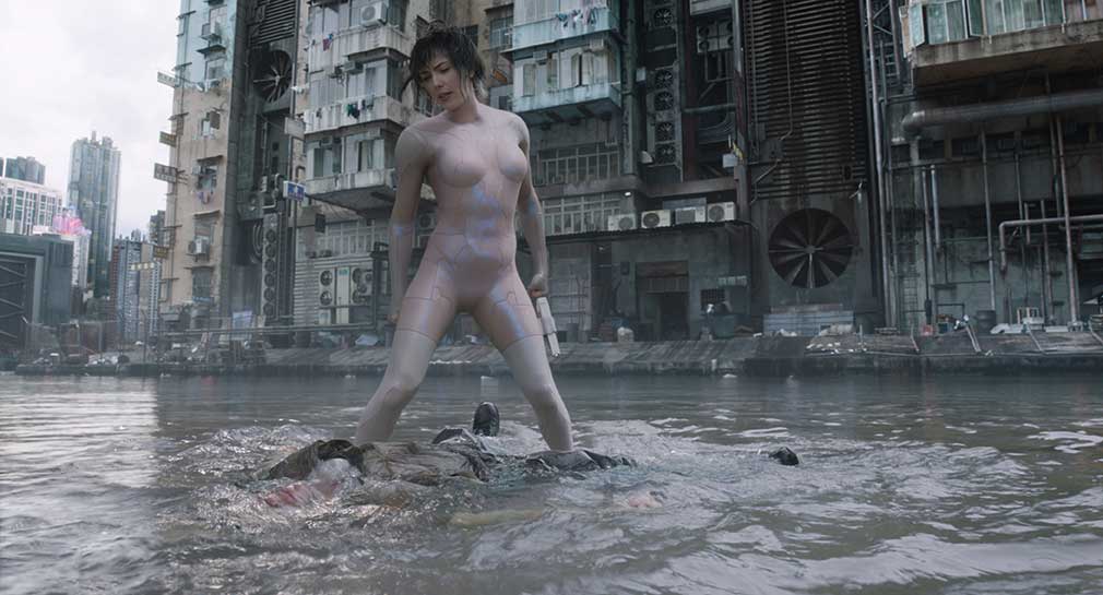
Major’s thermoptic suit and its invisibility effect are shown in a number of sequences in the film, from the iconic skyscraper jump to the trademark water-filled courtyard fight. For the courtyard fight, the complexities lay in blending a 360° full CG environment, built to recreate the look and scale of that in the original manga, practical and CG water effects and the suit’s invisibility effect.


