Ripley
Posted on May 28, 2024 by Samara Husbands
This Charming Man
Murderous monochrome thriller Ripley is a masterclass in tone and tension. Nicola Foley sits down with the series’ Academy Award-winning cinematographer Robert Elswit, ASC to find out more
When Robert Elswit, ASC got a call from director Steven Zaillian asking if he’d like to work on Ripley, his first reaction was: “Why would you want to remake that?”
It’s a fair question. Anthony Minghella’s seductive, sun-drenched 1999 feature, The Talented Mr Ripley, delivered an iconic, five-times Oscar-nominated portrayal of Patricia Highsmith’s enigmatic antihero nearly a quarter of a century earlier.
It had been done, and it had been done well. So why revisit it?
Back to the Source
“Steve made it clear that it wasn’t his intention to ‘re-do’ the film,” begins Elswit, whose previous credits include There Will Be Blood and Boogie Nights. “He told me, I’m starting over – I’m doing the Patricia Highsmith version of who Ripley was. Matt Damon’s Ripley was a charming college boy who inadvertently made some stupid choices, and he wasn’t that talented at all.
“But in Steve’s take on it – which I understood after we spoke about it and I read the books – Ripley’s talent was that he could have a five-minute conversation with you and knew exactly who you were, and how to manipulate you. He was a wonderful con man, probably the smartest person in most rooms he walked into, and understood human nature. That is a great talent.”
Zaillian wanted to scratch beneath the surface, exploring Ripley’s inner emotional workings and his evolution as a character.
Partly, this is achieved through the visual design of the series, which communicates the change in Ripley as he finds his footing in a rarefied new world; but it’s also helped by the simple fact Zaillian and his team had nearly eight hours of storytelling time at their disposal.
“I think that’s what he loved about the eight-episode idea,” reflects Elswit. “It was an 860-page script and gave us space to show Ripley’s emotional connection to what he sees around him – falling in love with Italy, the art,
the architecture and that lifestyle; but it also meant that we could show how his mind worked.
“Steve was interested in Ripley’s ability to improvise when things go wrong; the way he has to constantly figure out what to do next. I remember reading the part of the script where he kills Freddie and drops the body off, but realises he’s left the kid’s passport in his pocket, so he has to go back and get it. We follow his rhythm: him going back upstairs, to the cab, the whole journey – I didn’t expect we’d actually include that, but Steve was adamant. He wanted to show every bit of Ripley’s improvisation; how his killing wasn’t premeditated. These details and transitionary moments became an obsessive focus, whether watching
Ripley typing a letter or checking into every hotel – it adds to the texture of the character and Steve embraced that.”
Death Row
A sequence which gives us a blow-by-blow (literally) insight into Ripley’s movements is Dickie’s murder on the rowboat.
Here, we follow in real time, watching every bone-crunching fall of the oar and every frantic moment of calculation that follows, as Ripley tries first to throw Dickie’s body overboard, then sink the boat to destroy the evidence.
Appearing in episode 3, III Sommerso, this visceral set piece is a pivotal turning point for Ripley’s character, giving the audience a clear picture of the extremes he’ll go to in order to preserve his facade.
Capturing the scene was no small feat, requiring six full days of filming, with much of the shooting taking place in an outdoor water tank to provide the necessary controlled environment.
Utilising three cameras mounted on cranes, the team erected diffusion material to soften the harsh sunlight and simulate an overcast day, adding to the suffocating mood of the final sequence.
Shades of Noir
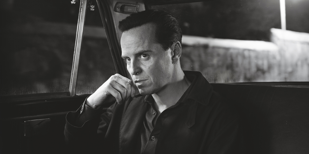
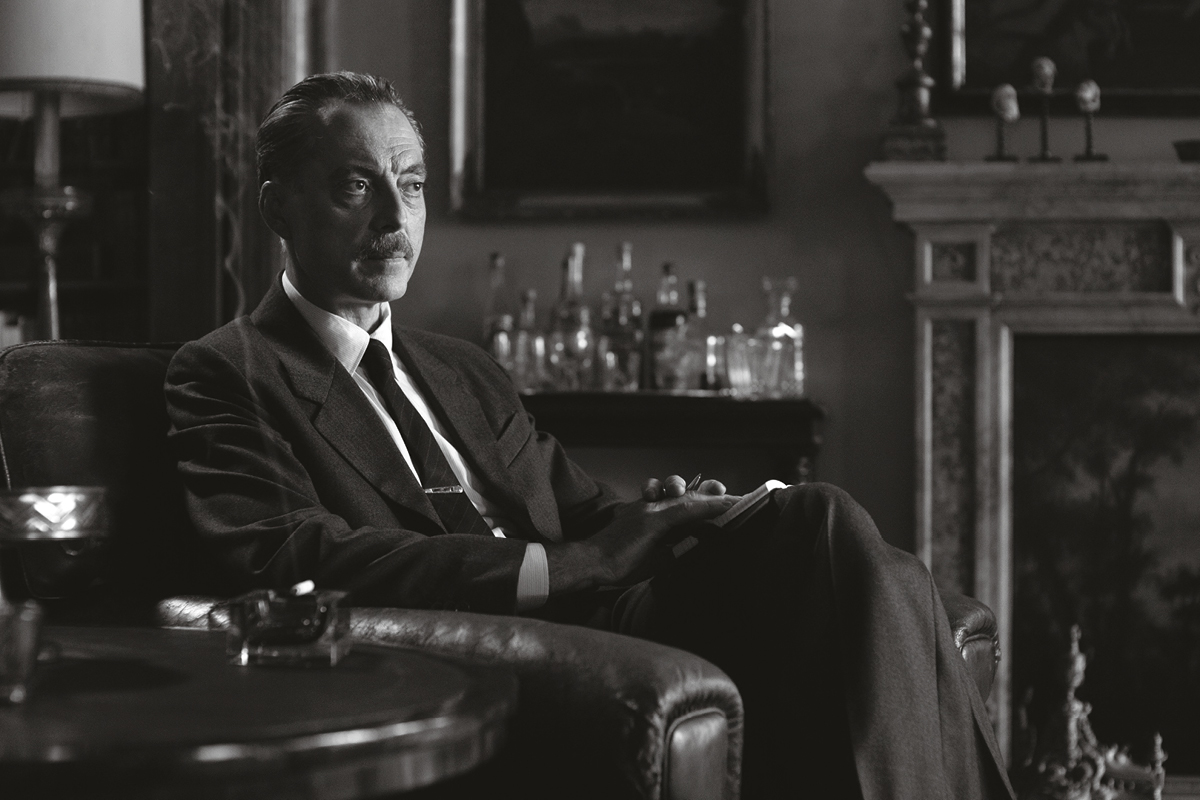
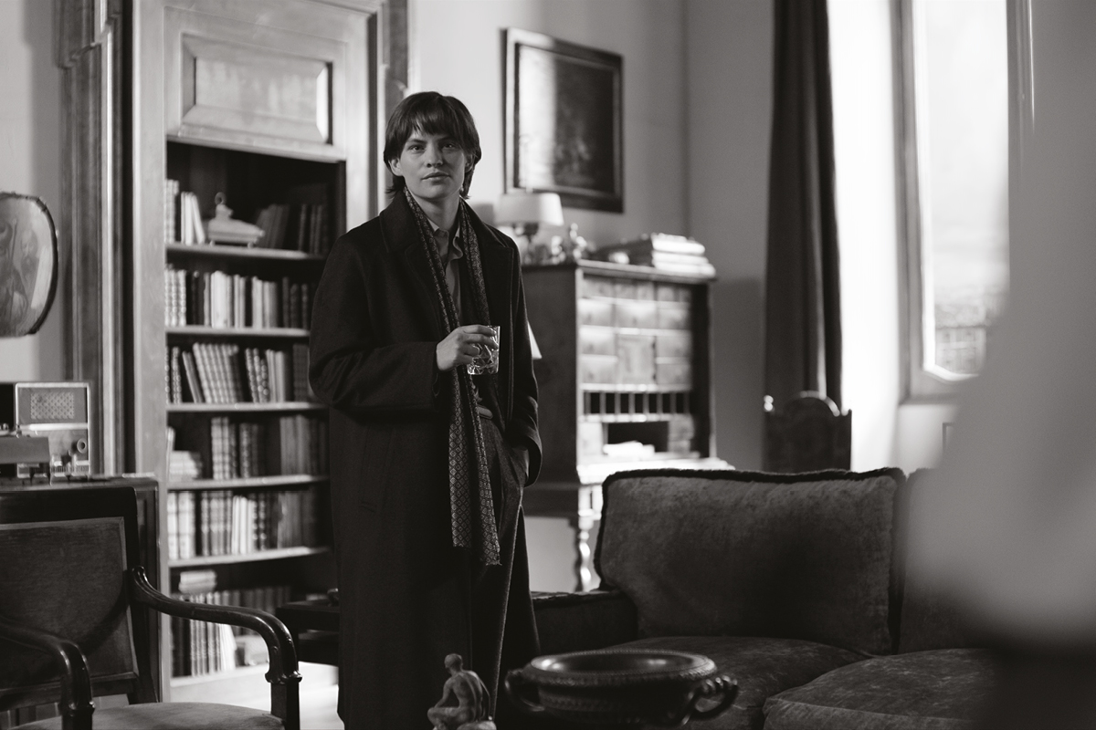
In the Minghella film, Ripley’s world is a sumptuous, colour-soaked Mediterranean fever dream, where Zaillian’s is the inverse: shadowy, cold, menacing and entirely monochrome.
Paying homage to the Caravaggio paintings which appear in the series, the cinematography is a masterclass in chiaroscuro; boldly playing with light and dark to shape the narrative and build tension.
The visual style is so striking that Elswit initially had concerns it might distract the viewer from the story, but Zaillian’s reasoning won him over.
“The way the show looks is a correlative to the emotional side. Steve wanted the audience to feel the tension and unease of the world that Ripley moved in – and he felt that the images would evoke this,” Elswit explains.
“Not a lot of directors feel that the way something is lit has a direct connection to the emotions of the people watching it, but Steve knows it,” he continues. “It became part of our dialogue: not just what the scene is about, but how should it feel? How should the people feel watching it?”
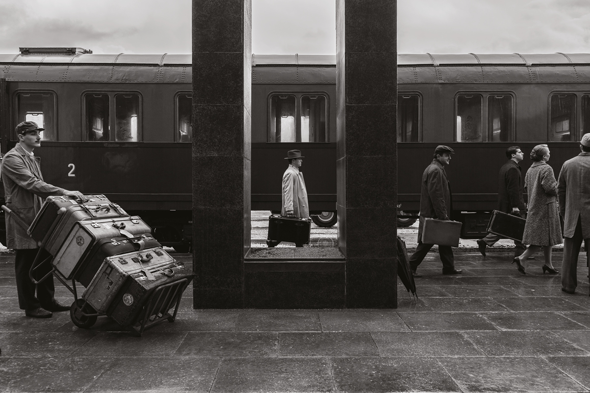
Production took the team across Rome, Venice, Naples, Capri and the Amalfi Coast, and they had their work cut out not just in ensuring a pitch-perfect period aesthetic, but in giving these idyllic settings a sinister edge befitting the story.
They were helped on both counts by the fact that principal photography took place in 2021 – mid-pandemic – which left them with deserted, tourist-free streets to play with.
The flip side of this timing was the restrictions put on filming, which caused severe delays to production; though Elswit ended up seeing this as a blessing since it gave them more time to scout and plan.
“I took hundreds and hundreds of stills and printed them in black & white, and I started considering what monochrome does – which is all about texture, quality of light and the tonal structure of an image. It’s very different from working in colour, and I needed that because I hadn’t done anything in black & white for a long time.”
Elswit began to think about lighting in a new way, considering how it could illuminate character dynamics: “There’s a general cliche about tonal structure and pictorial style – in painting, anyway – that light presents the idea of wisdom, understanding and enlightenment. If you are painting someone in open and direct sunlight, you’re making an emotional statement about your sense of who they are. And that carries over into monochrome more than in colour.”
In Ripley, light reveals truths about the characters and their inner worlds – Dickie can often be seen in half-light, while Marge “is open and honest –fully exposed. And there’s Tom, sitting in shadow,” he explains.
Taking a heavily stylised approach inspired by film noir, Elswit embraced the interplay of black & white highlights and shadows. “It makes you feel a certain way about what you’re looking at,” he muses. “It is a builder of tension; a creator of anxiety; and it just doesn’t happen the same way in colour.
“We have big LED units now that are very soft and broad and can recreate the feeling of day interior light. But with this series, we wanted hard light – something that didn’t look that real, the way films were lit 60, 70 years ago,” he adds. “When you look at people’s faces, there’s a more distinct nose shadow; there’s a fall-off; there’s a design of the lighting on someone’s face that takes advantage of the difference between a very strong highlight and shadows. So we exaggerated that; we didn’t try to create a realistic look.”
While he relied heavily on LED panels and praises their versatility – particularly when it comes to adjusting the colour temperature to create realistic lighting in both natural and staged settings – Elswit also utilised traditional tungsten lighting on Ripley, for a unique contrast which lends itself well to black & white.
Lamenting the disappearance of older lighting technologies like carbon arcs, which were adept at simulating sunlight, nowadays, he often combines LED panels with older fixtures like fresnel lenses to achieve desired effects, occasionally deploying HMIs for outdoor scenes.
Through the looking glass
Shot on an ARRI ALEXA LF and ALEXA Mini LF, lenses were supplied by Panavision, and Elswit had the firm’s VP of optical engineering on speed dial to ensure he got exactly the right glass for the job. “Dan Sasaki is a lens genius – he’s built lenses for me forever,” he gushes. “You can make a perfect lens now, for any format, which has no chromatic aberrations, almost no vignetting; that doesn’t have the kind of quirky qualities we became accustomed to. Lenses are pretty much so perfect that we don’t get that character any more.”
Seeking a blend of vintage characteristics and modern optical technology, Elswit and Sasaki landed on Panavision’s large format VA prime lenses, supplemented with a few select focal lengths from the brand’s Primo 70 and Ultra Speed series.
Designed with a compact, lightweight and modern mechanical structure, these lenses deliver state-of-the-art performance while offering predictable aberrations.
With a softer look compared to other Panavision lens collections, VA primes excel in close focus capabilities, fast apertures and consistent performance across focal lengths – enhanced by modern coatings to mitigate veiling glare. “They’re really great,” concludes Elswit. “Panavision has given us back a set of lenses which imitate the look of classic movies.”

Lessons Learned
One hallmark of the series is its sneaky framing and camera movement, which shows us the action from above, below and through foreground objects, adding an air of voyeurism. “Steve was always looking at ways of seeing Ripley through things, as if you’re an objective observer,” notes Elswit.
“He also made me think about the difference between moving back 15 feet and shooting someone with a longer lens in a medium close-up, and walking right up to them and shooting them with a wider lens; and the difference in intimacy and the feeling of presence,” he continues. “There’s barely a shot in Ripley made with a lens longer than 40mm: everything is wide lenses and mostly close-ups or medium close-ups or 40s. His storytelling sense is really something – and his understanding of what the scene had to be in terms of the emotional connection with the action.”
Elswit also credits the director’s influence in shaping his perspective on utilising architectural elements to inform shot design; a technique he’s continued to apply since. “We tried to make sure the lens choices and how we frame things worked as a complementary version to all these different spaces and buildings around us, and I definitely took that away from Ripley,” he shares.
Elswit was impressed by Zaillian’s uncompromising attitude. “The things you could live with, Steve wouldn’t live with. He was stringent about the design issues and everything. Once I understood this, I would never let things go and think ‘oh I can fix that later’ – which of course we can do in the digital suite. I almost never did that on Ripley,” he shares.
“Nobody works harder. Nobody is more dedicated to a vision. Nobody is more focused. He’s just an extraordinary human being. I’m so glad he dragged me along on this!”
Ripley is streaming now on Netflix.
Read our interview with Ripley’s colourists here.
This feature was first published in the June 2024 issue of Definition.